
Japandi Painting | Alessio Cacciatore

Japandi Painting
Des oeuvres en édition limitée pensées par l'artiste pour illuminer votre intérieur
Just a few years ago, the word japandi didn't exist. It took an entire generation of interior designers and architects, from Copenhagen to Kyoto, to finally put a name to something many had long suspected: Japan and Scandinavia share, thousands of miles apart, the same philosophy of beauty. A beauty sought in simplicity rather than ornamentation. In raw materials rather than gloss. In the right gesture rather than accumulation. It is this improbable yet obvious encounter that our japandi wall art seeks to bring into your home.
Our gallery brings together a precise selection of japandi compositions printed on premium canvas and glossy plexiglass, manufactured in our workshop in Germany. Stylized branches on beige backgrounds, monochromatic misty forest landscapes, Japanese cranes rendered in a Nordic palette, minimalist abstractions playing with white and gold: each piece in the collection seeks to embody this rare balance between formal rigor and natural warmth.
Japandi: The Meeting of Two Philosophies of Beauty
The word is a portmanteau: Japan and Scandi. But behind this neologism lies a deep cultural affinity, long noted by design anthropologists. In Japan, as in Nordic countries, harsh climates, long winters, and periods of deprivation have shaped a similar attitude towards objects: one owns few, but chooses them well. One prefers a perfect bowl to ten mediocre ones. A sturdy chair for fifty years rather than five flat-pack chairs for five years. This frugality has nothing to do with austerity; it is a form of elegance that consists of inviting into one's home only what deserves to remain there.
This philosophy has two names. In Japan, it is wabi-sabi: the art of finding beauty in imperfection, wear, ephemerality, asymmetry. In the Scandinavian world, it is hygge and its Swedish cousin lagom: the art of moderation, sober comfort, well-being without ostentation. When a Japanese person visits a well-composed Danish interior, they feel strangely at home. When a Scandinavian enters a Japanese tea house, they instinctively recognize the grammar of the space. Japandi is the decor that embraces this secret kinship and pushes it to its logical conclusion: no longer choosing between the two worlds, but uniting them.
Principles of Japandi Style in Wall Decor
Before discussing the artworks themselves, it's helpful to understand what visually defines the japandi style and therefore what to look for in a wall art piece that truly claims this aesthetic.
Chromatic Sobriety Above All
Japandi dislikes saturation. Its palette is built around neutral beige, sand, off-white, soft gray, taupe, occasionally enhanced with deep black for structure, or discreet gold for light. No fuchsia, no turquoise, no pop orange. When color appears, it is earthy: ochre, muted terracotta, sage green, faded indigo blue. This chromatic restraint is probably the most reliable criterion for recognizing true japandi art.
Asymmetry as a Principle of Balance
Where traditional Western decoration seeks symmetry and perfect centering, japandi embraces asymmetry. A branch crosses the painting diagonally, a subject is off-center to the right, a large void occupies two-thirds of the composition. This apparent imbalance is actually a more subtle balance, what wabi-sabi calls fukinsei. It allows the image to breathe and gives it its meditative quality.
Void as a Material in Its Own Right
In traditional Japanese painting, emptiness is never perceived as a lack. It is a compositional element in its own right, called ma. Japandi adopts this idea and applies it to the wall: a japandi painting leaves a lot of space around its main subject. This visual breathing space is exactly what distinguishes it from a more cluttered decor and also what makes it so restful for the eye on a daily basis.
Evoked Materials: Wood, Linen, Paper, Stone
Even when representing something abstract, a good japandi painting always evokes natural materials: the texture of raw wood, the grain of unbleached linen, the transparency of washi paper, the roughness of raw stone. This tactile dimension, even perceived through an image, is what creates the particular warmth of the style.
Major Themes of Japandi Wall Art in Our Gallery
Our collection covers the full range of what a japandi painting can be today. Here are the main categories you'll find.
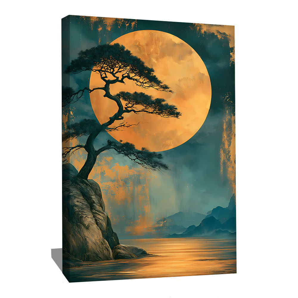
Stylized Branches and Trees
This is probably the most emblematic motif of the style. A bare winter branch, a cherry tree reduced to a few essential strokes, a tree silhouette against a beige background: these compositions translate the entire japandi philosophy into an image. Scandinavians appreciate them for their reminder of birch trees and boreal forests. Japanese enthusiasts recognize the grammar of sumi-e. Particularly successful in vertical format or as a light triptych.
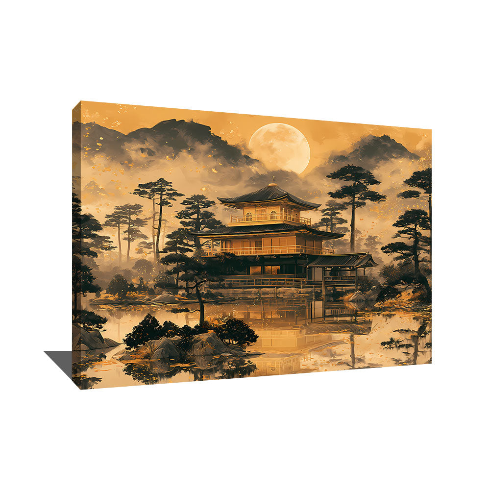
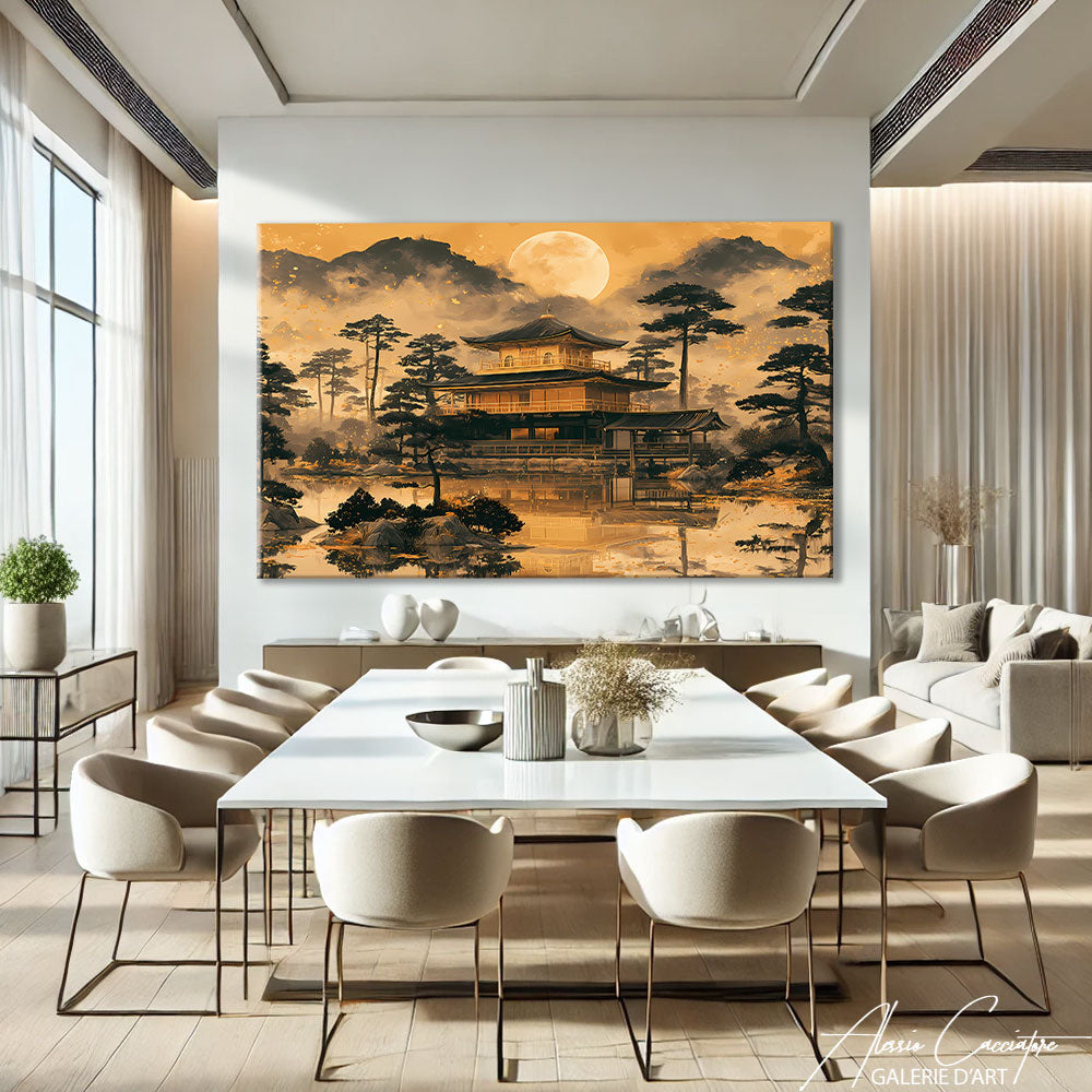
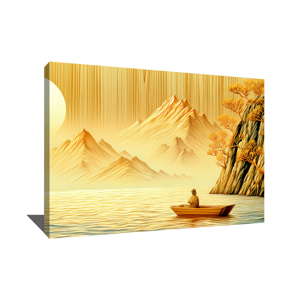
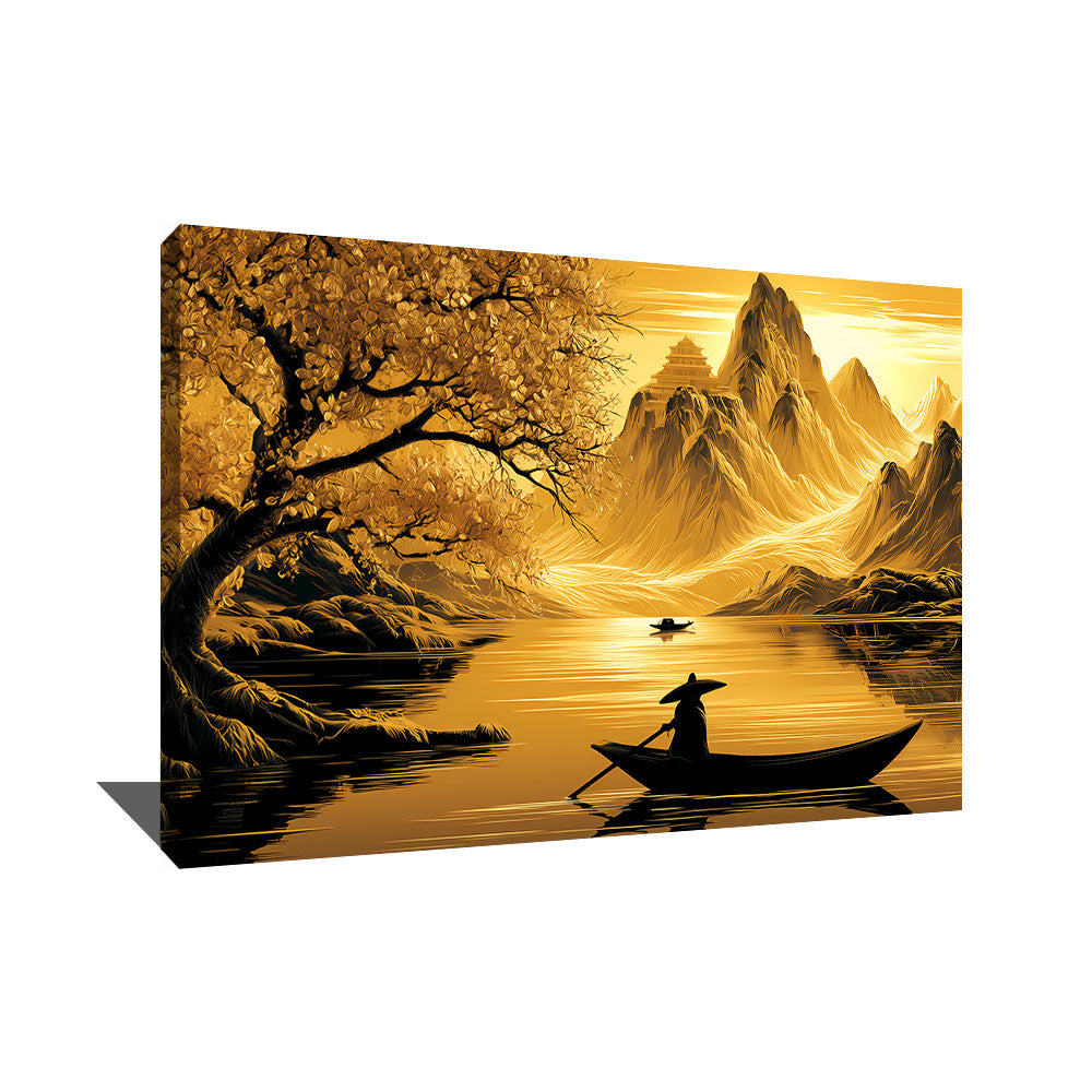
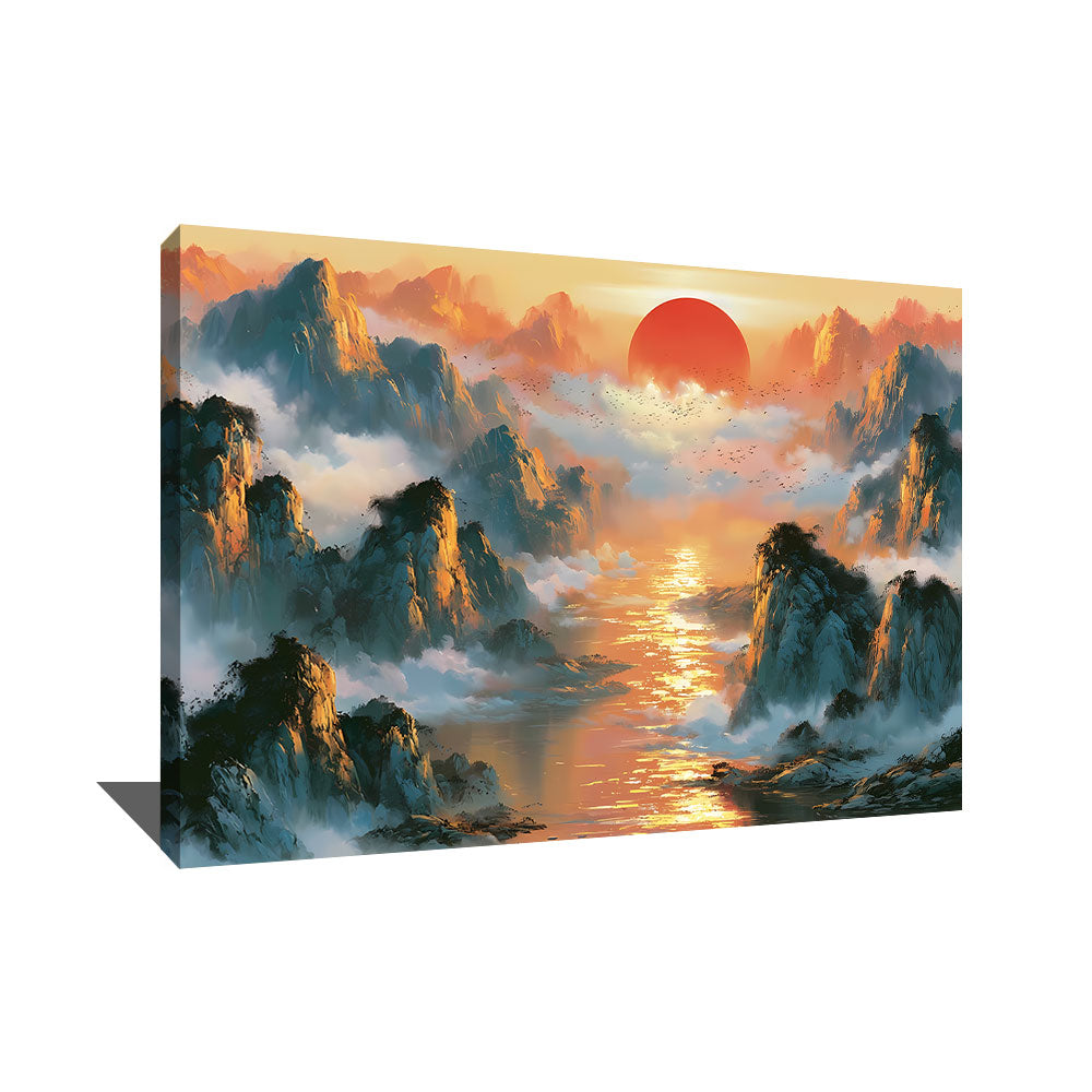
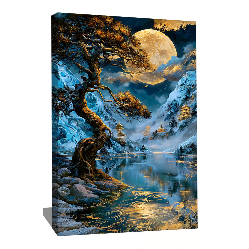
Monochromatic Landscapes and Misty Forests
More narrative but always restrained, these paintings depict landscapes reduced to their essential lines. A Scandinavian forest in the mist, a distant mountain in a flat gray, a lake with blurry outlines. The palette remains neutral, contrasts are soft, and the overall impression is one of silence. These compositions naturally find their place in bedrooms and cozy living rooms. To delve deeper into this vein, see our mountain collection.
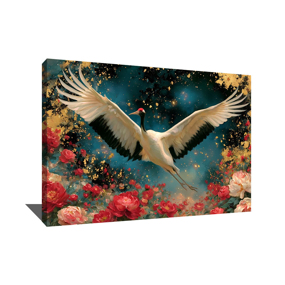
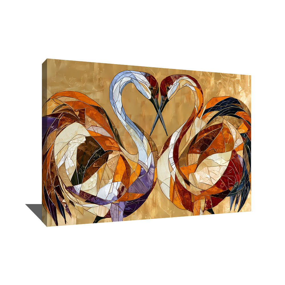
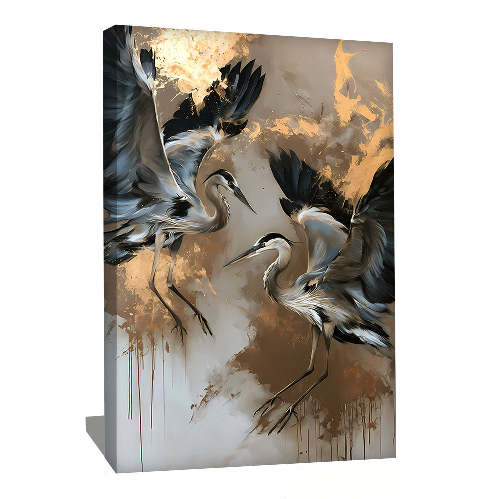
Japandi Birds and Wildlife
The Japanese crane, a symbol of longevity and fidelity in Japanese tradition, is one of the most represented motifs in this category. But you'll also find Nordic birds, owl silhouettes, compositions where a bird perches on a bare branch. The aesthetic remains minimalist: three strokes are enough to suggest life. These paintings bring a poetic dimension to an interior without being overly cute.
Stylized Portraits and Minimalist Figures
A geisha reinterpreted in a few neutral blocks of color, a samurai whose silhouette is hinted at rather than detailed, a female profile drawn in the style of contemporary line art: these compositions apply japandi to the human figure. They work particularly well in adult bedrooms, dressing rooms, and feminine spaces where they provide a presence without disrupting the overall sobriety.
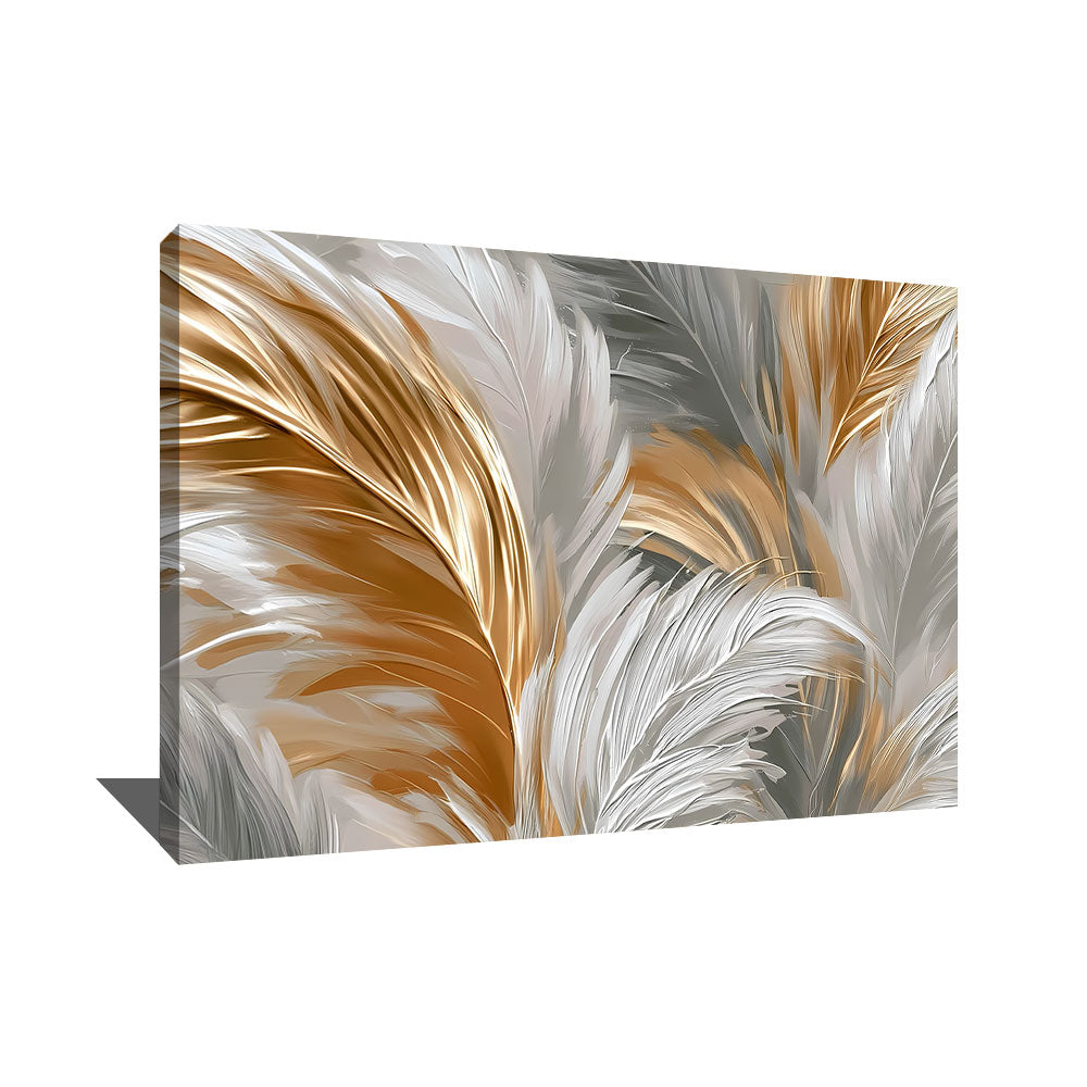
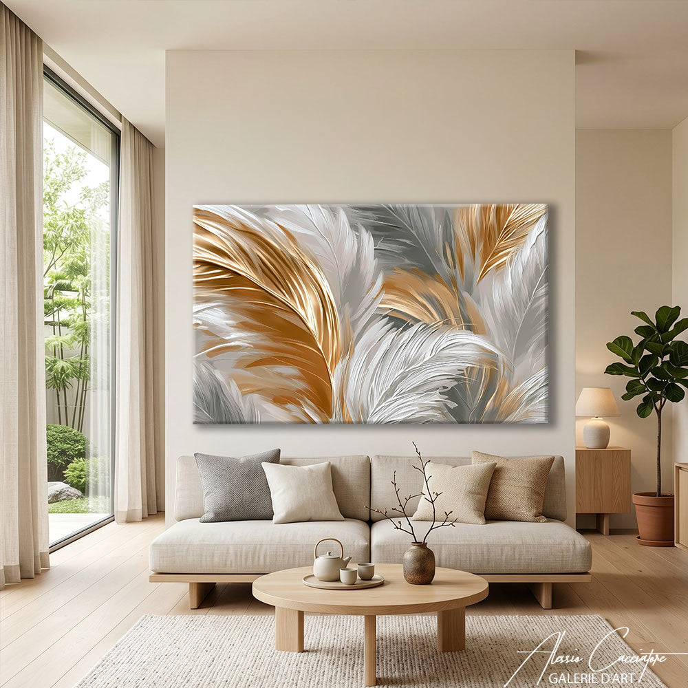
Japandi Abstraction
For contemporary art lovers, we also offer purely abstract compositions: blocks of neutral colors, plays of transparency, organic forms inspired by shibui (the Japanese concept of understated elegance). No identifiable subject, just a composition that invites contemplation. These paintings find their place in the most contemporary design interiors, where they interact with the architecture rather than the furniture.
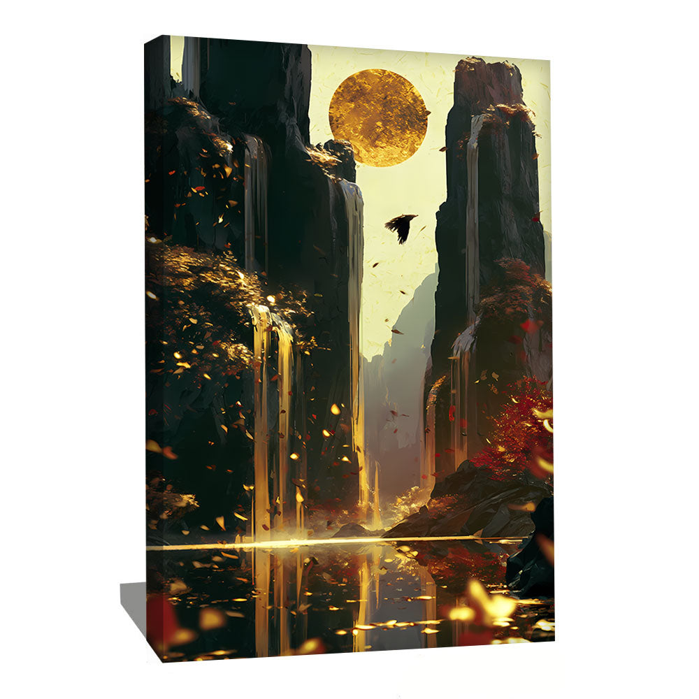
Japandi Gold: The Touch of Light
A special but important case: some japandi paintings incorporate gold, in small, localized touches (a sun, a moon, a gold leaf applied to a beige background). This luminous dimension recalls the aesthetic of kintsugi; the Japanese art of repairing broken ceramics with gold lacquer, and adds a precious note to the whole without disrupting the overall sobriety.
Symbolism and Philosophy: What Your Choice Says
Beyond aesthetics, hanging japandi art in your home often reflects a certain attitude towards life. These images evoke an imagination worth exploring.
The Choice of Sobriety
Japandi is the antithesis of ostentatious decor. It quietly says that one prefers quality over quantity, the essential over the accessory, durability over trendiness. Many of our clients arrive at this style after a period of simplifying their lives: moving to a smaller space, ending excessive consumerism, seeking a more peaceful daily life. Japandi art then becomes the wall symbol of this inner transition.
The Praise of Slow Time
In an era that values speed and constant stimulation, japandi offers something else: a gaze that settles, lingers, and takes its time. A japandi painting doesn't attract the eye with contrast or color; it invites it to slow down. That's why it works particularly well in rooms where one seeks to decelerate: bedroom, meditation room, reading nook, focused workspace.
The Beauty of Imperfection
Wabi-sabi celebrates what Western luxury rejects: the crack in ceramics, the irregular grain of wood, the asymmetry of a face. This acceptance of imperfection is a form of wisdom. Choosing japandi art often translates into your home the idea that not everything needs to be perfectly aligned for everything to be beautiful.
Choosing Your Palette: Japandi Colors
The japandi palette is both precise and nuanced. Here are the main tones in our selection.
Beige, Sand, and Off-White: The Heart of the Style
This is the dominant palette. Natural beige, soft sand, off-white, ivory, ecru. These neutral and warm tones form the chromatic signature of japandi and harmonize with almost all furniture. Particularly successful in living rooms bathed in natural light, where the nuance of neutrals comes into its own.
Soft Gray and Taupe: The Urban Version
For more urban, contemporary interiors, the gray palette brings an elegant and architectural dimension. From pearl gray to deep taupe, including dove grays and warm browns. This tone wonderfully complements leather furniture, polished concrete, and dark woods.
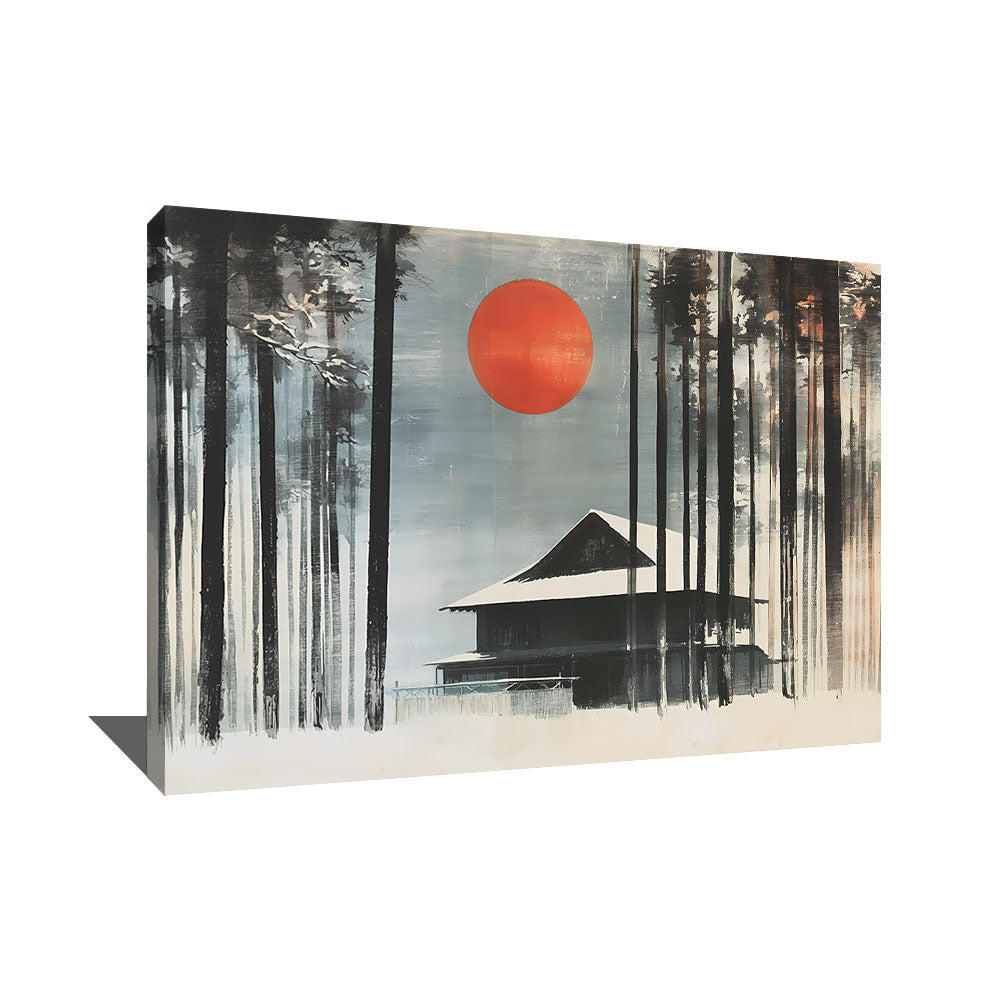
Minimalist Black and White
For lovers of pure graphic contrast. Black and white japandi does not abandon sobriety; it pushes it to its extreme. Ink compositions, graphic silhouettes on a light background, monochromatic landscapes. Integrates perfectly into strict Scandinavian interiors and design spaces.
Faded Blues and Sage Greens: The Natural Touch
Washed-out indigo, softened Prussian blue, sage green, moss green, eucalyptus green: these colored touches remain always restrained, earthy, as if weathered by time. They evoke natural Japanese dyes and Nordic landscapes. Ideal for bedrooms and rooms where you want a touch of color without disruption.
Discreet Gold: The Inner Light
Gold in japandi is never flashy. It is an aged gold, a matte leaf, a localized touch that catches natural light without reflecting it aggressively. This palette is particularly suitable for boudoir atmospheres and refined interiors.
Japandi Wall Art: For Which Room in Your Home?
Japandi is probably one of the most universally adaptable styles. Here are our room-by-room recommendations.
For the Bedroom: Promote Rest
This is probably the room where japandi best deploys its qualities. Its visual sobriety, restrained palette, and contemplative dimension make it the ideal motif for this space. Favor compositions with stylized branches, monochromatic landscapes, or minimalist figures. 80x60 cm format above the headboard or vertical compositions on the side wall. Japandi in the bedroom ensures a gentle awakening and a peaceful falling asleep.
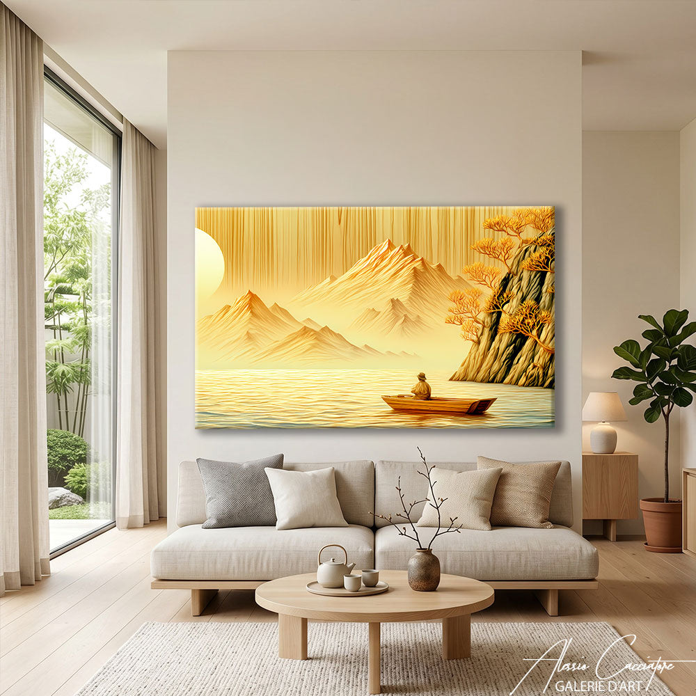
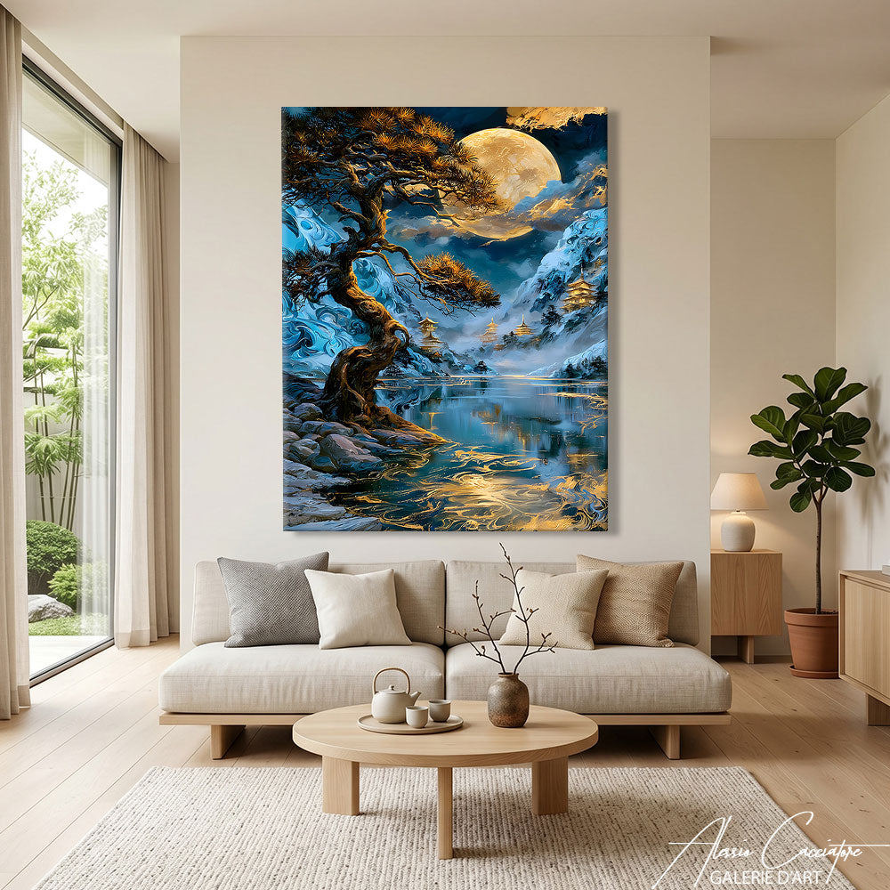
For the Living Room: Create an Elegant and Peaceful Atmosphere
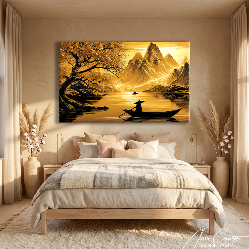
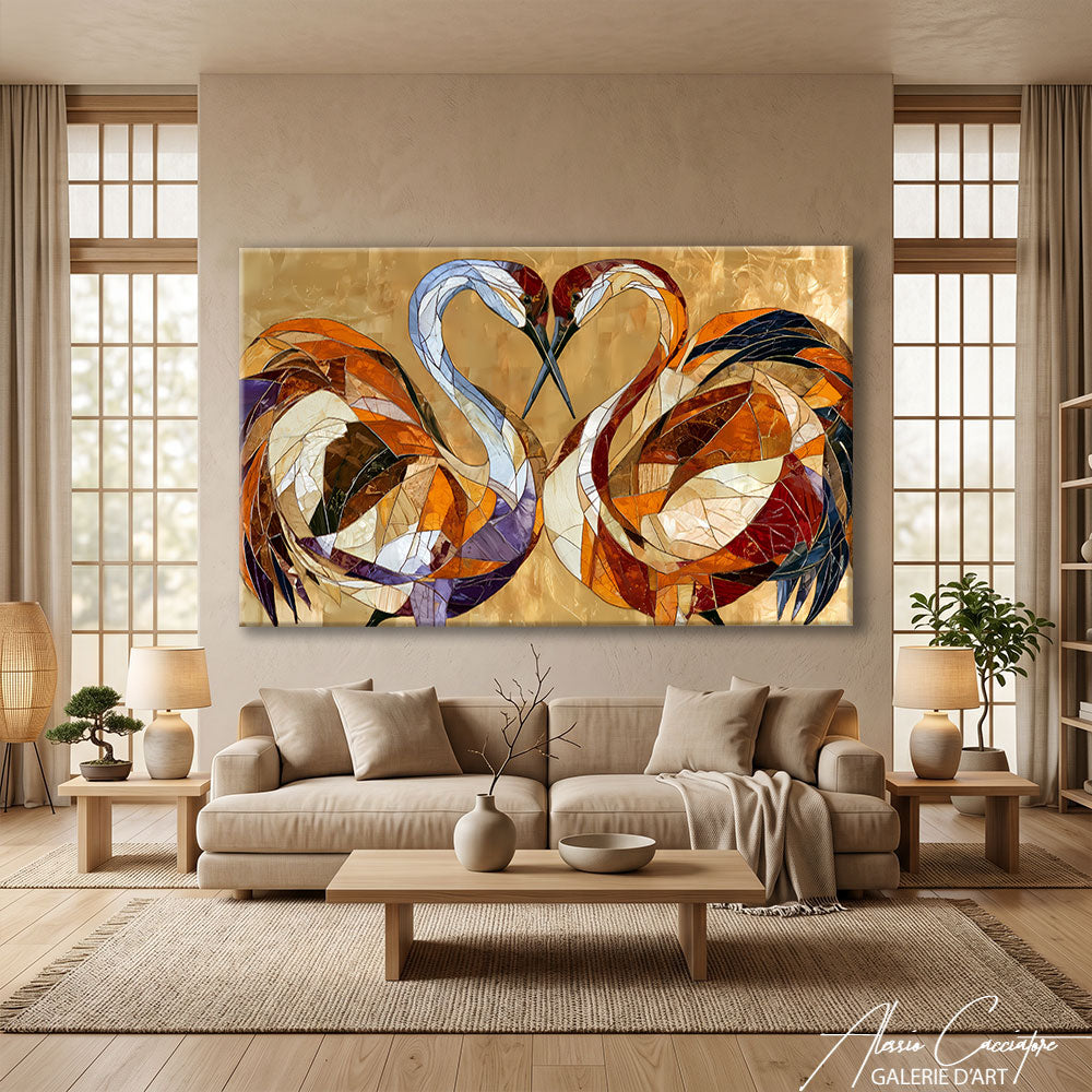
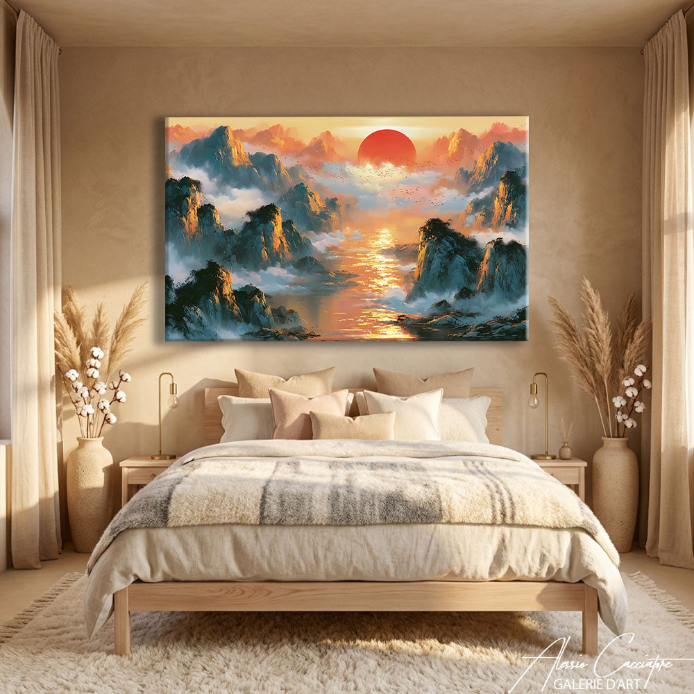
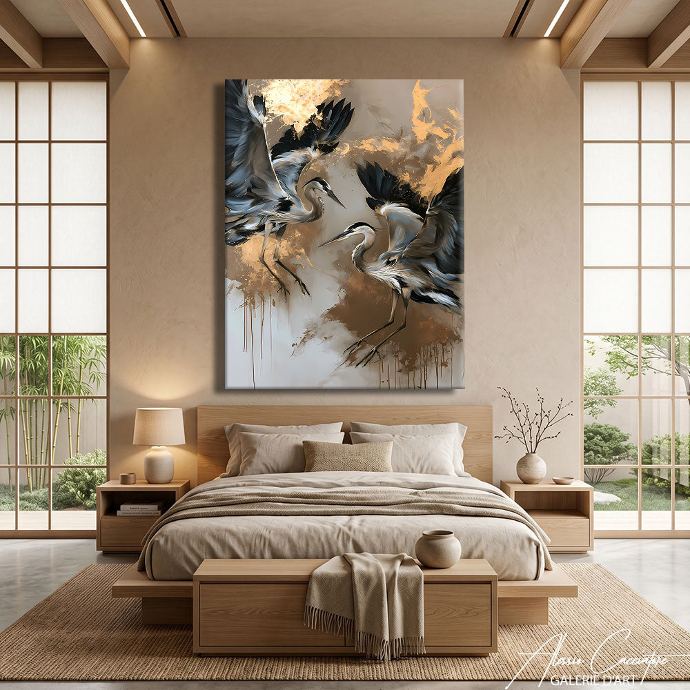
Above the sofa, a large japandi painting in 120x80 cm format immediately becomes the visual signature of the room, but a signature that doesn't scream. Here, favor monochromatic landscapes, crane compositions, or abstractions with dominant beige and gold. The desired effect: a living room that breathes, where each object has its place, and where the eye can rest without being assaulted.
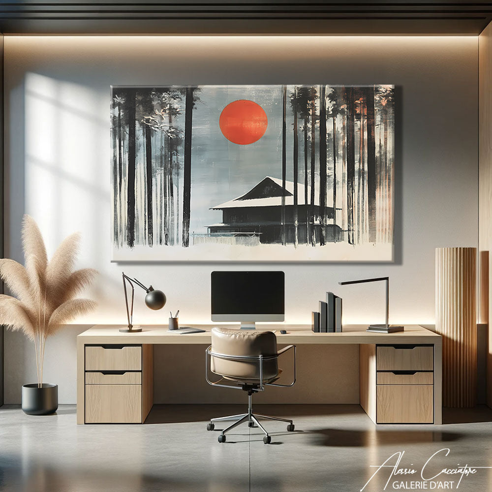
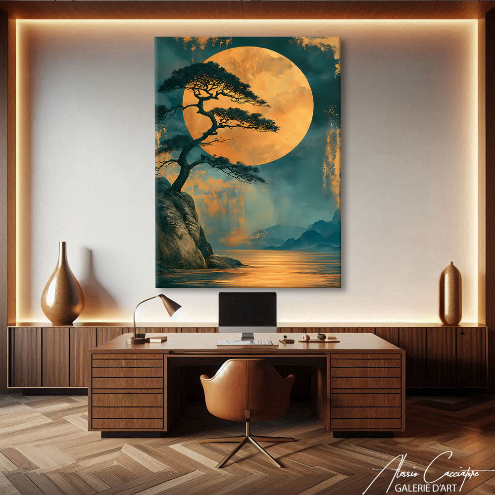
For the Office: Concentration Without Austerity
Japandi is probably the best style to install in an office or home office. Its sobriety aids concentration, its contribution of natural materials avoids the coldness of an overly functional space, and its palette does not tire the eyes over time. Prefer compact formats (60x40 or 80x60 cm) in minimalist compositions, stylized branches, or clean abstractions.
For the Entrance and Hallway
The entrance is where japandi immediately sets the tone for your interior. Vertical format, single branch composition or stylized figure, beige and black palette: your guest walks through the door and immediately understands something about the house they are visiting. Particularly successful in long hallways where several small japandi formats can be arranged in series.
For the Dining Room: Restrained Conviviality
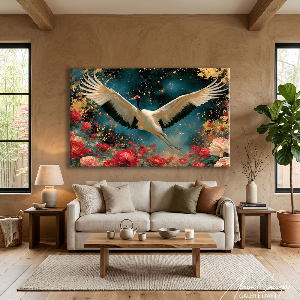
A more subtle case: japandi in the dining room creates a cozy atmosphere conducive to long conversations. Avoid overly minimal compositions here, which might seem cold: favor landscapes, bird compositions, or stylized floral motifs. The palette should remain warm (beige, gold, taupe) rather than cold.
For the Bathroom: Spa Ambiance
Japandi in the bathroom creates a private spa atmosphere that transforms the morning routine into a moment of discreet luxury. We strongly recommend plexiglass in this room for its resistance to humidity. Favor branch compositions, cranes, or soft abstractions in beige and faded blue tones.
Format and Dimensions: Composing with Space
For japandi, more than any other style, format is crucial. A japandi painting needs room to breathe to produce its effect, so it must be given enough space.
Compact format (60x40 cm): Ideal in a series of two or three to create a rhythmic wall composition. Very successful in hallways, offices, or reading nooks. At eye level for maximum effect.
Medium format (80x60 cm): The versatile size. Particularly suitable above a chest of drawers, a sideboard, or as a decorative accent in a bedroom. The format that best interacts with Scandinavian or Japanese furniture without dominating the room.
Large format (120x80 cm): The centerpiece for a living room. Above a long sofa or a large wall, this format allows japandi to fully deploy its contemplative dimension. To be preferred on walls where the surrounding space is sparsely furnished; the painting needs emptiness around it.
Vertical format: Particularly suited for branch compositions, stylized figures, and elongated landscapes. Ideal between two pieces of furniture, in a narrow entrance, in a stairwell, or on a gable wall.
Light triptych: In japandi, the triptych must remain airy. Three panels separated by more space than usual, or three compositions that echo each other without strictly complementing. The desired effect is that of a breathing rhythm rather than a continuous fresco.
Premium Canvas or Glossy Plexiglass: The Right Medium for Japandi
- Choosing a selection results in a full page refresh.
- Opens in a new window.
- Opens external website.
- Opens external website in a new window.