
It’s not said enough: a pink painting is one of the easiest to get wrong… and one of the most beautiful when chosen well. Too sweet, and the living room starts to look like a doll’s bedroom. Just the right amount, and it warms up a cold wall in a second. So the real question isn't "pink, yes or no?", but "which pink, where, and with what?". Here is how I answer my hesitant clients.
Which shade of pink should you choose for a painting?
There isn't just one pink, but a good dozen. Powder pink, almost beige, is the most consensual: it goes with everything and ages very well. Dusty pink, which is more earthy, gives a chic bistro or family home feel. Fuchsia and candy pink, meanwhile, are accents: to be reserved for a canvas with character in a sober room.
My firm opinion: if you are hesitating, go for a desaturated pink with touches of white or green. This is what you find in floral compositions, where the pink is carried by the texture and light rather than by a flat color. Our floral painting collection provides beautiful examples, from the most delicate to the most expressive.
In which room should you hang a pink painting?
The living room handles pink very well, provided it is anchored: a grey, linen, or charcoal sofa, a few cushions that echo the canvas, and the effect becomes intentional rather than decorative. On a large wall, a generous format avoids the "small lost touch" effect.

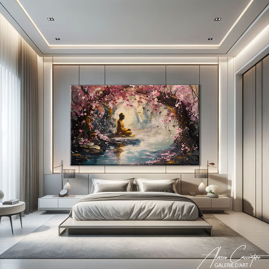
The bedroom is another ideal playground: pink is soothing there, almost sculptural in the evening light. To learn more about this, our guide on bedroom wall decor details the heights and formats that work best above a headboard.
A less obvious tip: the entrance or the office. A pink painting there acts like a smile, especially if the rest is neutral. No gender rules here; deep or powder pink suits a masculine interior very well when combined with black or midnight blue.
Which colors should you pair a pink painting with?
Pink is a chameleon. Some combinations that work every time:
- Pink and beige or taupe: the softest pairing, perfect for a living room in natural tones. We talk about this in our article on beige and taupe paintings.
- Pink and green: the ultimate botanical duo, very current with a green plant nearby.
- Pink and grey or black: for a graphic and contemporary contrast.
- Pink and gold: a dressier touch, to be used sparingly.
Avoid, however, multiplying different pinks in the same room: a single dominant pink, repeated in small touches, is enough. If you prefer freer palettes, the article on colorful abstract paintings will give you benchmarks for being bold without unbalancing the whole.
Floral, abstract, or graphic pink: which style to choose?
The subject changes everything. A pink flower on canvas creates a romantic yet refined atmosphere, especially in close-up. More elaborate floral compositions read almost like studio paintings; if the subject attracts you, take a look at our thoughts on the botanical painting.

Abstract art lets pink break free from any figuration: flows, clouds, flat tints. It is the choice for interiors that want color without a "subject." Our abstract painting collection gathers canvases where pink dialogues with other hues.
As for the feminine floral portrait, it adds a more artistic, almost assertive dimension:

What format and finish for a pink painting?
Our canvases are printed on canvas stretched over a frame, which gives the pink a soft texture without annoying reflections. If the room is very bright and you want more depth and brilliance in the colors, the plexiglass option intensifies the saturation: a good choice for a vivid pink. As for format, opt for large for a living room, medium for a bedroom. To refine, our article on modern flower paintings and the one on cozy living rooms provide additional ideas.
FAQ: your questions about pink paintings
Is a pink painting too feminine?
No, it all depends on the shade and the surroundings. A powder pink or dusty pink combined with grey, black, or light wood remains sober and suits all interiors.
Can you put a pink painting in a dark living room?
Yes, and it is even very successful: pink brings warmth to an anthracite or midnight blue wall. Choose a slightly warm shade so that it doesn't look dull.
What size pink painting for a sofa?
Count on about two-thirds of the width of the sofa for a single painting, more if you want it to become the centerpiece of the room.
In summary
A pink painting is chosen like a good dress: the shade first, the occasion second. Go for a nuanced pink, anchor it with neutrals or green, and let the canvas breathe on an open wall. Ready to take action? Browse the selection of pink-dominant paintings in our flower collection and find the one that will set the tone for your interior.