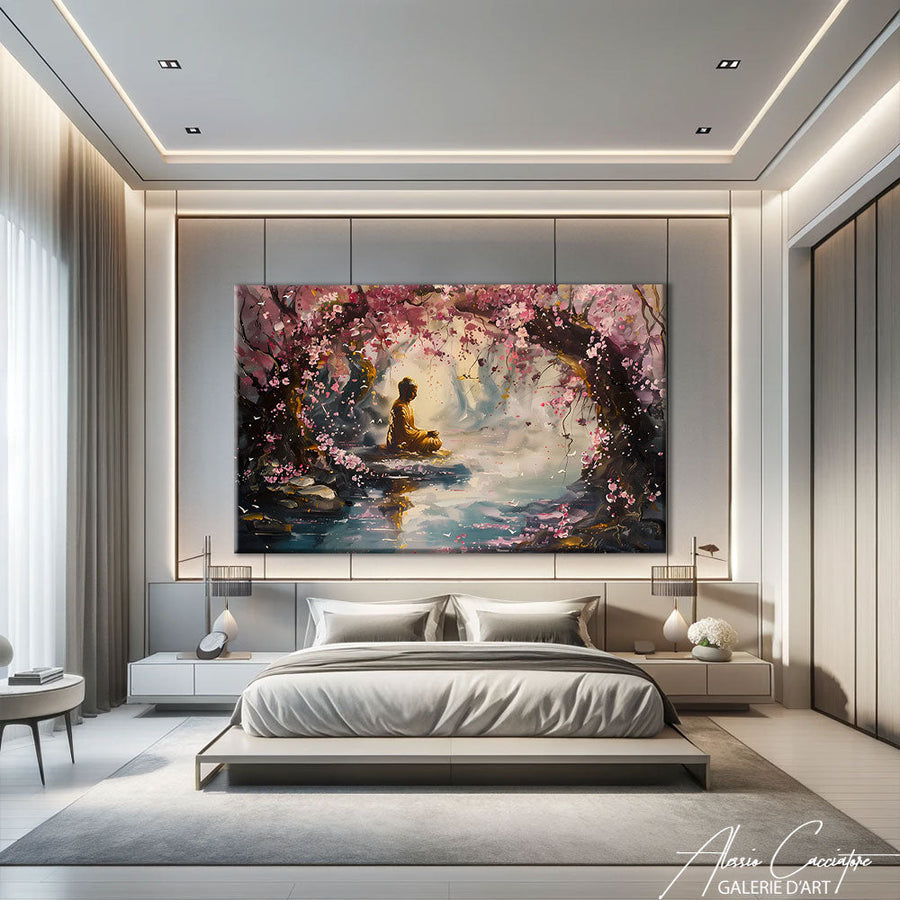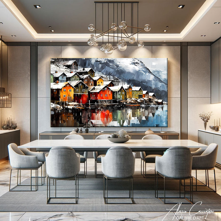

The beige and taupe painting has established itself over recent seasons as the gold standard for wall decor. Neither too cold like a pure gray, nor too timid like off-white, this duo of neutral tones has the unique ability to blend into almost any interior without ever weighing it down. But where should you hang it, how should you choose it, and what colors should you pair it with so it doesn’t just become a generic piece of art? Here are our answers, with examples pulled directly from our studio.
Why the beige and taupe duo (almost) always works
Beige and taupe share a rare quality in decoration: they don't date. Unlike a trendy shade that fades in two or three years, these tones draw their inspiration from timeless materials: stone, linen, raw wood, raw clay. A painting in these hues transcends trends without ever clashing with the rest of the room, even if you change your cushions or repaint a wall every five years.
It is also a palette that acts as a balancer. In a living room already heavy with color—a midnight blue sofa, patterned rugs, a colorful bookcase—a beige and taupe painting calms the space instead of adding yet another color. Conversely, in a very neutral room, it is enough to create a focal point without breaking the ambient softness. It is a safe bet for people who like to change their cushions or household linens with the seasons without having to rethink their entire wall each time.
In which room should you hang a beige and taupe painting?
This is the question we are asked most often in the studio, and the answer is simple: this palette works almost everywhere, but it performs best in three types of spaces.
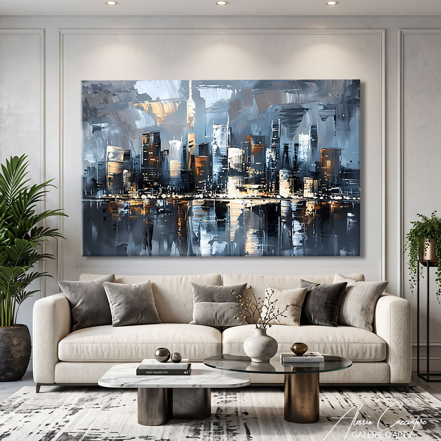
In a living room, a clean format like our  helps structure a wall above the sofa without competing with the rest of the decor. The simple lines and soft tones let the room breathe, even in an already well-furnished living room.
In a bedroom, we prefer more contemplative subjects. A Japandi style, like that of our  , pairs the warmth of beige with a refined composition that invites calm before sleep. This is exactly the desired effect in a place of rest, far from overly stimulating colors.
Finally, in an entryway, you can allow for a bit more texture and relief since the room is passed through more than it is contemplated at length. Our  mixes warm tones with the neutral beige base—a good compromise to give character to this first space without distorting the home's general palette.
How to pair a beige and taupe painting with the rest of the decor?
The rule we consistently give our clients: beige and taupe aren't really colors; they are foundations. They go with almost anything, provided you choose one or two accents to avoid a flat effect.
With light wood and rattan, the atmosphere becomes natural and warm, close to the Scandinavian spirit. If this style speaks to you, we have detailed the question in our article on the Scandinavian painting and the hygge spirit.
With terracotta or brick tones, the combination also works very well; you stay within the same family of warm, mineral colors. We explain how to combine these shades in our guide to the terracotta painting.
With sage green or some plants, you add a touch of life without distorting the softness of the palette. This is a pairing often found in bohemian chic interiors, where beige serves as a neutral backdrop and green brings in organic contrast.
For a more contrasted look, a matte black frame or a small touch of black and white elsewhere in the room prevents the whole from appearing bland. Our article on the black and white painting provides other ideas for playing with this contrast.
Our practical benchmarks to avoid mistakes
- A single bold color accent is enough in the room, not two.
- Light wood and the beige/taupe duo never go out of style together.
- A matte black frame or object avoids a look that is too smooth and lacking in relief.
Stretched canvas or plexiglass: which finish for neutral tones?
At our studio, every painting exists in two versions: canvas stretched on a wooden frame or plexiglass. For a beige and taupe palette, the material really changes the final result.
Stretched canvas slightly absorbs light and retains a matte grain that faithfully renders the subtle nuances of beige and taupe. This is our recommendation in the vast majority of cases, particularly for bedrooms where you are looking for a soft rendering rather than a bright, cold effect.
Plexiglass provides a brilliance and depth that suits a very bright living room or a room with a more contemporary style well. It slightly highlights contrasts, which can be interesting if your composition pairs beige with a deeper tone like terracotta or dark brown.
If you are still hesitating about which style will best suit your wall, our Minimalist Painting collection brings together several compositions in this refined spirit and can help you refine your choice before you decide.
Frequently Asked Questions
Will beige and taupe go out of style?
No, and that is precisely their appeal. These shades draw inspiration from natural materials—stone, linen, wood—that have always been present in decoration. Unlike a seasonal trend color, a beige and taupe painting remains relevant years after its purchase, even if the rest of your decor evolves in the meantime.
What size painting should I choose for a wall in these tones?
It all depends on the size of the wall and the viewing distance you have, but in a neutral palette, you can afford to go bigger without fear: unlike a vibrant color, a large-format beige or taupe piece never saturates the space. We detail size benchmarks room by room in our article XXL paintings, from what size and for what room.
How do I maintain a light-toned painting on a daily basis?
A painting in beige or taupe tones shows dust a bit faster than a dark canvas. Regular dusting with a soft cloth or a feather duster is sufficient in most cases. For more stubborn stains, it is better to follow our detailed advice in our article how to clean a painting rather than improvising with an unsuitable household product.
Beige and taupe are rare in that they do more than just dress up a wall; they set the tone for an entire room without ever overwhelming it. Whether you are looking for a canvas for a living room, bedroom, or entryway, the essential thing is to choose a subject and format that dialogues with your existing furniture rather than just a currently trendy color. Find all our compositions in these tones in our Modern Painting collection, and let yourself be guided by our advisors if you are still hesitating between two formats.