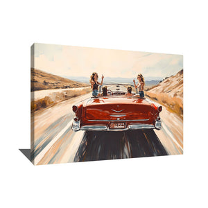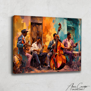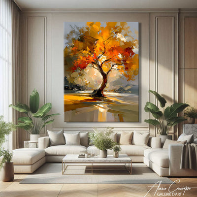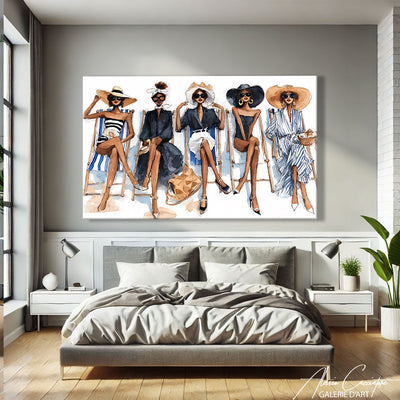

I am often asked this question in workshops: can you really enlarge a room with a painting, without tearing down a partition or repainting the walls? The answer is yes, and it is even one of the most underrated decor levers. The right painting to enlarge a room does not literally cheat with space, but it plays with perception: format, colors, perspective, and placement combine to visually open up a somewhat cramped living room, lengthen a hallway, or give breathing room to an attic bedroom. Here is how to choose and hang the canvas that will truly create an illusion.
Why can a painting give the impression of a larger space?
The human eye needs a vanishing point. In a room without depth, it bumps into the back wall and the room feels closed off. A well-chosen large painting works like an open window: it draws the eye, creates a line of sight, and mentally pushes back the boundary of the wall. It is the exact opposite of an accumulation of small, disparate frames, which fragments the space and, on the contrary, gives a sensation of clutter. In my experience, a single generous canvas almost always makes a room look larger than a gallery of ten A4 formats, even for the same total surface area. If you are still hesitant about the dimensions to adopt for your room, our guide on XXL painting size according to the room details the proportions to respect.
Which painting format to choose to enlarge a room?
This is where the essence of the effect lies. A landscape format, wider than it is tall, stretches the gaze horizontally and naturally accompanies the line of a sofa, a sideboard, or a headboard: it gives the impression that the wall continues beyond the frame. A portrait format, conversely, pulls the eye upward and is better suited to a room that is already wide but has a low ceiling. For a long living room, a hallway, or a dining room, I almost systematically recommend a generous horizontal canvas rather than two medium-sized formats side by side. This is precisely the spirit of our collection of landscape format paintings, designed for this type of visual opening effect. To calibrate the ideal width relative to your wall, our article on contemporary large-format paintings offers simple benchmarks based on the length of the sofa or sideboard.
Which colors and patterns should be prioritized for a magnification effect?
Light tones and bright gradients visually push back the walls, while a dark, compact mass brings them closer. This does not mean you should ban color: an abstract composition with a gradient going from light to more intense, or a minimalist pattern that suggests depth (a stylized landscape, geometric blocks playing with perspective), works very well. On the other hand, avoid scenes that are too busy, with multiple subjects and many details: the eye stops on each element instead of traveling through the composition, and the opening effect disappears. I also like to pick up a shade already present in the room to create continuity between the wall and the canvas, which blurs the visual break of the frame. To explore compositions in this spirit, our collection of modern paintings brings together pieces with clean lines that are particularly suitable. If you are starting from scratch for the entire living room, our complete guide to choosing a living room painting will help you harmonize the canvas with the rest of the room.
Where to hang your painting to maximize the enlargement effect?
Placement counts as much as the choice of the artwork. Place your painting preferably in the line of sight from the entrance door of the room: it is the first element the eye encounters upon entering, and it immediately gives a sense of depth. Center it at eye level, with the center of the artwork around 145 to 150 cm from the floor, and leave 20 to 25 cm between the bottom of the frame and the top of a sofa or sideboard so that the composition can breathe. In a narrow hallway, a landscape format hung in a row visually lengthens the passage much better than a series of small aligned frames, as confirmed by our article on XXL paintings in the living room. Finally, a large format on a wooden frame remains light, but if you opt for a very large dimension or a plexiglass version, check the mounting carefully: our article on how to hang a heavy painting details the wall plugs and systems adapted to the weight and type of wall.
Three examples that really enlarge the space, room by room
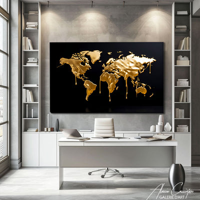
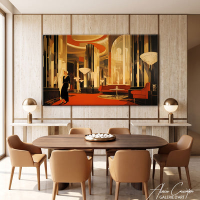
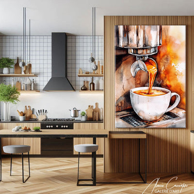
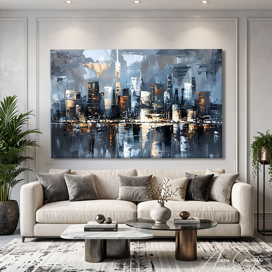
To make all this concrete, here are three landscape-format canvases that I particularly like to recommend, each in a different context.
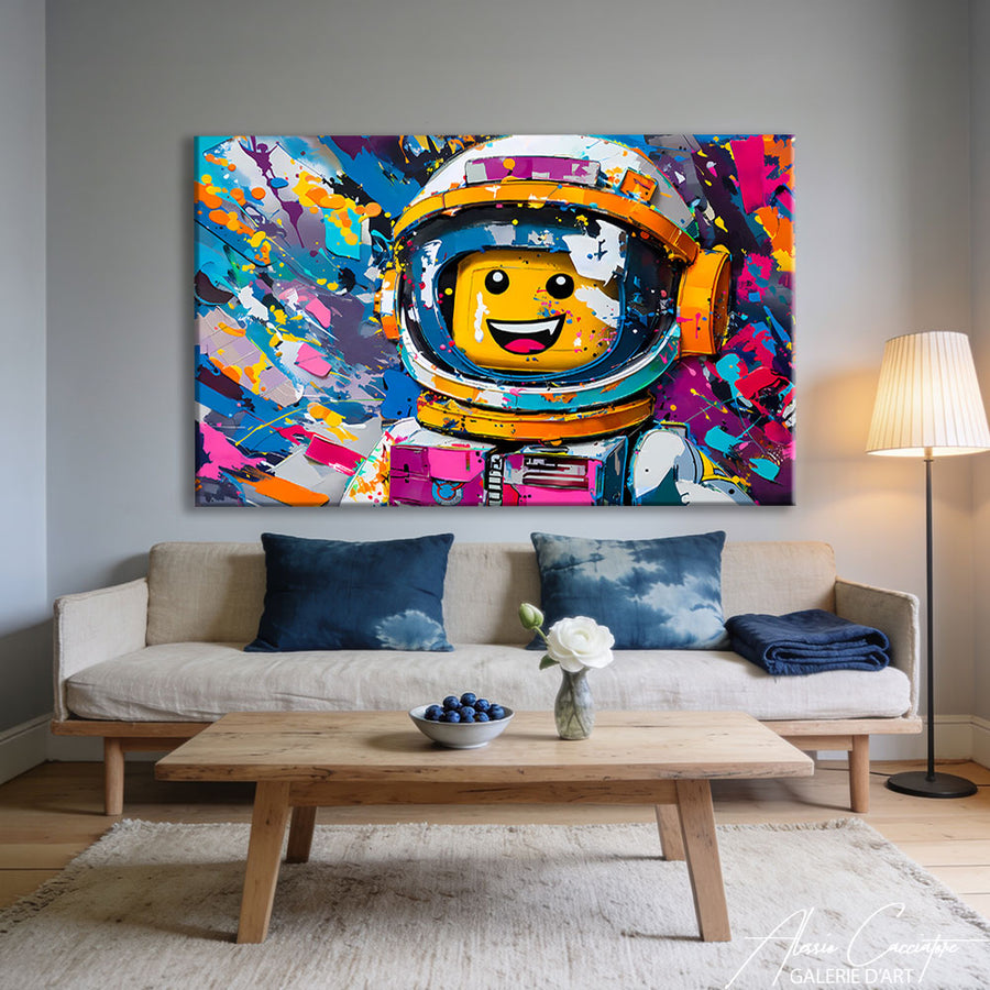
In a living room with neutral walls, a colorful and graphic composition like our  immediately catches the eye when entering and visually pushes back the back wall.
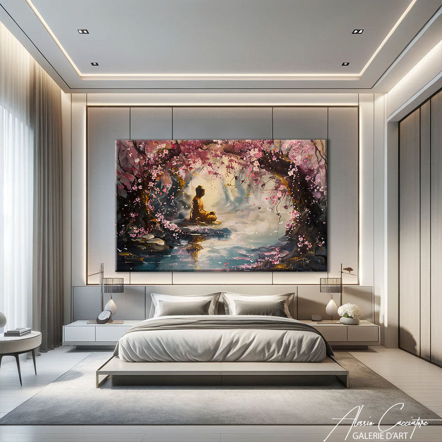
In a bedroom, we prefer a more peaceful atmosphere: our  installed above the headboard lengthens the room without ever overloading the atmosphere conducive to sleep.
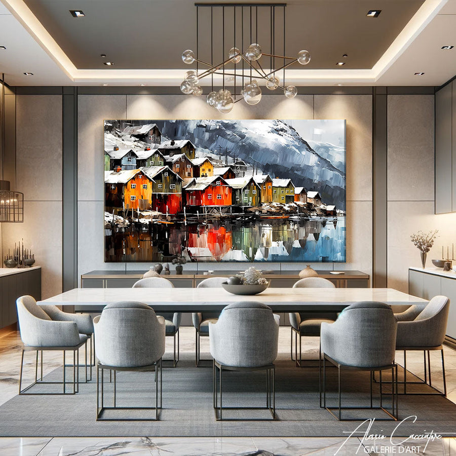
Finally, in a dining room, a canvas with golden accents like our  captures the evening light and gives height to a wall often left bare above the sideboard.
Frequently asked questions
What size painting to choose to enlarge a small living room?
As a general rule, aim for a width equivalent to 60 to 75% of the length of the furniture under which it will be hung. In a small living room, it is better to have a single generous painting (for example 120x80 cm) rather than two medium formats that fraction the wall.
Should you have a single large painting or several small ones to enlarge a room?
For an enlargement effect, a single, wide painting almost always works better than a wall composition of several frames. A gallery wall has its charm, but it multiplies the visual stopping points where a single canvas creates a real vanishing point.
Which colors to avoid if you want to visually enlarge a room?
Avoid very dark and compact compositions that occupy the entire field of vision without leaving any air, as well as scenes overloaded with details. Prefer bright tones, a gradient, or a minimalist composition that lets the gaze wander.
A painting to enlarge a room is therefore not a matter of decor superstition: it is a matter of well-thought-out format, color, and placement. Generous landscape format, bright palette, hanging in the line of sight: with these three reflexes, even the most modest room gains breathing room.