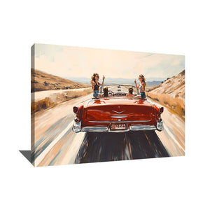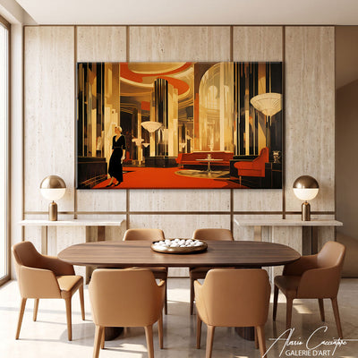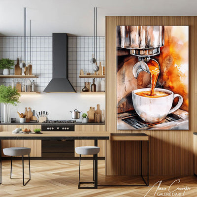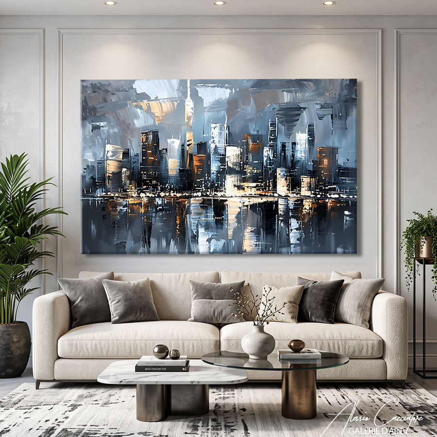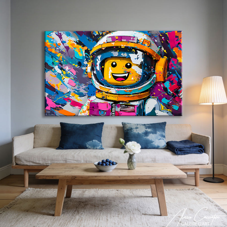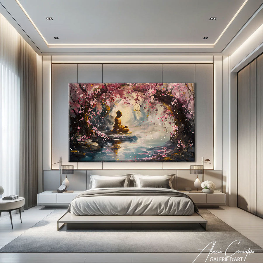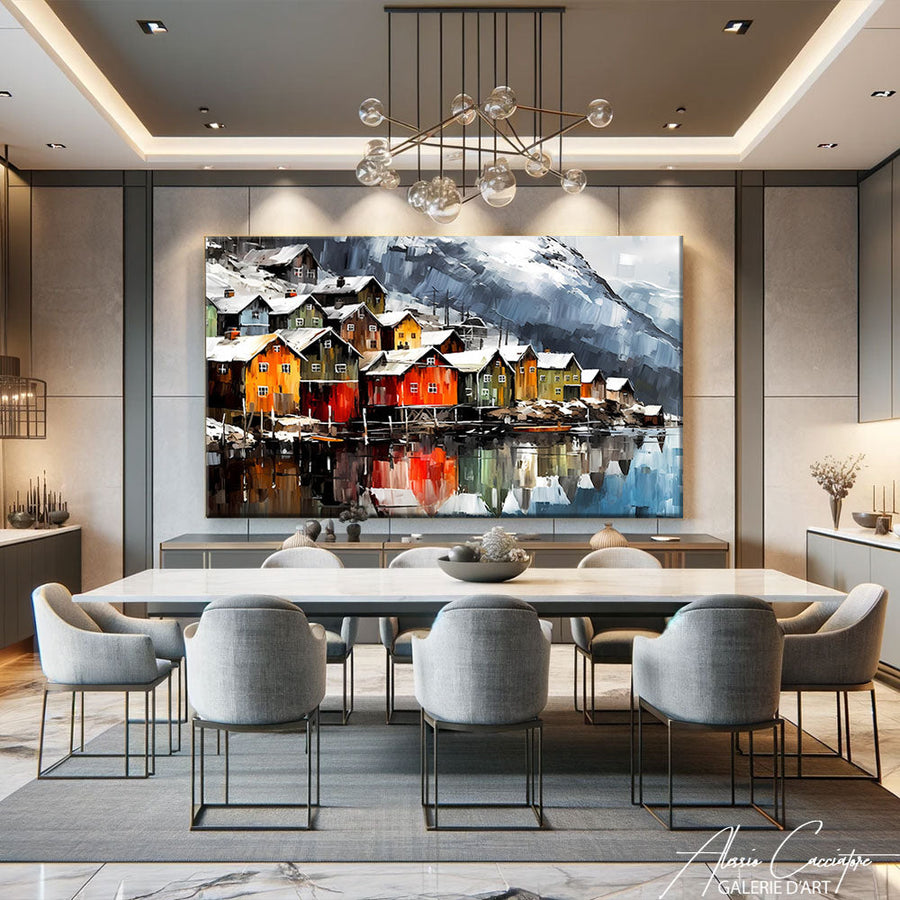

Last week, a client called me in a panic. She had just bought a €2000 charcoal grey sofa and realized her living room now looked like a waiting room. "Alessio, I need a painting, but I don't even know where to start." I hear that at least three times a week. The living room is where you really live, where you entertain, where you sink down at night after a hard day. The artwork you hang there isn't just decorative—it sets the tone for your entire daily life.
Why choosing a living room painting is so strategic
Unlike the bedroom or office, the living room is the most exposed room in your home. It's where your guests spend time, where your family gathers, where you have your Sunday aperitifs.
The artwork you hang there acts as a visual focal point. It draws the eye as soon as you enter the room. It can soften an overly cold space, energize a bland interior, or conversely, create visual tension that makes the room uncomfortable.
In my workshop in Berlin, I've seen collectors hesitate for months over a piece for their living room, while they choose a work for their office in ten minutes. It's normal: the living room engages your identity. What you put there says something about you.
But be careful. A bad choice—too small, too busy, poorly placed—and your room instantly loses 30% of its potential. I'm barely exaggerating.
The 60% rule: how to calculate the ideal size for your living room decorative painting

First mistake I see everywhere: a painting that's too small on a wall that's too big. It floats, it looks empty, it gives the impression that you bought the frame on sale at a discount store.
The simple formula
Your painting (or composition of paintings) should occupy between 60% and 75% of the width of the furniture piece above which it is hung. Sofa, console, sideboard—it doesn't matter.
Concrete example: your sofa is 200 cm wide? Your artwork should measure between 120 cm and 150 cm. You can achieve this with a single large format, or a composition of 2-3 aligned paintings.
When to break this rule
I break it myself sometimes. If you have an immense wall and want to create a "gallery" effect, you can opt for a smaller work, but then it must be extremely visually strong. Bright colors, maximum contrast, striking subject. Otherwise, it disappears.
Another case: double-height living rooms. There, you can play on verticality with an XXL artwork (180 x 120 cm or more). It anchors the room, giving it a real presence.
Living room wall decoration: which style to choose according to your interior
Now, we get to the heart of the matter. The style of your living room painting should interact with your interior—without necessarily copying it.
Minimalist / Scandinavian living room
Do you have white, light wood, clean lines? Two options:
- Either you amplify this softness with an abstract work in neutral tones (beiges, grays, off-white)
- Or you disrupt everything with an explosion of color—a pop art painting, an intense portrait, a vibrant urban scene
Personally, I prefer the second option. A Scandinavian living room without visual contrast quickly becomes boring.
Industrial living room (bricks, metal, concrete)
Here, you need warmth. Industrial interiors are magnificent, but can become cold if you don't balance them.
I often lean towards: - Expressive black and white portraits - Urban scenes (New York, Tokyo, Paris) - Works with touches of red, orange, ochre—which warm up metal and concrete
Classic / Haussmannian living room
Moldings, herringbone parquet, marble fireplace? You're in luck, anything works. You can dare to be radically contemporary (it will create an elegant contrast), or stay classic with modern portraits, landscapes, still lifes.
What annoys me, however, is when an 18th-century reproduction is put in a Haussmannian apartment. It looks like a dusty museum. Dare to mix eras.
Modern paintings for the living room: my 5 essential genres in 2025

If you're looking for a contemporary artwork for your living room, here are the five genres that are currently trending—and that really make visual sense.
1. Expressive abstract art
Large brushstrokes, thick textures, bold colors. This brings energy without being narrative. Perfect if you want color without imposing a "subject."
2. Contemporary portraiture
Stylized faces, often in black and white or with a reduced palette. This humanizes a space, creating a presence. Be careful: the subject's gaze must be just right, otherwise it becomes oppressive.
3. Urban scenes (New York, Tokyo, Paris)
I sell a lot of urban views, especially in large formats. They create an imaginary window, add depth, and bring a cosmopolitan touch.
4. Majestic animals (lion, elephant, horse)
Always in high demand. In black and white or vibrant colors. They impose a real, almost totemic presence. Reserve for large walls.
5. Geometric minimalism
Simple shapes, reduced colors, clean compositions. Perfect for modern interiors. Less risky than expressive abstract art, but can lack warmth if the entire living room is already cold.
Frankly, avoid framed motivational quotes. They're outdated and age poorly.
Where and how to hang your living room decorative painting
You've chosen the artwork. Perfect. Now, you need to hang it in the right place, at the right height. And here, I still see too many mistakes.
Hanging height: 145 cm is the golden rule
The center of your artwork should be located 145 cm from the floor. This is the average human eye level. Not the top of the frame, not the bottom—the center.
If your painting is 80 cm high, the top of the frame will therefore be at 185 cm, and the bottom at 105 cm.
Exception: if the artwork is above a piece of furniture (console, sideboard), leave 15 to 25 cm between the top of the furniture and the bottom of the frame. In this case, the 145 cm rule does not apply.
Classic placement mistakes
- Hanging too high: this breaks the visual link with the rest of the room. The artwork "floats" towards the ceiling.
- Hanging on a thoroughfare wall: avoid areas where people are constantly moving. The artwork needs a "settled" wall, facing the sofa or armchair.
- Mixing too many styles on the same wall: if you're creating a gallery wall (multiple artworks), maintain coherence—same style, same tones, or same frames.
In my own living room in Paris, I have a large abstract canvas facing the sofa. It's at 145 cm, it occupies 65% of the sofa's width, and it interacts with a mustard yellow cushion. Everything else is neutral. It works because it's balanced, not overloaded.
Trendy living room wall decoration: multi-painting compositions and gallery walls

You don't have to rely on a single large artwork. Multi-painting compositions—what we call gallery walls—are very popular.
Why it works
A well-thought-out composition allows you to: - Tell a visual story (thematic series: cities, portraits, abstracts) - Fill a large wall without investing in an XXL artwork - Create a "collection" effect even with affordable works
But beware, it's also an absolute trap if done poorly. A wall overloaded with mismatched frames is guaranteed visual chaos.
My rules for a successful composition
- Chromatic coherence: all works must share a common palette (even if the subjects differ)
- Identical or coordinated frames: either all the same, or a maximum of two types (light wood + black, for example)
- Regular spacing: 5 to 8 cm between each frame, no more, no less
- A focal point: an artwork slightly larger than the others, which anchors the composition
I recently sold a series of four urban portraits to a client. She arranged them in a line, at the same height, with 6 cm of spacing. The result: modern, clean, elegant. If she had scattered them randomly, it would have turned into a jumble.
How to choose the colors of your living room decoration painting
Color is what will make (or break) your living room. An artwork can be magnificent in a gallery and completely dissonant in your home if the colors don't interact.
Strategy 1: Repeat an existing color
Do you have a teal sofa? A terracotta cushion? A rosy beige rug? Choose an artwork that repeats this color, even subtly. This creates visual continuity, a common thread.
Example: an abstract painting with a touch of terracotta will resonate with your cushions, without necessarily being dominated by that color.
Strategy 2: Introduce the missing color
Is your living room entirely gray, white, black? Then the artwork must bring the color. Mustard yellow, Klein blue, vermilion red, forest green—dare to be bold.
This is my favorite strategy. A neutral living room + a strong colored artwork = perfect balance between calm and energy.
What never works
- Too many bright colors everywhere (walls, furniture, and overloaded painting): visual overdose
- A painting in the same tones as the wall behind it: it disappears
- A multi-colored painting in an already very colorful living room: cacophony
There's no denying it, color is instinct. But an instinct that can be honed by looking at many interiors, magazines, and galleries.
Realistic budget: how much to invest in a painting for your living room
A delicate question. But concretely, how much should you spend?
The 10% rule
Some decorators advise allocating approximately 10% of the total living room budget to artwork. If you've invested €8000 in your sofa, coffee table, rug, lighting, then budgeting €800 for the artwork is not unreasonable.
But frankly, this rule is arbitrary. I have clients who bought an IKEA sofa for €400 and an artwork for €1200. And their living room is magnificent.
What you're really paying for
An original artwork (not a reproduction) means: - The artist's labor (hours, sometimes days) - Exclusivity (you are the only one who has it) - Quality of materials (canvas, stretcher, pigments) - Durability (a well-made work lasts for decades)
A printed canvas reproduction for €150 will be faded in three years. An original artwork will gain value—sentimental, and sometimes financial.
My indicative ranges (2025)
- Small budget: €150-€400 — small formats, works by emerging artists, limited editions
- Intermediate budget: €400-€1200 — medium to large formats, developing artists, professional quality
- Serious collection: €1200 and + — large formats, established artists, unique pieces
On alessiocacciatore.com, I offer works in all these ranges. Because contemporary art is not just for the rich.
Fatal mistakes to absolutely avoid
Before concluding, here are the five mistakes I see all the time—and which ruin an otherwise well-designed living room.
1. Buying an artwork that's too small out of fear
Hesitating between 80 cm and 120 cm? Take 120 cm. Always. A painting that's too small looks cheap, even if it's expensive.
2. Choosing solely based on the sofa
Your sofa will last 5-10 years. Your artwork can stay with you your whole life. Don't choose it FOR the sofa, choose it for yourself.
3. Accumulating famous reproductions
Klimt's Kiss, Girl with a Pearl Earring, Starry Night... we've seen them a thousand times. They say nothing about you. Dare to be original, even if modest.
4. Neglecting lighting
A poorly lit artwork loses 50% of its impact. Plan for a spotlight, a wall-mounted reading light, or at least a lamp that highlights it in the evening.
5. Buying impulsively without measuring
I can't count the clients who bought a brilliant artwork... that won't fit through their door, or that overwhelms their wall. Measure. Always.
I made these mistakes myself when I started. Now, I spot them a mile away.
Frequently Asked Questions
What size painting for a 20m² living room?
For a 20m² living room, opt for a format between 100 x 70 cm and 150 x 100 cm, depending on the size of your main wall. Apply the 60% rule: your artwork should occupy about 60 to 75% of the width of the furniture (sofa, console) above which it is placed. If your sofa is 180 cm, aim for a painting about 110-130 cm wide.
What type of painting to put in a modern living room?
A modern living room pairs perfectly with abstract paintings with clean lines, stylized contemporary portraits, or urban scenes (New York, Tokyo). Favor bold colors or strong contrasts (black and white + a bright color). Avoid classic reproductions or overly busy works that weigh down the space.
How high to hang a painting in a living room?
The center of your painting should be 145 cm from the floor—this is the average eye level. If the artwork is above a piece of furniture (sideboard, console), leave 15 to 25 cm of space between the top of the furniture and the bottom of the frame. This rule ensures optimal visual comfort and harmonious balance in the room.
How to choose the colors of a painting for your living room?
Two strategies work well: subtly repeating a color already present in your decor (cushion, rug, china cabinet) to create visual continuity, or introducing the missing color if your living room is neutral (gray, white, beige). In the latter case, dare to use a strong colored artwork that becomes the focal point of the room.
Is a large painting or several small ones better?
It all depends on your style and your wall. A single large painting (120-150 cm) creates an immediate impact and structures the space—this is my recommendation for modern living rooms. Several small paintings in a composition (gallery wall) work if you maintain coherence: same frames, common palette, regular spacing of 5-8 cm. Absolutely avoid an anarchic mix.
What budget to plan for a quality living room painting?
For an original, professional-quality artwork, expect to pay between €400 and €1200 for a medium to large format (80-120 cm). This is a lasting investment: unlike printed reproductions that degrade, an original artwork lasts for decades and can gain value. If your budget is limited, a small original artwork is better than a large soulless reproduction.
All works mentioned in this article are available on the gallery. Free worldwide delivery, 30-day money-back guarantee.