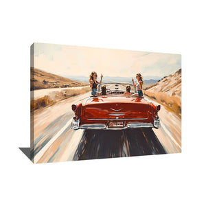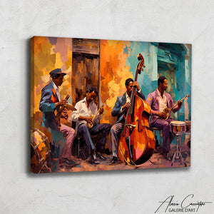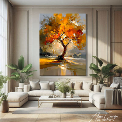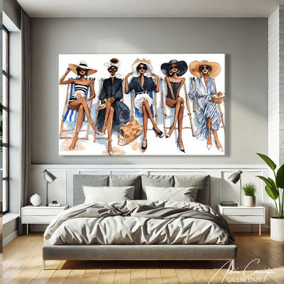

A few months ago, a client asked me if black and white "felt a bit too 2000s." I smiled. Because frankly, it's exactly the opposite: monochrome is probably the only visual language that transcends decades without ever looking dated. No color that ages poorly, no chromatic trend that makes you think "oh my god, that's so 2015." Just pure contrast, composition, raw emotion. In my Parisian studio, I create colorful works, but my black and white paintings are the ones that adapt most easily to my collectors' interiors. Here's why this minimalist palette continues to dominate, and how to choose yours.
Why black and white paintings remain a safe decor choice
Black and white is like the raw denim of the wall art world. It goes with everything, structures any space, and won't bore you after six months.
When I visit interiors — those of my clients, but also showrooms, Berlin lofts, Haussmann apartments — I always notice the same thing: colorful artworks can be magnificent, but they dictate the mood of the room. A black and white painting, on the other hand, enhances it.
A concrete example: two years ago, I sold a large abstract monochrome canvas to an interior designer. She moved it three times in her own apartment — living room, office, bedroom — and each time, the artwork worked. Impossible with a bright red or mustard yellow canvas.
The advantage of chromatic neutrality
Monochrome creates what I call a "visual breathing space." In a contemporary interior often overloaded (screens, objects, textiles), black and white provides a pause. A visual silence, if you will.
And contrary to what one might think, "neutral" does not mean "bland." A well-designed black and white design painting plays on:
- Hard contrasts (sharp black solids against pure whites)
- Subtle gradients (intermediate grays, textures)
- Materials (glossy vs. matte, smooth vs. grainy)
- Composition (lines, curves, asymmetrical balances)
It's this richness that makes a good monochrome painting captivate the eye as effectively as an explosion of colors.
The main styles of black and white paintings (and how to recognize them)

Not all black and white paintings are alike. Far from it. Here are the main categories I regularly encounter, with their own codes.
Black and white photography: the emotion of reality
Black and white photo paintings are timeless classics. Intimate portraits, urban landscapes, street scenes captured on the fly — monochrome photography has that timeless quality that freezes a moment without dating it.
I love large format prints of cities (New York in the snow, Tokyo at night) or portraits of iconic personalities. Be careful though: avoid overly common clichés (the Eiffel Tower, Marilyn Monroe blowing a kiss, red lips on a black background). That looks like a postcard.
Geometric abstract: pure design
Clean lines, sleek shapes, rigorous composition. This style works wonderfully in minimalist interiors, design offices, contemporary spaces.
In my own catalog, my monochrome geometric works are the ones that sell fastest to architects and interior designers. They create a controlled visual tension — neither too calm nor too aggressive.
Gestural abstract: the energy of the gesture
Opposite to geometric, you have black and white paintings where the artist's gesture remains visible: splashes, broad brushstrokes, accumulated materials.
These works bring movement and spontaneity. They humanize an overly smooth interior. One of my Berlin collectors hung a huge one (180x120 cm) in his all-white loft — the effect is striking.
Refined figurative: the subject without the superfluous
Portraits, silhouettes, animals treated with economy of means. No unnecessary details, just the essential.
I created a series of fragmented black and white faces three years ago. What interests me is to suggest rather than show everything. The viewer mentally completes the image. It's this active participation that makes these works fascinating in the long term.
How to choose a black and white painting for your living room
The living room is where your guests will spend the most time. The artwork you hang there must therefore stand the test of time and engage conversation.
The first question I always ask my clients is: what is the main wall in your living room? The one you see when you enter, or the one facing the sofa? That's where your black and white painting should go.
Size: dare to go large
Classic mistake: choosing too small. A 60x40 cm painting above a 2.20 m sofa looks timid. My advice?
- For a main wall: minimum 100 cm wide (ideal: 120-150 cm)
- For a secondary wall: 70-90 cm works well
- For a multi-frame composition: the ensemble should occupy at least 2/3 of the width of the furniture below
I recently sold a 160x120 cm black and white painting to a couple who were hesitant ("isn't it too big?"). They sent me a photo a week after installation: the artwork structured the entire space, added ceiling height, created a real focal point. Too big doesn't exist if the proportions are right.
Style: coherence with your furniture
Is your living room more industrial (bricks, metal, raw wood)? Opt for a black and white design painting with graphic lines or a contrasting urban photo.
Scandinavian ambiance (light wood, soft textiles)? A monochrome abstract with nuanced grays will create a beautiful harmony without breaking the softness.
Classic interior (moldings, parquet)? A refined portrait or a gestural abstraction will bring modernity without clash.
Framing: with or without?
Contemporary black and white canvases often benefit from being unframed, especially if the edges are painted. This gives a raw, direct look.
But if you have a more classic interior, a matte black or off-white frame can create an elegant transition between the artwork and the wall. Avoid gold or silver frames — they instantly date the whole thing.
Black and white paintings for the bedroom: soothing without boring

The bedroom is an intimate space. What you hang on the wall must therefore speak to you personally, creating a soothing atmosphere without falling into visual blandness.
I often advise against overly energetic works (highly contrasted gestural abstracts, dynamic urban scenes) in a bedroom. In my opinion, they create a tension that prevents true disconnection.
Subjects that work well
Minimalist landscapes: mountains in the mist, serene oceans, backlit forests. Black and white sublimates these subjects by removing chromatic distractions.
Contemplative portraits: faces looking away, pensive profiles. Avoid direct gazes towards the viewer — it's too confrontational for a bedroom.
Soft abstractions: organic forms, subtle gradients, balanced compositions. My Belgian client chose a large monochrome painting with interlocking circles — he told me it became his favorite object in the apartment.
Where exactly to hang it?
The classic position: above the headboard, centered. Ideal size: approximately 2/3 of the bed's width.
But there's also the option of the wall facing the bed, which I often find more interesting. It's the first thing you see when you open your eyes in the morning. Might as well make it beautiful.
One of my abstract black and white paintings has been hanging facing the bed of a collector in Lyon for four years. He tells me he still discovers new details depending on the morning light. That's exactly what a successful artwork is all about.
Black and white painting in the office: asserting without aggressiveness
Whether it's a home office or a professional workspace, wall art plays a subtle but powerful role: it influences the energy of the room.
In my own Parisian studio, I hung a rather dense black and white geometric composition behind my desk. When I look up from the screen, the sharp contrast re-centers me. It's like a gentle mental slap.
Why monochrome works in a professional environment
Bright colors can be distracting or visually fatiguing in the long run. Black and white design paintings structure the space without interfering with concentration.
And unlike colorful works that can look like "personal decor," monochrome maintains a certain professional neutrality. Perfect if you receive clients in your office.
Vertical or horizontal format?
If you have a narrow wall behind a desk (common in urban spaces), dare to use a vertical format: 60x90 cm or 70x100 cm. It adds height and visual structure.
If the wall is wide, a large horizontal (minimum 120x80 cm) creates a beautiful visual anchor.
I have an architect client who composed a monochrome triptych (three 50x70 cm canvases) behind her desk. The effect: professional, sophisticated, coherent. Each canvas can exist alone, but the ensemble interacts.
Common mistakes with black and white paintings (and how to avoid them)

After hundreds of sales and exchanges with my collectors, I see the same mistakes repeated. Here are the ones that kill the impact of a good monochrome painting.
Mistake 1: Choosing too small out of fear
The fear of "too imposing" leads many people to timid formats. Result: the artwork gets lost on the wall, structures nothing, and looks like an accessory.
Solution: Photograph your wall, print the image on A4, and draw several rectangles on it with the proportions of the intended painting. You will immediately see what size works.
Mistake 2: Multiplying small black and white frames
The "Instagram gallery wall" with 15 small black and white photos can work, but it's extremely difficult to compose harmoniously. It quickly turns into clutter.
If you like the idea, limit yourself to 4-6 frames max, with varied but consistent formats (all vertical rectangles, or a mix of square + rectangle). And space them generously — 5 cm minimum between each.
Mistake 3: Hanging too high
Classic rule: the center of the painting should be at eye level, about 145-150 cm from the floor. If you hang it above furniture (console, sofa), leave 15-20 cm of space between the furniture and the bottom of the frame.
I've seen too many beautiful black and white paintings lose all impact because they were hung 180 cm from the floor. You twist your neck to look at them.
Mistake 4: Neglecting lighting
A monochrome painting without dedicated lighting is like good wine in a plastic cup. It works, but you miss out on 50% of the experience.
If possible, add an adjustable LED spot or a wall sconce that grazes the surface of the artwork. This reveals textures, accentuates contrasts, and adds depth.
In my studio, I use 3000K (warm white) spots that sublimate monochrome works without yellowing them. The difference is amazing.
Composing with multiple black and white paintings: the art of the gallery wall
Do you have several black and white paintings and want to create a true wall composition? Here are my golden rules.
Rule 1: A guiding principle
Either all paintings are framed identically (e.g., the same matte black frame), or they are not framed at all. Mixing framed and unframed canvases rarely works.
Either they share a common style (all geometric abstracts, or all photographic), or you embrace eclecticism but with a strictly monochrome palette.
Rule 2: Odd number if possible
Three or five artworks create a more visually interesting dynamic than two or four. I'm not sure why — something about asymmetry that pleases the eye.
Rule 3: Floor composition first
Before drilling 15 holes in the wall, arrange all your black and white paintings on the floor, in front of the target wall. Step back. Photograph. Adjust. Validate.
Only then do you hang them.
I have a Parisian collector who spent an entire Sunday composing his monochrome gallery wall in the hallway. Result: 7 artworks (mix of paintings and black and white photos) that interact perfectly. Every guest slows down in that hallway. Mission accomplished.
Where to buy a quality black and white painting (without getting ripped off)
The monochrome wall art market is saturated. Between IKEA reproductions, Aliexpress prints, and original artist works, how do you find your way?
Reproductions vs. originals: clarifying what you're buying
A reproduction (digital print of an existing artwork) generally costs €50-€200 depending on the size. It's perfect for starting out, testing a location, furnishing an Airbnb. But it's not art — it's decor.
An original (unique work or signed limited edition print) starts around €300-€500 for a young artist, and can go much higher. You are buying a unique piece, an approach, a creative gesture.
Personally, I don't judge anyone who buys reproductions. But be honest about what you're looking for: decorating quickly and cheaply, or investing in a work that has a soul.
Online vs. physical galleries
Physical galleries (Paris, Berlin, London) allow you to see the artwork in person, feel the textures, check the dimensions. Downside: more limited choice, prices often higher due to gallery fees.
Online galleries (like mine, alessiocacciatore.com) offer a wider catalog, often more accessible prices (no gallery margin), and the possibility to compare comfortably from home. Downside: you are buying from a photo.
My advice: if you hesitate between two black and white design paintings online, ask for additional situational photos, or even a short video. Good sellers will gladly comply.
Questions to ask before buying
- Is the work signed? (If yes, proof of authenticity)
- What is the support? (Canvas, paper, wood, other?)
- What is the technique? (Acrylic, ink, print, mixed media?)
- Exact dimensions? (With or without frame?)
- Secure delivery? (Insurance, reinforced packaging?)
- Return policy? (7-14 days minimum)
If the seller cannot clearly answer these questions, flee.
Frequently Asked Questions
Won't a black and white painting make my interior too cold?
This is the most common fear, but it's based on a misunderstanding. Black and white only creates coldness if it's alone in a totally white and minimalist space. If you have wood, textiles (throws, cushions), plants, the monochrome artwork will, on the contrary, structure this ensemble without cooling it down. I have clients with very warm interiors (parquet, velvet, soft lighting) where the black and white painting provides the necessary visual balance.
What is the minimum size for a black and white painting above a sofa?
Aim for at least 2/3 of the sofa's width. For a 180 cm sofa, that means a painting at least 120 cm wide. Below that, the artwork looks lost and doesn't structure the space. If a single large format seems too expensive or imposing, opt for a diptych (two canvases side by side) which will visually create the same width.
Can I mix black and white paintings with colorful works in the same room?
Absolutely, it's often very successful. Monochrome serves as a "visual resting place" between colorful works. My advice: keep the black and white painting as the main piece (the largest format), and add 1-2 colorful works in secondary formats. Just avoid mixing everything on the same wall — that creates confusion.
Do black and white paintings go out of style over time?
It's probably the least risky choice in terms of decoration. I have collectors who bought monochrome artworks 10-15 years ago — they still work perfectly. Colors, on the other hand, can become dated (the turquoise of the 2010s, the mustard yellow of 2018...). Black and white transcends decades without a problem.
What budget should you plan for a quality original black and white painting?
For an original work by an emerging artist in a standard format (around 80x60 cm), expect to pay between €300 and €800. More established artists or large formats (120x100 cm and above) generally start around €1000-€2000. Reproductions or signed limited prints are available from €150-€300. My advice: an original in a small format is better than a large, soulless reproduction.
All works mentioned in this article are available on the gallery. Free worldwide shipping, 30-day money-back guarantee.