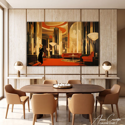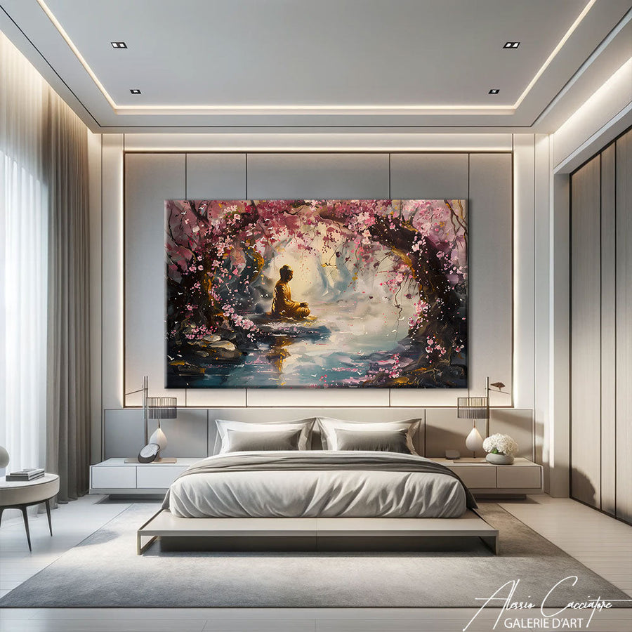

Last week, a client contacted me because she wasn't sleeping anymore. Well, not exactly: she wrote that she had hung a large, bright red pop art painting above her bed, and ever since, it took her two hours to fall asleep. I couldn't help but smile—but frankly, she wasn't the first. The bedroom is the most intimate space in your home, where you let your guard down. And yet, it's often the one that gets decorated last, or haphazardly. Here's what I've learned in ten years of selling (and creating) artworks for this very special space.
Why bedroom wall decor requires a different approach
When you decorate your living room, you aim to impress, to spark conversation, to assert your personality. That's normal: it's the social space of your home.
The bedroom is the opposite.
You spend a third of your life there—often in the dark, admittedly, but also waking up, before sleeping, sometimes sick in bed with a book. It's the place where you need to be able to truly unwind. The artwork you hang here should not stimulate you. It should welcome you.
In my workshop, I see collectors looking for big, bold, colorful pieces. When they specify "it's for the bedroom," I slow down the conversation. Because a bedroom painting is not chosen like an office or entryway painting. It needs to withstand being looked at 10,000 times—without ever assaulting your senses.
Adult bedroom wall decor meets three criteria: soothe, invite introspection, and respect your biological rhythm. Yes, I know, that sounds pompous. But in reality, it just means: avoid garish colors, overly busy compositions, and anxiety-inducing subjects.
Which colors for a bedroom decor painting that promotes sleep

Cool and neutral tones, your best allies
Grey-blue, sea green, rosy beige, taupe. These shades are not "boring"—they are restful. In the bedroom, color should never dominate the rest of your decor. It should blend in, creating visual continuity. My abstract works in neutral tones are designed precisely for this.
I have a client in Berlin who bought an abstract piece in very soft sienna and ocher tones. He later told me that he looked at it every morning when he woke up, and that "it made him feel like he was going away for the weekend." That's exactly the desired effect.
The danger of bright colors
Red activates. Orange stimulates. Fluorescent yellow wakes you up (and not in a good way). Frankly, if you want a red painting for your bedroom, ask yourself: do you really want your brain to go into "alert" mode before sleeping?
That said, there's a nuance. A small red accent in a predominantly neutral composition is fine. What's not fine is a solid red patch measuring 120 x 80 cm directly opposite your bed.
What about black and white?
Black and white is my passion. I do a lot of it. But for the bedroom, be careful: a black and white painting that's too high-contrast can be as energizing as a colorful work. Prefer shades of gray, subtle gradients, minimalist compositions. A very soft black and white portrait, a misty landscape, a calming graphic abstraction—yes. Brutal contrast in the German expressionist style—to be avoided. Take a look at my minimalist black and white paintings to get an idea.
Bedroom painting: what size above the bed
This is THE question I receive three times a week by email.
Basic rule: the painting should occupy about 2/3 of the width of the headboard. If your bed is 160 cm wide, aim for a work (or a diptych) that is 100-120 cm wide. This creates visual balance without overwhelming the space.
But.
This rule is not absolute. I've seen magnificent bedrooms with a very small painting (40 × 50 cm) centered above a large bed—it worked because the rest of the wall was empty, uncluttered, almost zen. The artwork became a point of meditation, not just decor.
Conversely, if you have a bedroom with high ceilings and a large wall, an adult bedroom painting measuring 100 × 150 cm can be sublime—provided its treatment remains soft. Large surface area ≠ high energy.
A practical tip: before buying, cut out a rectangle of kraft paper to the dimensions of the artwork, tape it to the wall, and live with it for 48 hours. You'll quickly see if it breathes or stifles the space.
Subjects to favor (and those to avoid) for adult bedroom wall decor

What works
Soothing landscapes: deserted beach, misty forest, marine horizon. No storms, no crashing waves—just calm. My soothing landscapes for the bedroom all focus on this gentleness.
Soft abstraction: organic shapes, gradients, minimalist compositions. My favorite style for the bedroom. It leaves room for interpretation without imposing a narrative.
Artistic nudes: if treated gently, a nude can be very beautiful in a bedroom. Just avoid overly theatrical or eroticized poses—privilege subtle sensuality.
Contemporary still life: a stylized bouquet, objects in chiaroscuro. Less common, but it can work really well.
What doesn't work (in my opinion)
Portraits that stare at you. Seriously. Waking up to a painted gaze fixed on you is creepy.
Crowded scenes, bustling cities, traffic. Save those for the office or entryway.
Overly busy artworks: too many details, too many textures, too many layers. Your eye can't rest.
Overly direct text messages (with rare exceptions). "BREATHE," "DREAM BIG," "HUSTLE"—frankly, no. The bedroom is not a LinkedIn motivation room.
Adult bedroom painting: adapting the style to your existing decor
Do you have a Scandinavian bedroom? Minimalist? Bohemian? Industrial? The bedroom painting must fit into this logic—without mimicking it.
If your bedroom is uncluttered, Nordic style, favor a geometric abstract work, a subtle monochrome, or a very soft black and white photograph. Avoid baroque golden frames; they clash.
If you're more boho-chic, you can allow for terracotta colors, organic compositions, handcrafted works. A textile painting, an oil painting with textures—that works.
Industrial bedroom, loft, polished concrete? A large monochrome painting, an abstract architectural work, or even a raw piece simply framed (or not at all). Here, the contrast between the hardness of the wall and the softness of the artwork can be magnificent.
And if you don't have a defined style? Start with the artwork. Seriously. Buy the painting that truly speaks to you, and build around it. This is often more effective than the inverse.
Where to hang a painting in the bedroom (besides above the bed)

Everyone thinks "above the bed." But there are plenty of other options.
Opposite the bed: if you like to contemplate something when you wake up, this is perfect. Then, choose an inspiring but never aggressive work. A landscape, a luminous abstraction.
On the perpendicular wall: near the dresser, vanity, or in a reading corner. This creates a dedicated zone within the bedroom, a small visual ritual.
Above an armchair or bench: if you have a reading nook, this is the ideal spot for a small, intimate artwork. You'll see it up close, often, and so it must hold emotional distance.
Avoid hanging artwork too low (below 1.50 m from the floor, except in special cases), or too high (you should be able to enjoy it without craning your neck from the bed).
And there's no denying: one good painting is better than four poorly arranged small ones. The bedroom is not a gallery.
Common mistakes (which I see all the time)
Mistake #1: Buying a painting that's too small out of fear. Result: it floats on the wall, the space looks empty and poorly thought out. If you're torn between two sizes, take the larger one—unless it's truly disproportionate.
Mistake #2: Choosing a work just "to look pretty" without truly loving it. In the living room, that might pass. In the bedroom, no. You'll see it every day, sometimes in fragile emotional states. If it doesn't genuinely speak to you, it will weigh on you.
Mistake #3: Neglecting natural light. A painting can be sublime in a gallery, and dull in your bedroom if it's too dark. Conversely, too much direct light can distort colors (and damage the work long-term). Think about exposure, think about accent lighting if needed.
Mistake #4: Forgetting the hanging height. The center of the painting should ideally be at eye level (about 1.60 m from the floor). In a bedroom, you can lower it a bit if you mainly view it from the bed—but not too much, otherwise it looks like it's "sitting on the floor."
And one last, more subtle one: buying a reproduction of a famous work (Van Gogh, Monet, Klimt). Frankly, in a bedroom, it's a shame. It's the perfect place to support a contemporary artist, discover a universe, and create a personal connection with a unique work.
Why invest in an original work for your bedroom
I know, a poster costs €20, an Ikea print €50, and an original canvas can go up to several hundred (or even thousands) of euros. But here's what changes.
An original work is a presence. You feel the texture, the brushstrokes, the variations in material. It vibrates differently. In a bedroom, where intimacy matters, this authenticity creates a much stronger emotional connection than an offset print.
In addition, you directly support an artist. You participate in contemporary creation. And that gives meaning to your purchase—it's no longer just "decor," it's a cultural choice.
If your budget is tight, look at young artists, small-format works, works on paper (watercolors, inks, drawings). You can find magnificent pieces between €150 and €400—the price of a good Ikea furniture piece, but with incomparable emotional value.
In my online gallery, I offer original works starting from €200. Some are perfect for a bedroom: soft, introspective, timeless. And frankly, when a client writes to me "I look at it every morning, it makes me feel good," I tell myself that's exactly why I do this job.
Frequently asked questions
What color painting for an adult bedroom?
Favor cool and neutral tones: grey-blue, sea green, beige, taupe, or soft monochromes. Avoid bright colors (red, vivid orange, fluorescent yellow) which stimulate the brain and hinder sleep. Black and white works well if it's low contrast.
What size painting above a bed?
Aim for about 2/3 of the width of your headboard. For a 160 cm bed, a 100-120 cm painting is ideal. You can also opt for a diptych or several small aligned works, but avoid formats that are too small and get lost on the wall.
Can a colorful painting be placed in a bedroom?
Yes, provided the colors are soft and harmonious. A painting with pastel touches, earthy tones, or subtle gradients can work very well. It's the intensity and contrast that need to be monitored, not the presence of color itself.
Where to hang a painting in a bedroom if there's no headboard?
Hang it opposite the bed (what you'll see when you wake up), on a perpendicular wall near an armchair or dresser, or above a bench if you have one. The essential thing is that the artwork is visible from the areas where you spend time.
Is an original painting or a reproduction better for the bedroom?
An original painting brings authenticity, texture, and emotional presence—valuable qualities in an intimate space like the bedroom. If the budget allows, it's an investment that makes all the difference. Otherwise, prefer a high-quality reproduction (art print) over a basic poster.
What subjects should be avoided for a bedroom painting?
Avoid portraits that stare, crowd or busy city scenes, overly cluttered compositions, and overly direct text messages. Favor soothing landscapes, soft abstraction, subtle artistic nudes, or contemporary still life.
All works mentioned in this article are available on the gallery. Free worldwide shipping, 30-day money-back guarantee.