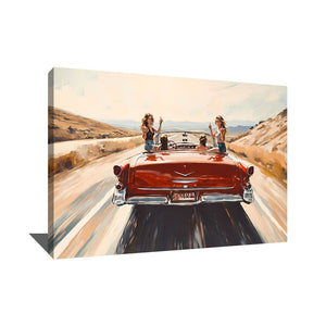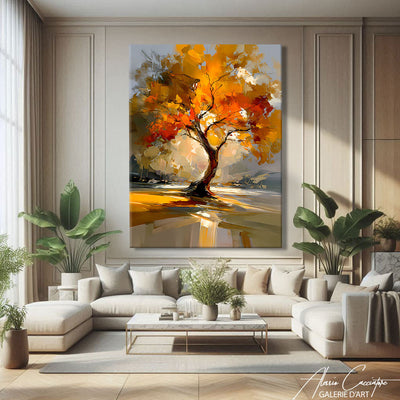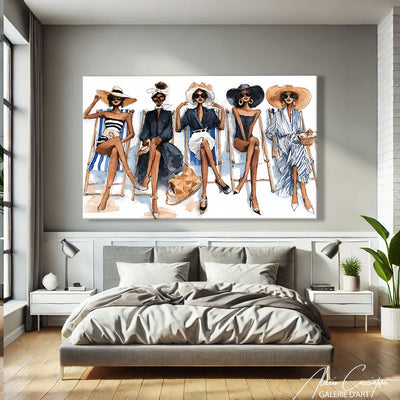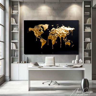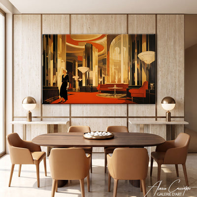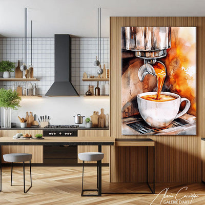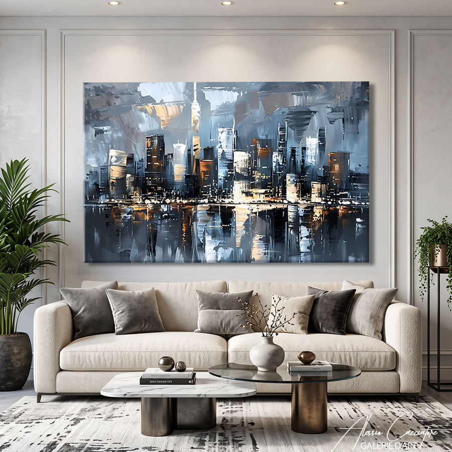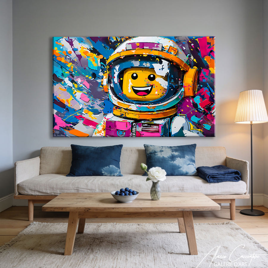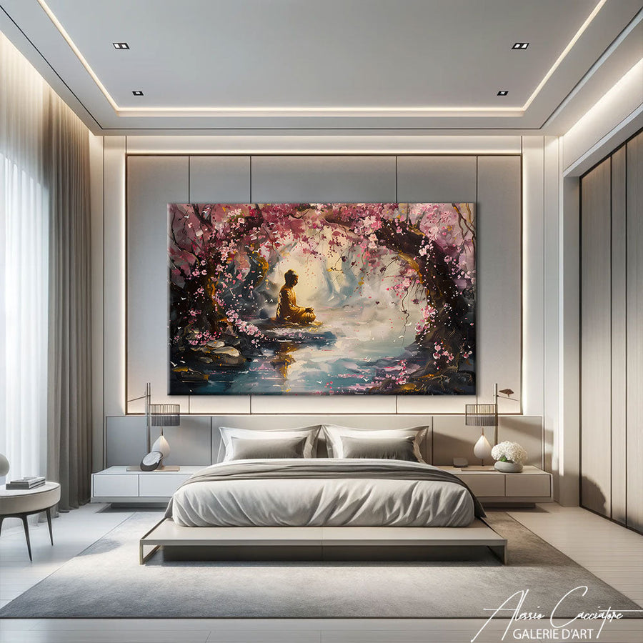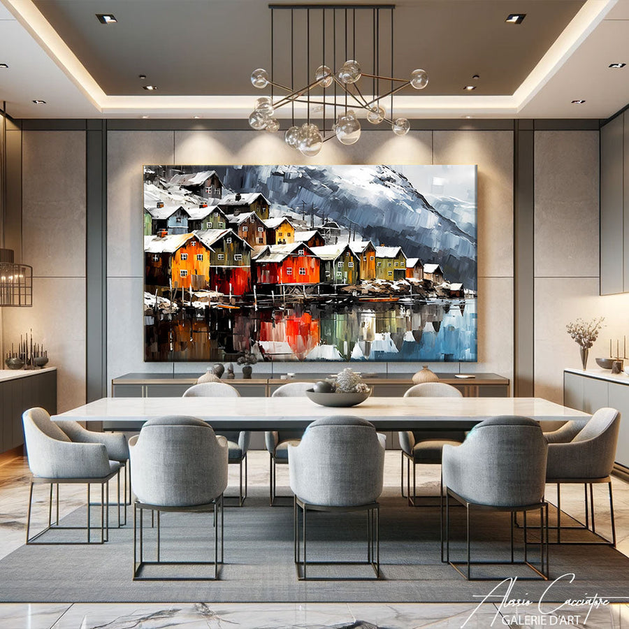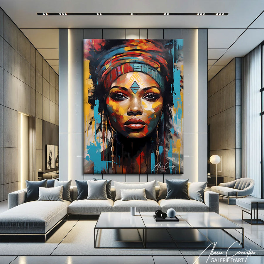

Last week, a couple visited the studio. They were looking for "something original" for their living room. But during our conversation, I realized they already had the same three posters seen in 80% of Parisian apartments. The problem with wall decor today is that people think they're being original by following the exact same Pinterest trends as everyone else. So here are 15 ideas that truly break the mold – some I use myself, others I've seen work for collectors. No BS, just concrete advice.
1. The solo large format (and why it changes everything)
Forget compositions of 12 small frames aligned to the millimeter. A single XXL painting on a blank wall has a presence nothing else can match.
I have a client who put a 180×120 cm canvas in his entryway. Just that. The wall opposite is bare. People entering his home stop dead. It's radical, but it works because it embraces the empty space around it.
The trick: choose a piece with strong colors or a graphic subject. Not a pastel landscape that will blend into the background. If you're going for large format, it needs to make a statement.
My studio tip: for a 25-30 m² living room, aim for at least 140×100 cm. Anything smaller, and you lose the effect.
And honestly, stop with the symmetrical compositions. Life isn't symmetrical.
2. Decorative paintings in diptychs or triptychs (but not just any way)

Decorative paintings in multiple panels are nice when done right. They're ugly when it's a landscape cut into three pieces found on AliExpress.
The difference? The composition must be designed to be divided. Not a photo cut up afterward.
In my studio, I often work on triptychs for urban series: each panel works alone, but the three together create movement. A client installed them with 5 cm of space between each — it breathes, it doesn't look like a "Conforama kit."
Spacing to respect
- Small format (less than 50 cm wide): 3-5 cm between panels
- Medium format (50-80 cm): 5-8 cm
- Large format (more than 80 cm): 8-12 cm
And never frames on a contemporary triptych. Never.
3. The material mix (raw wood + metal + canvas)
A classic mistake: matching everything. Same frame style, same finish, same vibe. Result: a wall that looks like a Zara Home collection.
What really works? Mixing a metal designer wall decoration (a sculpture, a graphic shelf) with a raw unframed canvas and maybe a piece of driftwood.
I did this at home: one of my pop art canvases next to a black steel shelf and a round brass-rimmed mirror. Three materials, three textures. It adds depth, relief — the wall becomes three-dimensional.
The principle: one element must dominate (often the canvas), the others support it. No democratic equality on a wall.
4. The unconventional hanging (my favorite)

Academic rules say: center of the painting 1.60 m from the floor, perfect horizontal alignment.
I say: sometimes, break everything.
A wall painting hung slightly too high or, on the contrary, very low (40 cm from the floor), creates interesting visual tension. It forces the eye to move differently in the room.
Be careful, I'm not saying do anything. The offset must be intentional, not "I messed up my screw hole." If you hang a painting 2 meters high, it must interact with a tall piece of furniture or another low artwork.
A collector I know hung a canvas 30 cm from the floor, just above a low radiator. Everyone told her it was strange. Three months later, everyone thought it was brilliant. There's no denying it, daring pays off.
5. The XXL decorative wall mirror (which is not just a mirror)
A 120×80 cm decorative wall mirror is both functional and sculptural.
But not just any mirror. Forget the rattan "sun" mirrors seen everywhere since 2021. What works today:
- Organic-shaped mirrors (like puddles of water)
- Large rectangular mirrors with a raw steel frame
- Smoked or tinted mirrors (bronze, anthracite)
I have one in my studio, tinted smoky gray. It reflects light but in a softened way, and visually it almost looks like an abstract painting. Several visitors have asked me if it's an artwork.
Where to place it
Opposite a window, of course, for light. But also: opposite a strong artwork, to create a mise en abyme. Or in a narrow hallway, to add depth.
6. The asymmetrical gallery wall (aka the controlled messy wall)

The key? Controlled asymmetry. You don't follow a grid, but you still maintain partial alignments (two frames aligned on the left edge, three others on the top, etc.).
I always recommend laying out the whole thing on the floor first. Take a photo. Look at it the next day. If you still like it, hang it.
What kills the effect:
- Too many frame colors (limit yourself to 2-3 finishes max)
- Too much space between artworks (keep 5-8 cm max)
- No dominant element (you need at least one larger piece to anchor the whole thing)
And please, no motivational phrases in adhesive letters in the middle. This isn't an open-plan office.
7. The decorative painting placed (not hung)
A trend I love: the decorative painting placed on a console, a shelf, a mantelpiece.
Why does it work? Because it gives an unfixed, "work in progress" feel, as if you just brought it back from a gallery.
I did this in my living room: two medium canvases (70×50 cm) placed against the wall on a low cabinet. Behind them, a third painting hung. It creates depth, play.
The rules of the game
- The placed artwork must be large enough not to tip over (minimum 40 cm wide)
- Use non-slip bumpers if the furniture is smooth
- Do NOT put ANYTHING in front that would obstruct the view of the artwork (no candles, no plants)
This is perfect if you often change your decor — you can switch it up in 30 seconds without drilling new holes.
8. The clashing color (that wakes everything up)
Your wall is off-white, your furniture is light wood, everything is in neutral tones. Perfect. Now add a vibrant red canvas or a lemon yellow one.
I'm serious.
The problem with "harmonious" interiors is that they are often... flat. A well-placed color clash electrifies everything. I have a client whose living room is entirely gray and white. He put one of my neon pink pop art canvases above the sofa. Result: the living room finally has personality.
Of course, you have to dare. And only use ONE piece of that color — not three. Otherwise, you go from "daring" to "candy store."
My advice: if you're hesitating between two artworks and one has a color that makes you slightly nervous, take that one. It's often the right choice.
9. XXL wall art for small spaces (yes, it's counter-intuitive)
Everyone thinks: small space = small artworks. Wrong.
A large canvas in a small living room (15-20 m²) visually enlarges the space. Why? Because it creates depth, especially if the artwork has perspective or vanishing lines.
I furnished an 18 m² studio with a 120×80 cm canvas depicting a street in Manhattan. The tenant thought it would overwhelm the room. The opposite happened: the eye plunges into the urban perspective, the room seems larger.
Small space checklist
- Dominant light colors (not only dark)
- Vanishing lines or compositions that "open up" (no compact subjects)
- Adjacent bare walls (don't overload other sides)
And one large format is better than four small ones.
10. Rail hanging (pro system at home)
You know the rails seen in galleries and museums? You can do the same at home.
Ceiling rail system + adjustable cables = you change your artworks in 2 minutes without drilling new holes. That's what I installed in my studio, and frankly, it's liberating.
The advantages:
- You don't touch the walls (perfect for renters)
- You adjust the height to the millimeter
- You can hang heavy artworks without a problem (up to 30 kg per cable)
The only drawback: the initial investment (count 200-400€ to equip a 4-meter wall). But if you like rotating your collection, it's worth it.
And visually, the thin cables are discreet — you barely see them.
11. Radical black and white (when color is tiring)
There are times when color is too much. A well-chosen black and white painting rests the eye and brings timeless elegance.
But beware: not just any black and white. Icelandic landscape photos in B&W are out. What works today:
- Graphic portraits (faces, close-up animals)
- Urban architecture (buildings, bridges, geometry)
- Minimalist abstract compositions
In my living room, I have a series of three B&W canvases: a lion, an elephant, a gorilla. All tightly framed, all in deep gray tones. It's striking, and it never goes out of style.
The mistake to avoid
Mixing black and white with colors on the same wall. Choose a side.
12. The thematic series (to tell a story)
Instead of disparate artworks, compose a thematic wall: a city (New York), a subject (wild animals), a technique (abstract collages).
I have a collector who decorated her entire hallway with "female icons": Marilyn, Frida Kahlo, Grace Jones, Basquiat (yes, Basquiat). Four canvases, same format, same pop art style. It tells a story.
The advantage of a series: you can expand it over time. You start with three artworks, you add one per year. It's a living collection.
However, there must be coherence:
- Same format (or harmonious proportions)
- Same graphic style (photo, painting, illustration)
- Same color palette (warm, cool, monochrome)
It's harder to build than a random mix, but the result is much more powerful.
13. Dedicated lighting (because without light, an artwork doesn't exist)
What bothers me is when people buy a beautiful piece and put it in a dark corner. Without light, your original wall decoration is useless.
Solutions:
- Adjustable track lighting (the most flexible)
- Picture lights (small lamps above the artwork)
- Indirect LED lighting behind the frame (modern halo effect)
In my studio, each artwork has its own spot. It changes everything. Colors pop, contrasts stand out.
Light temperature: 3000K (warm white) for cozy interiors, 4000K (neutral white) for accurate color rendering.
And adjust the angle: the spot should illuminate the artwork at about a 30° incline to avoid reflections.
14. The color wall (background that makes the artwork stand out)
Everyone hangs on white walls. Try a forest green, navy blue, or terracotta wall.
I repainted my living room wall in petrol blue. My canvases stand out three times better — especially those with golden or copper touches.
The principle: the wall becomes a setting. The artwork no longer floats in a void; it is highlighted by the contrast.
Combos that work
- Forest green wall + golden or copper canvases
- Navy blue wall + orange or yellow artworks
- Terracotta wall + black and white or sky blue
Caution: only paint ONE wall. Otherwise, you go from "chic gallery" to "teenager's bedroom."
And test with samples first — the color changes dramatically depending on the natural light in your room.
15. The unique artwork that replaces everything else
Sometimes, the best designer wall decoration is a single, exceptional piece.
I sold a 200×150 cm canvas to a couple who removed EVERYTHING else from their living room. No more knick-knacks, no more small decorations. Just this artwork, a sofa, a coffee table. It became a serene, powerful, obvious space.
This is the most radical approach, but also the most effective if you find THE piece. The one that stops you dead, that obsesses you, that you already see in your home even before you've bought it.
My advice if you're hesitating: if you're still thinking about an artwork three days after seeing it, it's calling to you. Take it.
And stop asking yourself "does it match my cushions." If the artwork is strong, the cushions will adapt.
Frequently Asked Questions
What size painting for a 3-meter wall?
For a 3-meter wide wall, go for an artwork (or composition) that is 120 to 150 cm wide. The idea: the artwork should occupy about 50-60% of the wall's width to have an impact without overwhelming the space. If you opt for several paintings, leave 8-10 cm of space between them.
How to hang a heavy painting without drilling?
Three solutions: high-strength adhesive hooks (Command type, up to 7 kg), ceiling rail systems with cables, or floor-to-ceiling extendable rods (Artiteq type). Avoid classic adhesive pads for anything over 2 kg — it always ends up falling at 3 am.
What frame color to choose for a modern painting?
For contemporary art, three safe options: no frame at all (canvas on a thick stretcher), matte black frame (universal mat), or light raw wood frame (oak, ash). Avoid Louis XV-style gilded frames and glossy white frames — they've been out since 2015.
How many paintings should be in a 20 m² living room?
Fewer than you think. In 20 m², I'd say: either ONE large format (140×100 cm or more), or a composition of 3-5 artworks maximum on a main wall. The rest of the walls can remain bare. The classic mistake is trying to fill every wall — you end up with a cluttered and tiring interior.
Where to buy original wall decoration?
Avoid large chains where everyone buys the same prints. Look at independent artists' online galleries (like alessiocacciatore.com, obviously), artists' Etsy shops, or direct studio sales. If you really want to go off the beaten path, you have to go where the general public doesn't.
All the works mentioned in this article are available in the gallery. Free worldwide shipping, 30-day money-back guarantee.