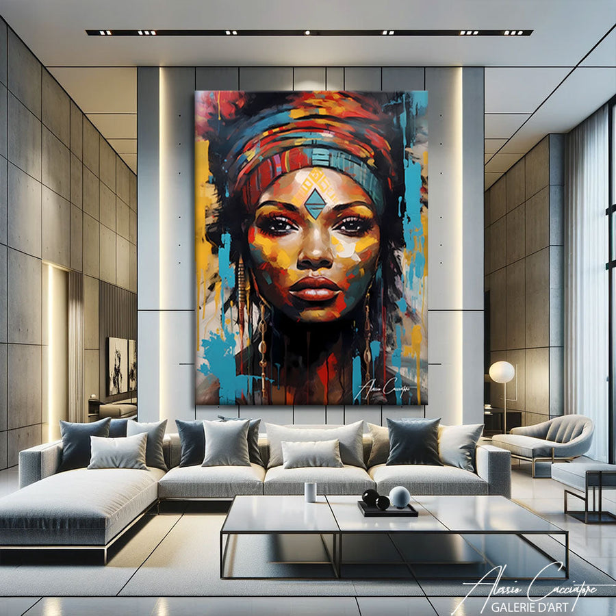

Terracotta painting
25 œuvresDes œuvres en édition limitée, pensées par l'artiste pour illuminer votre intérieur.
Fait main en AllemagneLivraison offertePrêt à accrocher30 jours pour changer d'avis
-
Add to Wishlist TERRACOTTA LANDSCAPE PAINTINGDès 89 €
-
Add to Wishlist TERRACOTTA HORIZONTAL PAINTINGDès 89 €
-
Add to Wishlist TERRACOTTA PAINTING MOROCCODès 89 €
-
Add to Wishlist TERRACOTTA LANDSCAPE PAINTINGDès 89 €
-
Add to Wishlist TERRACOTTA LIVING ROOM PAINTINGDès 89 €
-
Add to Wishlist TERRACOTTA VILLAGE PAINTINGDès 89 €
-
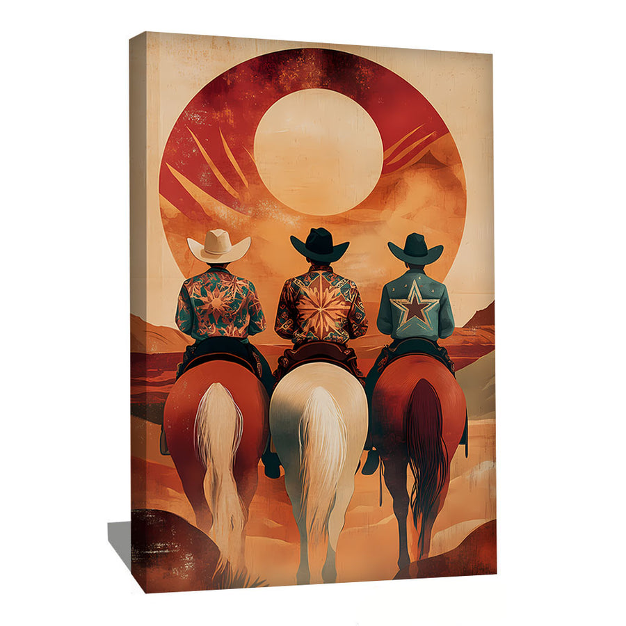
Add to Wishlist WESTERN TERRACOTTA PAINTINGDès 89 €
-
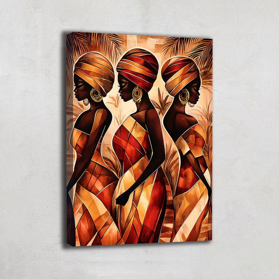
Add to Wishlist TERRACOTTA WOMAN PAINTINGDès 89 €
-
Add to Wishlist TERRACOTTA SUN PAINTINGDès 89 €
-
Add to Wishlist BEIGE TERRACOTTA PAINTINGDès 89 €
-
Add to Wishlist TERRACOTTA COLOR PAINTINGDès 89 €
-
Add to Wishlist GEOMETRIC TERRACOTTA PAINTINGDès 89 €
-
Add to Wishlist TERRACOTTA DECORATIVE PAINTINGDès 89 €
-
Add to Wishlist TERRACOTTA PARROT PAINTINGDès 89 €
-
Add to Wishlist ORIENTAL TERRACOTTA PAINTINGDès 89 €
-
Add to Wishlist TERRACOTTA DESIGN WALL ARTDès 89 €
-
Add to Wishlist TERRACOTTA WOMAN PAINTINGDès 89 €
-
Add to Wishlist TERRACOTTA ANIMAL PAINTINGDès 89 €
-
Add to Wishlist PINK TERRACOTTA PAINTINGDès 89 €
-
Add to Wishlist TERRACOTTA AND BLUE PAINTINGDès 89 €
-
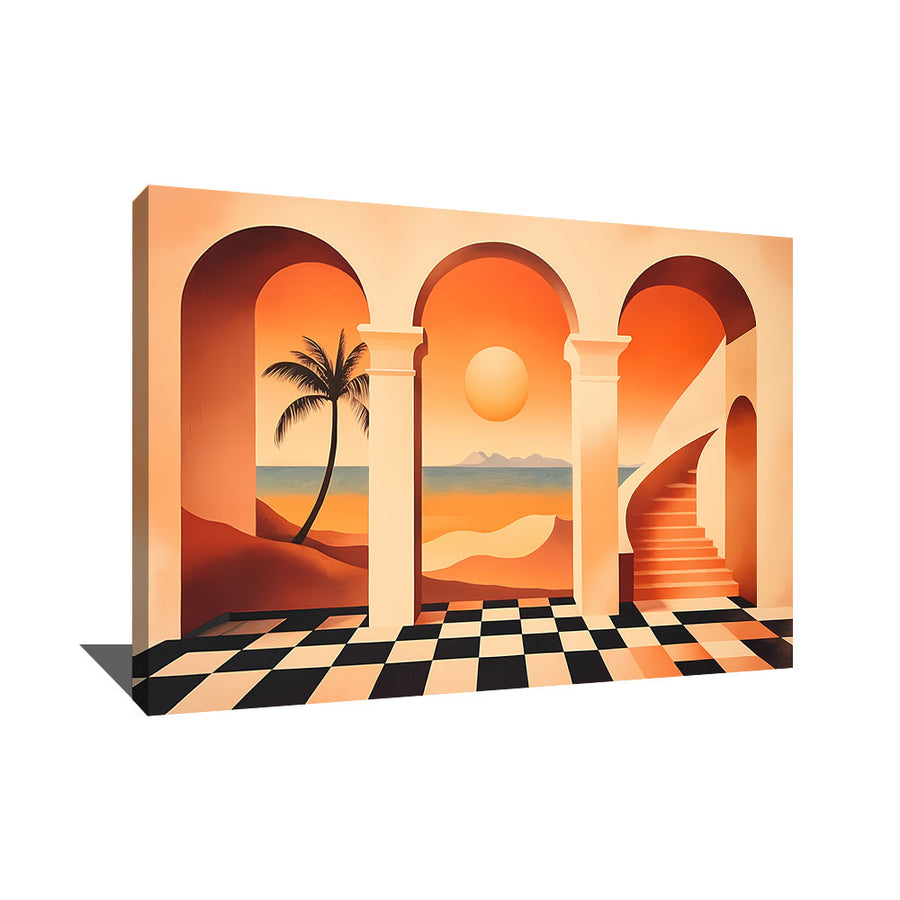
Add to Wishlist TERRACOTTA ARCH PAINTINGDès 89 €
-
Add to Wishlist TERRACOTTA KITCHEN WALL ARTDès 89 €
-
Add to Wishlist TERRACOTTA DECORATIVE PAINTINGDès 89 €
-
Add to Wishlist BEIGE AND TERRACOTTA ABSTRACT PAINTINGDès 89 €
-
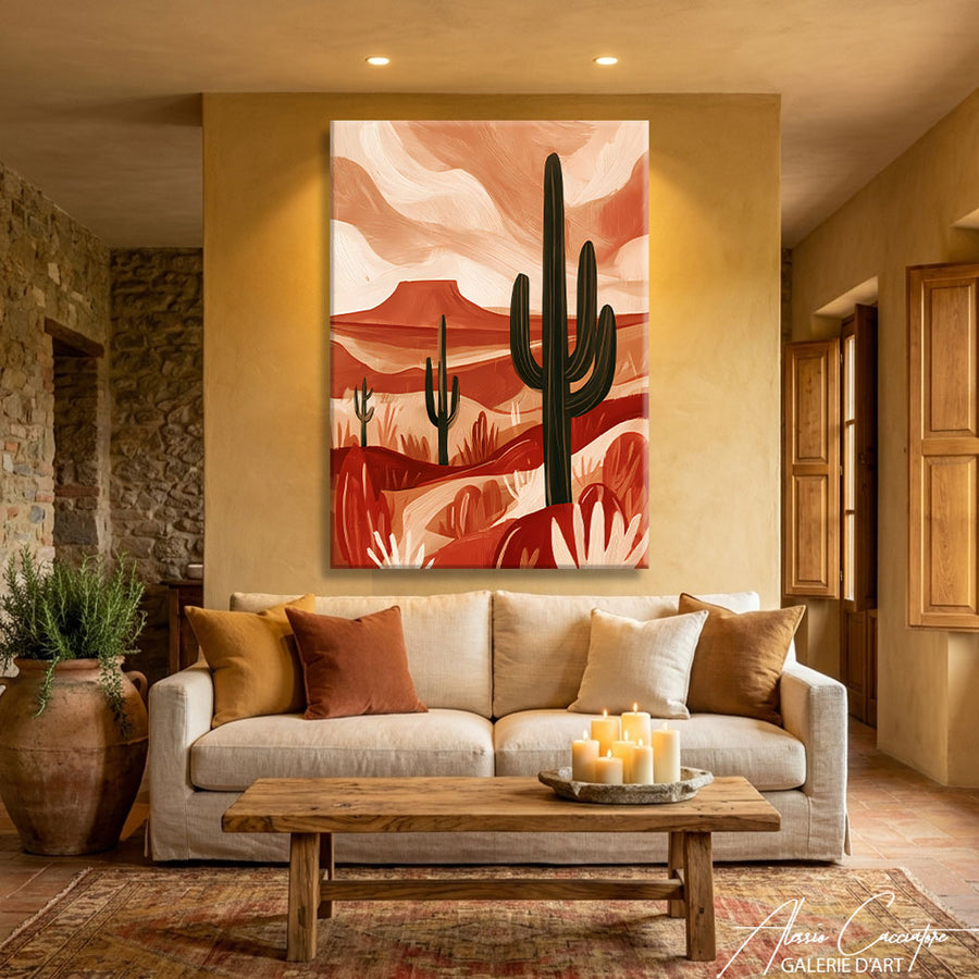
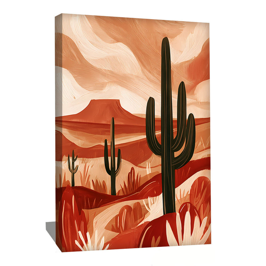
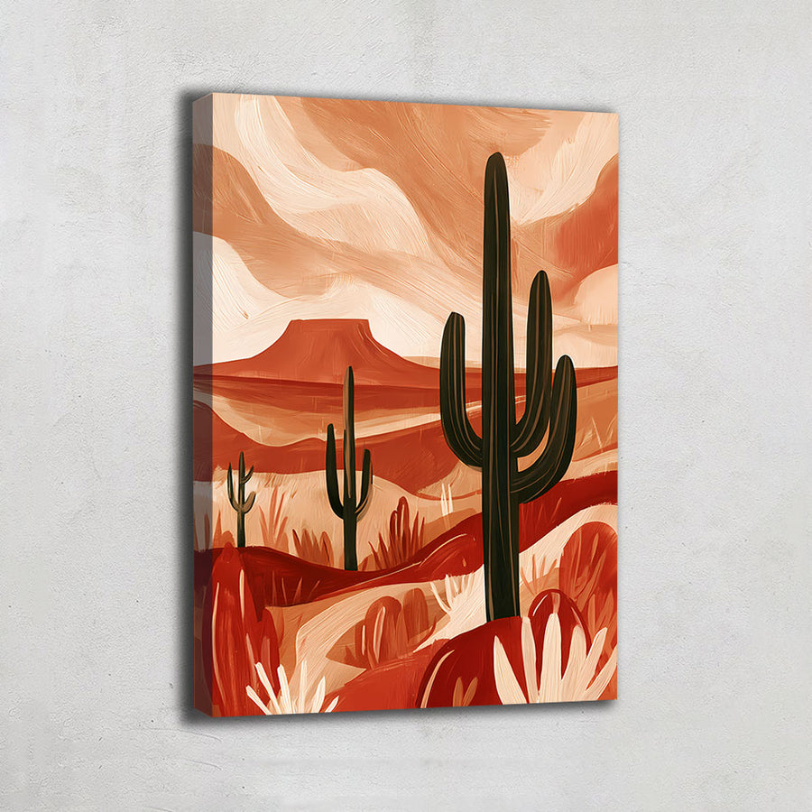
Add to Wishlist TERRACOTTA DESERT PAINTINGDès 89 €








Chargement des œuvres suivantes…
Vous avez vu 20 œuvres sur 25


In wall decor, terracotta occupies an absolutely unique place that no other color can truly claim. Where blue, green, pink, or gray are abstract shades that can be obtained in a thousand different ways without referring to a specific material, terracotta is probably the only color in contemporary decor that is a material before it is a shade. "Terra cotta" literally means "cooked earth" in Italian, and the color designates exactly the shade clay takes after being fired, somewhere between burnt orange, brick red, and pinkish brown, with those subtle variations that depend on the earth's composition and the firing temperature. This material dimension gives terracotta a historical depth that no other color possesses: it carries within it the memory of humanity’s oldest gesture, which consists of transforming earth through fire to make a durable object. The Venus of Dolní Věstonice, the oldest known ceramic, is nearly thirty thousand years old. The eight thousand soldiers of the Terracotta Army of Xi'an have been guarding the tomb of the first emperor of China for two thousand two hundred years. Roman tiles, Provençal floor tiles, the floors of Tuscan palaces, pots in Mediterranean gardens, the earthen architecture of Djenné in Mali or Shibam in Yemen: wherever man has built and cooked, terracotta has been the color of the home in the most literal sense of the term. Since 2018, this color has experienced a major decorative renaissance to the point of becoming arguably the iconic shade of an entire decade, carried by the boho movement, japandi, warm minimalism, and the earth tones trend that has invaded both fashion and decor. It is precisely this dimension of an ancestral "color-material" that our terracotta wall art collection brings together: a selection of wall works printed on premium canvas and glossy plexiglass in our workshop in Germany, chosen for their ability to warm up a wall with the mineral softness that distinguishes terracotta from all other warm colors.
Abstract compositions in terracotta gradients, from the softest clay pink to the deepest burnt sienna, organic boho-inspired shapes with enveloping arches and curves, Moroccan arches and riad ambiances with ocher tadelakt walls, desert landscapes in the warm mineral palettes of dunes and canyons, Bauhaus-inspired geometric compositions revisited in clay tones, still lifes of pottery and terracotta jars in Mediterranean light, stylized feminine silhouettes in terracotta flat tints of contemporary line art, textures of rammed earth and adobe walls in materialist compositions, stylized suns and concentric circles in earth gradients, raw earth villages of West Africa and Yemen, Provençal tile and Tuscan floor ambiances, warm minimalism compositions in terracotta and sand flat tints, ethnic and Berber motifs in red ocher palettes, japandi compositions marrying terracotta and light wood: each painting in this gallery has been designed as a decorative object charged with palpable mineral warmth, capable of becoming the visual anchor of a boho living room, a warm minimalism-inspired bedroom, a japandi space, or a Mediterranean interior—a space that fully celebrates this unique color in all its dimension as both an ancestral material and a contemporary trend.
Why terracotta is experiencing a major decorative renaissance
In recent years, terracotta art has undergone a particularly fascinating cultural transformation that is essential to understand to fully appreciate its current value. Long associated with the traditional rustic decor of Mediterranean country houses (old tiles, flower pots, weathered roof tiles), since 2018, terracotta has made a spectacular comeback to the forefront of contemporary urban decor, driven by several major cultural convergences that are important to measure precisely. It is, first of all, the exhaustion of the cold minimalism that dominated the 2010s: the entirely white and gray interiors, the glacial Scandinavian palettes, and the smooth, textureless surfaces gradually wearied a generation seeking more warmth and grounding in their homes. The warm minimalism that followed retains the refinement and simplicity but replaces the cold white with enveloping earthy shades, of which terracotta is the queen color. Next is the explosion of the contemporary boho movement, which made the warm earth palette (terracotta, ocher, rust, sand, sienna) its absolute chromatic signature, spread by millions of pieces of content shared on Instagram and Pinterest. It is also the rise of japandi, that meeting of Japanese refinement and Scandinavian functionality, which favors raw natural materials (light wood, linen, clay, ceramic) and of which terracotta constitutes one of the few authorized colors because it is precisely a "color of material." It is also the practice of color drenching, a decoration technique that consists of painting an entire room in a single enveloping shade, ceiling and woodwork included, and of which terracotta has become the most used color because it envelops without feeling oppressive. Finally, it is the recognition of the psychological dimension of this color by decorators and interior architects: terracotta warms without being aggressive, unlike bright red or saturated orange; it anchors (professionals call it a "grounding" color), it evokes the earth, the hearth, and stability—all qualities that a hyper-connected urban generation seeks to find in their home. For those who particularly love soft neutral palettes in their lightest expression, our beige collection offers a neighboring universe that beautifully extends the spirit of natural shades toward more lightness.
Our selection process prioritizes three essential qualities for this subject with specific requirements. Chromatic accuracy first, because terracotta is a subtle shade that distinguishes itself from its neighbors by precise nuances that enlightened enthusiasts recognize immediately: a terracotta that is too saturated tips into orange and loses its mineral softness, one that is too dark tips into brown and loses its light, and one that is too pink tips into "nude" and loses its depth. The true terracotta shade lies in this precise balance between warmth and restraint, with that matte and powdery quality characteristic of fired clay. We ensure that each composition respects this accuracy, with gradients ranging from the softest clay pink to the deepest burnt sienna without ever leaving the territory of earth. The dimension of material second, because terracotta calls for compositions that evoke the texture of its origin: grain of the clay, patina of rammed earth walls, irregularities of old tiles, cracks in pottery, matte and powdery surfaces that absorb light rather than reflecting it. This materialist dimension distinguishes a successful terracotta composition from a simple, soulless orange patch. The dimension of grounding last, because a successful terracotta painting does not just decorate: it must produce that particular sensation of peaceful warmth and stability that constitutes the very soul of this color in contemporary decorative culture. It is this inherently enveloping quality that transforms a terracotta painting into a true emotional anchor for the home.
The major families of our terracotta collection
Our gallery explores all the great possible iconographies of this material-color. Here are the main families that make up the selection.
Terracotta abstractions
Probably our most iconic family. Abstraction constitutes the natural territory of contemporary terracotta: enveloping organic shapes, boho-inspired arches and semicircles, subtle gradients from clay pink to burnt sienna, gestural compositions with visible brushstrokes, matte flat tints juxtaposed in a mastered chromatic economy. These compositions celebrate the color for itself, without figuration, and allow terracotta to deploy its entire palette of nuances. Our compositions explore this dimension in various treatments: overlapping arches in earth gradients, floating organic shapes on a sand background, gestural composition in burnt sienna and red ocher, soft geometric flat tints in terracotta and cream. On matte canvas that perfectly respects the powdery quality of the color, the effect is particularly accurate. To be combined beautifully with our abstract collection to explore abstraction more broadly in its other palettes.
Desert and mineral landscapes
A particularly immersive family. The world's great deserts constitute the natural landscape of terracotta: dunes of the Moroccan Sahara in the low light of evening, canyons of the American West with red strata, sculpted rocks of Wadi Rum in Jordan, mineral formations of the Atacama. These landscapes offer natural terracotta gradients of extraordinary richness, from light sand to deep red ocher depending on the time and the light. Our compositions celebrate this dimension in various treatments: dunes in soft gradients at sunset, canyon in graphic composition with horizontal strata, mineral rock in a materialist close-up, desert horizon in a minimalist composition. To be combined beautifully with our desert collection to delve deeper into this particular iconography.
Moroccan ambiances and tadelakt
Particularly warm compositions. Morocco is probably the country that has best integrated terracotta into its daily architecture: ocher tadelakt walls of riads, rammed earth ramparts of Marrakech, earth kasbahs of the Drâa valley, Safi pottery, patio tiles. Our compositions celebrate this dimension in various treatments: Moroccan arch in terracotta flat tints, riad patio with ocher walls in soft light, earth kasbah in a heritage composition, tadelakt wall in a textured materialist composition. To be combined beautifully with our Morocco collection to extend this universe into its other decorative expressions.
Warm minimalism and warm refinement
A particularly contemporary family. Warm minimalism, the decorative movement that succeeded the cold minimalism of the 2010s, retains the refinement but dresses it in enveloping earthy shades. Our compositions celebrate this dimension in various treatments: single flat tint of terracotta on a cream background, two simple shapes in chromatic dialogue, horizon line in a composition reduced to the essential, solar circle in terracotta on a sand background. These compositions bring to an interior that dimension of warm refinement that defines the style. To be combined beautifully with our minimalist collection to explore refinement in its other chromatic expressions.
Japandi and natural materials
Particularly refined compositions. Japandi, that meeting between Japanese refinement and Scandinavian functionality, favors raw natural materials and only admits colors of material into its palette: light wood, ecru linen, clay, stone. Terracotta occupies a place of choice here as the only authorized warm note. Our compositions celebrate this dimension in various treatments: wabi-sabi composition in terracotta and sand with assumed imperfect shapes, ceramic bowl in a contemplative composition, stylized branch in terracotta on a linen background, enso-inspired (zen circle) composition in clay. To be combined beautifully with our japandi collection to deepen this particular aesthetic.
Pottery and terracotta still lifes
A particularly heritage-focused family. Pottery constitutes the original object of terracotta: Mediterranean jars, antique amphorae, Tuscan garden pots, Berber vases, contemporary studio ceramics. These objects offer still life compositions of great sobriety. Our compositions celebrate this dimension in various treatments: single jar in a contemplative composition in low light, set of pottery in a rhythmic composition, terracotta vase with olive branch, antique amphora in a heritage composition.
Line art and stylized silhouettes
Particularly graphic compositions. Contemporary line art—those feminine silhouettes or faces traced with a continuous line—has massively adopted terracotta as a background or fill color. Our compositions celebrate this dimension in various treatments: stylized face in thin line on a terracotta flat tint, feminine silhouette in terracotta and cream flat tints, abstract bodies in earthy organic shapes, Matisse-inspired composition in earth and sand paper cutouts.
Earthen architecture
A particularly cultural family. The world's great raw earth architectures constitute a fascinating and little-known iconography: Great Mosque of Djenné in Mali, the largest raw earth building on the planet; earth skyscrapers of Shibam in Yemen nicknamed the Manhattan of the desert; Taos pueblos in New Mexico; kasbahs of the Atlas. Our compositions celebrate this dimension in various treatments that celebrate the beauty of these vernacular architectures in the earth palettes that are literally their material.
Solar compositions and earth circles
Particularly symbolic compositions. The solar circle in terracotta gradients constitutes one of the most iconic motifs of contemporary boho decor: terracotta disk on a sand background, concentric circles in ocher gradients, stylized sun with geometric rays, moon and sun in chromatic dialogue. These compositions bring to an interior that dimension that is both graphic and symbolic of warmth and cycles. To be combined beautifully with our orange collection to amplify the solar dimension in a more vivid palette.
Nuance and style determine your terracotta choice
Terracotta comes in several distinct decorative registers depending on the dominant nuance and the style sought. Here are our guidelines for identifying the painting that exactly matches your project.
For an enveloping boho ambiance
Favor compositions with organic shapes: overlapping arches, solar circles, silhouette flat tints, stylized Berber motifs. On matte canvas that respects the powdery quality of the color, these works transform the wall into a true chromatic cocoon. Particularly suitable for boho living rooms, cocooning bedrooms, and spaces that celebrate the warmth of natural materials.
For a refined warm minimalism ambiance
Turn toward compositions reduced to the essential: single flat tint, two shapes in dialogue, horizon line, circle on a neutral background. These paintings assert a taste for warm expressive economy and integrate beautifully into contemporary interiors that have abandoned cold white without renouncing refinement.
For a Mediterranean and heritage ambiance
Opt for figurative compositions: pottery and jars, Moroccan arches, floor tiles, earth villages, desert landscapes. On matte canvas for an authentic atmosphere, these paintings bring an immediate sense of terroir that is particularly suitable for interiors inspired by Provençal mas, riads, or Tuscan houses.
For a contemplative japandi ambiance
Choose wabi-sabi compositions: imperfect shapes, enso circle, ceramic bowl, stylized branch on a linen background. These paintings assert a taste for the beauty of imperfection and integrate beautifully into refined interiors of Japanese and Scandinavian inspiration.
The terracotta painting, room by room
Each room calls for its ideal terracotta painting according to its use and the desired atmosphere. Here are our decorative recommendations.
In a boho or warm minimalism living room
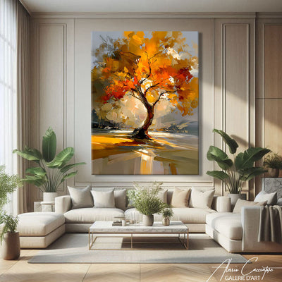
This is probably the preferred location for a large terracotta painting. Above the sofa, a 120x80 cm format immediately becomes the chromatic anchor of the room. Favor compositions with a strong character here: abstract arches in earth gradients, immersive desert landscape, monumental solar composition. Above an ecru linen, sage green velvet, or cream bouclé sofa that dialogues with the terracotta palette, in an atmosphere punctuated by natural materials (rattan, light wood, ceramic, jute), the terracotta painting warms the whole without ever weighing it down. Our living room collection offers other complementary subjects to complete this reception universe.
In a cocooning bedroom
A configuration particularly well-suited thanks to the soothing dimension of the color. Terracotta is probably one of the warm colors most conducive to sleep because it warms without stimulating. Favor soft compositions: gradient from clay pink to sand, floating organic shapes, peaceful solar circle, wabi-sabi composition. 80x60 cm format above the headboard, on matte canvas which further softens the color.
In a convivial dining room
A particularly successful configuration. Terracotta is historically the color of the table (pottery, earth dishes, kitchen floor tiles) and it gently stimulates the appetite without the aggressiveness of red. Still lifes of pottery, Moroccan arches, solar composition: these are all paintings that extend the convivial dimension of the shared meal. Medium to large format depending on the dimensions.
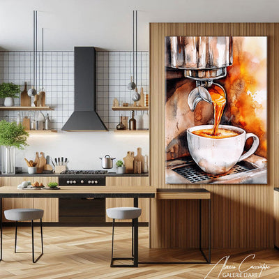
In a Mediterranean kitchen
Ideal configuration. Kitchens with wooden countertops, open shelves filled with ceramics, zellige tiles, or terracotta floor tiles serve as an admirable backdrop for terracotta compositions that extend their natural palette. Pottery in rhythmic composition, a single jar, or a stylized tile motif. Plexiglas is mandatory in this room.
In a cozy entryway
An entryway featuring a terracotta composition provides an immediate sense of welcome. Your guest walks through the door and is enveloped by the gentle warmth of the color. An abstract arch, a solar circle, a line art silhouette: the first impression is that of a warm and contemporary home. A vertical format is suitable for narrow spaces.
In a peaceful office or home workspace
A particularly well-suited configuration. Terracotta promotes calm concentration because it warms up the space without overstimulating it. Warm minimalism composition, desert horizon line, or a single block of color in dialogue with a wooden desk. Medium format 80x60 cm.
In a spa-inspired bathroom
A strong contemporary trend. A hammam or Mediterranean spa-inspired bathroom, with its tadelakt walls, ceramic basins, and natural fiber baskets, beautifully accommodates terracotta compositions. Plexiglas is mandatory in this humid room.
In a professional wellness or lifestyle space
Natural-style beauty salons, yoga studios, ceramic and craft boutiques, boho-style cafes, therapist offices, Mediterranean or Moroccan-inspired boutique hotels, and lifestyle concept stores: a terracotta painting is an obvious decorative choice. Opt for large formats and abstract compositions with a strong chromatic signature.
Choosing the right format to magnify terracotta
The format significantly influences the effect of a terracotta painting, because this enveloping color often benefits from occupying a generous surface to fully deploy its warmth.
The compact format (60x40 cm) is ideal for intimate compositions (a single piece of pottery, a solar circle, a line art silhouette) or as a set of three to create a cohesive terracotta wall (e.g., three complementary arches, three earthy shades from clay pink to burnt sienna, three organic forms in dialogue). Particularly successful when hung in a line, reminiscent of ceramicist galleries.
The medium format (80x60 cm) remains the go-to size. It is suitable for all compositions, from abstractions and still lifes to landscapes. Placed above a dresser in a bedroom, as an accent in a dining room, or in a peaceful home office, it provides a warm, assertive presence without dominating the room.
The large format (120x80 cm) is particularly suitable for abstract compositions and desert landscapes that require scale to fully unfurl their enveloping warmth. Going big with terracotta means giving this anchor color all the surface it needs to transform a room's atmosphere.
The terracotta triptych is a configuration particularly well-suited to this color with its multiple nuances. Three panels can present three earthy shades in a progressive gradient, three complementary organic forms, or a continuous abstract composition broken into three sections. An immediately enveloping effect that turns a large wall into a true chromatic surface.
The panoramic horizontal format particularly magnifies desert landscapes and compositions with a horizon line that exploits the horizontal dimension. Ideal above a long sofa or in a spacious living room.
Premium canvas or glossy Plexiglas: elevating terracotta
The material determines how your terracotta painting will render the very specific quality of this textural color. On this specific subject, the choice is more distinct than for most other collections.
Printing on premium canvas
Our canvas is hand-stretched over a 2 cm thick FSC-certified spruce wood frame. Its matte and delicately granular texture is likely the most naturally suited medium for terracotta in our entire gallery: terracotta color is essentially matte and powdery, like the clay from which it takes its name, and the canvas respects this quality exactly by absorbing light rather than reflecting it. The weave of the canvas itself evokes the texture of raw material. This is the choice we recommend for the vast majority of terracotta compositions, particularly abstractions, boho compositions, warm minimalism, japandi, and pottery still lifes. A finish that beautifully extends the textural dimension of the color.
Printing on glossy Plexiglas
Plexiglas offers a different and more contemporary interpretation of terracotta: its smooth and glossy finish intensifies gradients, gives desert landscapes a spectacular, near-photographic rendering, and makes the contrasts of geometric compositions pop. It is particularly suitable for dune and canyon landscapes in raking light, high-contrast graphic compositions, and, of course, humid rooms (kitchen, bathroom) where it is necessary for practical reasons. For matte and powdery abstractions, we suggest canvas instead, as it better respects the spirit of the color.
In both cases, our prints use high-definition, odorless, and solvent-free ink, safe even in a child's bedroom. The printing technology we use preserves contrasts and color fidelity for several decades. Each painting is delivered ready to hang, with a mounting system included.
Pairing terracotta with your existing decor
Terracotta is one of the easiest colors to pair in contemporary decor because it behaves like a warm neutral. Here are some ideas depending on your style.
In a boho interior
The perfect match. Rattan, macramé, jute, raw wood, abundant green plants, ethnic textiles, handcrafted ceramics: this world has made terracotta its signature color and welcomes all compositions from the collection with immediate ease.
In a japandi or warm Scandinavian interior
A particularly refined configuration. Light wood, ecru linen, off-white, warm gray, clean lines: terracotta provides the single warm note that heats up the ensemble without betraying it. Favor the most minimalist and matte compositions.
In a Mediterranean or Provençal farmhouse interior
A natural configuration. Limewashed walls, terracotta floor tiles, patinated wood, ceramics: terracotta is already present in the materials of the space, and the painting extends this continuity. Opt for pottery, arches, and landscapes.
In a contemporary interior with dark walls
More unexpected but magnificent. On a deep green, midnight blue, or anthracite gray wall, terracotta creates a warm contrast of great sophistication. Opt for abstract compositions with sharp shapes that stand out with force.
In a terracotta "color drenching" interior
A bold and very trendy configuration. In a room entirely painted in terracotta, including the ceiling, the painting should play with tone-on-tone: compositions in slightly offset shades of the same color, or conversely, compositions in cream and sand that provide a luminous breather.
In a softened industrial interior
Polished concrete, black metal, exposed brick: terracotta naturally dialogues with brick (which is terracotta) and warms up concrete. Opt for textural compositions and architectural earth forms.
Frequently asked questions about terracotta paintings
What is the difference between terracotta, orange, brown, and beige?
Terracotta is the exact hue of baked earth: a burnt orange softened with pinkish-brown, matte and powdery, which always remains in the realm of raw material. Orange is brighter, more saturated, more energetic, and falls into the category of pure color. Brown is darker and woodier, losing the warm light of terracotta. Beige is a light neutral that lacks the deep warmth of baked earth. Our terracotta painting collection sits precisely in this middle ground that makes the color so unique: warm enough to heat up a room, restrained enough to behave like a neutral. The orange, brown, and beige painting collections each cover their own distinct registers and are complementary.
Are all your terracotta paintings prints?
Yes, these are high-definition prints on premium canvas or glossy Plexiglas, made in our workshop in Germany. Our compositions are designed and printed with gallery quality, allowing us to offer highly refined work at an accessible price, with particular attention paid to color accuracy, which is decisive for this subtle color.
Is a terracotta painting suitable as a gift?
It is a particularly safe gift because terracotta is one of the easiest colors to integrate into any contemporary interior. Ideal for a housewarming, wedding gift, birthday for someone sensitive to decor trends, or a present for a lover of ceramics or travel to Morocco and the Mediterranean. The 60x40 cm format on matte canvas remains one of our most popular gifts, particularly the abstract arch compositions that are universally appealing.
Will terracotta go out of fashion?
Terracotta has been a trending color since 2018, but it is also, above all, an ancestral color present in human dwellings for millennia. This dual nature protects it from the fate of fleeting fashion colors: its uses may evolve, but it never disappears because it is literally the color of building materials and ceramics. The most timeless compositions are pottery still lifes, desert landscapes, and soft abstractions, which remain appropriate regardless of how trends evolve.
Which composition should I choose for a room painted in terracotta?
Two approaches work. Tone-on-tone with a composition in slightly offset earthy shades (more pinkish or more burnt than the wall) creates an enveloping and sophisticated atmosphere. A soft contrast with a composition in cream, sand, and off-white provides a luminous breather and highlights the wall. We advise against compositions in a shade identical to the wall, as they will visually disappear.
At what height should I hang a terracotta painting?
Center the painting at about 1.50m from the floor, the average eye level. Above a sofa or a dresser, leave 20 to 30 cm between the top of the furniture and the bottom of the frame for a balanced visual harmony that respects the soothing dimension of the color.
Are your paintings delivered ready to hang?
Yes. The canvas is delivered stretched on its frame, with hangers attached to the back. The Plexiglas is delivered with its invisible mounting system. In both cases, installation takes less than five minutes.
How do I maintain my terracotta painting?
A dry or slightly damp cloth is enough for both supports. Avoid abrasive products and prolonged exposure to direct sunlight to preserve the accuracy of the earthy shades that make these compositions so subtle.
Questions fréquentes
Quels sont les délais de livraison ?
La livraison est offerte dans le monde entier, sous 4 à 7 jours. Vous pouvez suivre votre colis à tout moment depuis la page « Suivre le colis ».
Le tableau est-il prêt à accrocher ?
Oui, le système d'accroche est inclus. Les toiles sont tendues sur un châssis en bois d'épicéa de 2 cm (4 cm en option) et les plexiglas sont livrés avec des rails d'accroche en aluminium invisibles.
Toile ou plexiglas : quelle différence ?
La toile est une vraie toile tendue sur un châssis en bois. Le plexiglas est incassable, protégé des rayures et du vieillissement, et travaillé à la main par nos artisans en Allemagne.
Puis-je retourner mon tableau ?
Oui, vous avez 30 jours pour changer d'avis : contactez-nous par e-mail ou par le chat. Et si votre œuvre arrive abîmée, nous la réimprimons, sans retour à faire.
Livraison offerte sous 4 à 7 jours
Fabriqué à la main en Allemagne
30 jours pour changer d'avis