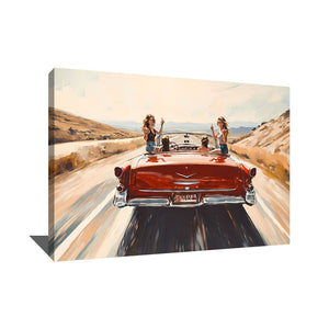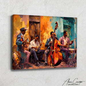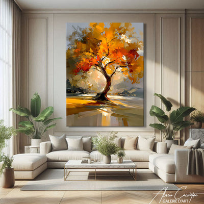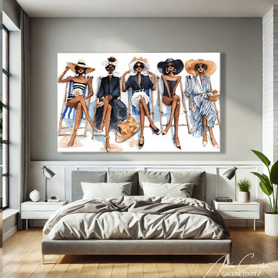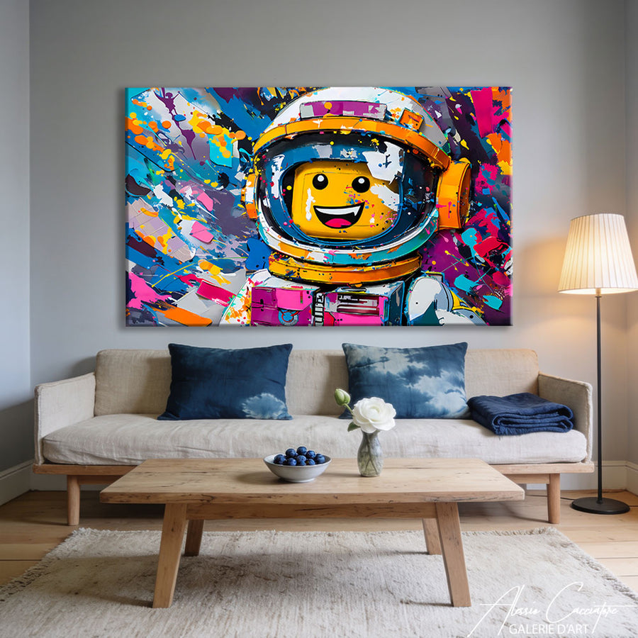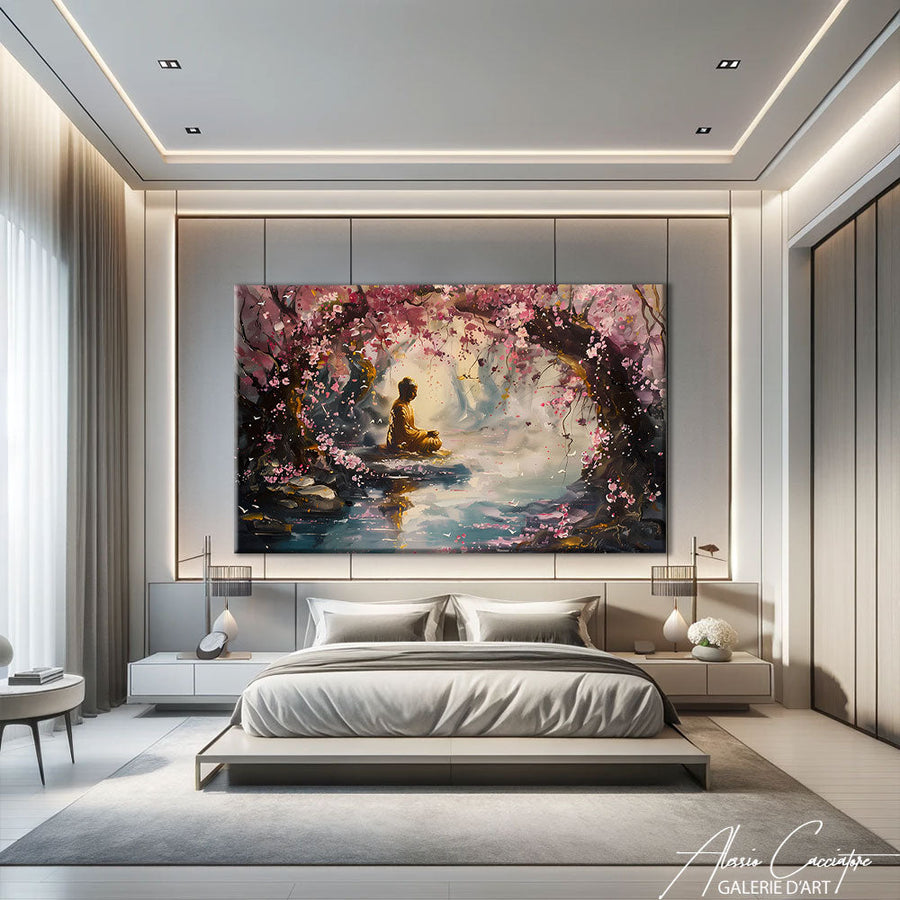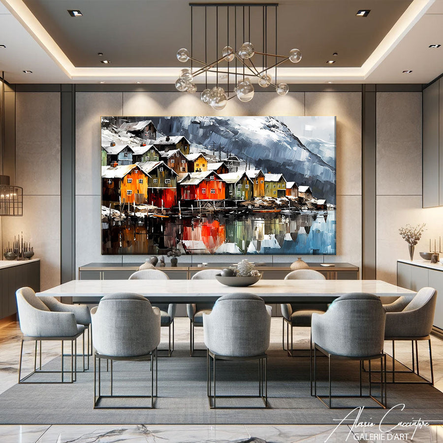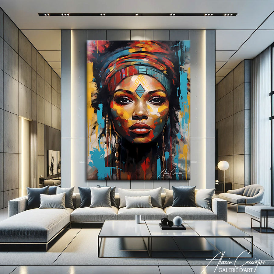

The first time a collector told me he had repainted his entire living room to match the room to one of my paintings, I realized that wall decor isn't just "filling a hole on a blank wall." It's a silent conversation between you and the space, between who you are and how you want to feel when you come home. After fifteen years of creating works for interiors around the world, I've seen walls transform into havens, statements, and sometimes even visual therapy. Here are ten concrete tips—some I apply in my own studio in Berlin, others inspired by my clients—to make your walls more than just a background.
1. Large Format: When One Piece Is Enough
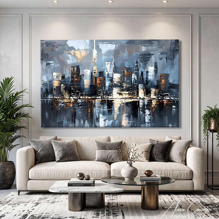
Frankly, if you have a 3-meter wide wall and cover it with ten small frames, you dilute the impact. A single XXL piece—120×150 cm minimum—anchors the space, giving it a backbone.
In my Parisian studio, I have a 4-meter triptych above the sofa. Nothing else on that wall. Visitors stop dead in their tracks when they enter. That's exactly the desired effect: creating a powerful focal point that structures the entire room.
The classic mistake? Choosing too small for fear of being "too much." But successful wall decor is precisely about daring to go big. A imposing painting in a living room is like a grand piano: it doesn't go unnoticed, and that's a good thing.
How to choose the right size
- Measure your wall and aim for 60-75% of its width for the artwork
- Leave at least 20 cm of empty space on each side
- For a sofa: the painting should be 2/3 of its width
An architect friend once told me, "A blank wall is a sentence without a verb." She was right.
2. Gold Wall Decor to Warm Up the Space

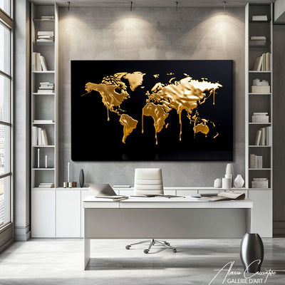
Gold is delicate. Poorly dosed, it turns into a Dubai palace. Well-integrated, it brings a luxurious warmth without being gaudy.
I use a lot of gold leaf in my "Urban Reflections" series—not as a flat color, but in touches, almost like accidents. What works is the contrast between matte and glossy: a deep black background with golden glints that catch natural light.
Gold wall decor works particularly well in three contexts:
Dark spaces where it reflects light and visually opens up the room. Last year, I delivered a piece to Berlin for a windowless hallway: the gold literally illuminated the passage.
Minimalist contemporary interiors where a touch of gold breaks the coldness of polished concrete or sleek Scandinavian furniture.
Mixed compositions: a gold frame around a black and white photograph, or an abstract work with gold pigments mixed with Mars black.
My advice: if you go for gold, limit yourself to one or two pieces maximum in the same room. And prefer matte or aged gold over mirror-like shine.
3. Garden Wall Decor: Bringing Nature Indoors
Since the pandemic, this demand has exploded. People want nature in their homes, but without the maintenance of a vertical garden that always ends up dying (let's be honest).
Garden wall decor is the perennial alternative: large-format botanical prints, photographs of forests, paintings of foliage. I have an entire series inspired by the gardens of the Palais Royal—those deep, almost black greens, with touches of filtered light.
What works:
- Saturated greens rather than pastel tones (more presence)
- Asymmetrical compositions: a branch extending out of the frame, an off-center fern
- Large vertical formats to create a sense of height, as if the ceiling is rising
Where to place garden wall decor
In a bathroom (if the artwork is protected), it immediately creates a spa atmosphere. In a bedroom, it soothes—I have a client in Munich who swears his blood pressure has dropped since he installed my "Canopy" series facing his bed.
Just avoid the cliché of the monstera leaf on a white background. It's 2025, that thing has been seen 800,000 times on Pinterest.
4. The Gallery Wall: Curating Like a Pro

Composing a gallery wall is 10% instinct and 90% planning. The people who master this all did the same thing: they laid everything out on the floor first.
Here's my method (which I also share with my clients):
- Gather all the pieces you want to hang
- Arrange them on the floor, move them around for 20 minutes
- Take a photo of the final arrangement
- Transfer it to the wall using a level and masking tape
The secret? Maintain consistent spacing between frames: 5-7 cm everywhere. No more, no less. It's this regularity that makes a busy wall legible.
I've seen too many attempts where frames are 3 cm here, 15 cm there, and the eye doesn't know where to rest. A successful wall decor guides the eye, it doesn't lose it.
Mix & Match: The Unwritten Rules
- Mix sizes but maintain stylistic consistency (all wood-framed, or all unframed, or all black)
- Vary subjects but stick to a palette of 3-4 dominant colors
- Include at least one larger piece that anchors the whole (otherwise it looks like confetti)
Something I really like: incorporating a small round mirror into the composition. It breaks the rhythm of rectangles and adds depth.
5. Nature Wall Decor: Beyond the Landscape
When people say "nature wall decor," most think of a Tuscan sunset or a Maldivian beach. Meh.
What interests me is raw, tactile, almost abstract nature: the macro bark of a redwood, the geological strata of a canyon, the veins of a leaf magnified 500 times. These images have an organic power that works even in an ultra-contemporary interior.
I have a collector in London who hung my "Mineral" series—photographs of Icelandic rock formations—in his concrete and steel loft. The contrast is striking: natural mineral facing industrial mineral.
The three approaches that work
The scientific approach: old botanical plates, enlarged naturalistic illustrations, framed herbariums. This works particularly well in offices or libraries.
The immersive approach: large-format photographs of forests, deserts, oceans—where the viewer feels like they're stepping into the image.
The abstract approach: natural textures (wood, stone, water) photographed so closely that the source is no longer recognizable. It becomes pure form, color, movement.
In my opinion, the third one ages best. Figurative landscapes quickly become dated.
6. Painting Wall Decor: The Irreplaceable Original

There's no denying it, a real painting on canvas—one with thickness, visible brushstrokes, sometimes even drips—is nothing like a print.
Painting wall decor is a physical object that interacts with light. As you walk past it, the angle changes, reflections move, you see the textures of the material. A print will always remain flat, no matter its quality.
I say this as an artist who also sells prints: both have their place. But if you have the budget for ONE original piece, put it where you spend the most time. Living room, bedroom, office. Not in the entryway where you only pass through.
What I observe with my collectors: once they've bought an original, they almost never go back to reproductions. The click has happened. They understand that a painted work is a companion that evolves with you, not just a decorative item you change every three years.
How to choose your first original painting
- Forget "investment": buy what moves you
- Prioritize emerging contemporary artists (more accessible than established names, and you directly support creation)
- Ask for a certificate of authenticity and keep it carefully
- If possible, see the artwork in person before buying (or ask for close-up photos of the texture)
7. The Powerful Monochrome: Black, White, or a Single Pigment
Monochrome intimidates. People fear it will be "too sober," "too cold," "not warm enough."
And yet, a large, entirely black painting with just variations in texture—that can be the strongest element in an interior. I have a piece in my personal collection: 2 meters of absolute black with almost invisible silver lines. Depending on the light, you see or don't see the pattern. This visual instability is fascinating.
Monochrome wall decor works because it lets the rest breathe. If your furniture is colorful, if you have a lot of wood, textiles, plants, a monochrome wall creates a visual resting point. Black and white monochrome paintings are among the most versatile in my gallery.
Three monochromes that always work
Deep black: immediate sophistication, works in 90% of interiors, makes surrounding colors pop.
Textured off-white: less obvious than it seems, ideal for very bright spaces where you want softness without emptiness.
Prussian blue or olive green: technically almost monochrome, neutral enough to play the role of black/white but with a touch of character.
Last year, I delivered an all-white series to a collector in Copenhagen. She installed it in an apartment entirely made of light wood and linen. The effect is both minimalist and incredibly rich—because the Scandinavian light makes every relief vibrate.
8. The Wall Accumulation: Controlled Clutter
Here, we are at the opposite end of the single large format. Wall accumulation is when you cover an entire wall—really entire—with dozens of small pieces.
Some of my clients have entire walls covered with postcards, small drawings, clippings, family photos, mini-canvases. This creates a cabinet of curiosities, artist's studio, obsessive collection atmosphere.
The trap: doing it halfway. If you put 5 images on a large white wall, it looks empty. If you put 80, it becomes a deliberate statement.
When I set up my first studio in Berlin, I covered a 6-meter wall with all my preparatory sketches, Polaroids, failed color tests. Visitors spent more time in front of that messy wall than in front of my finished paintings. There was a sincerity in it, a work-in-progress aspect that touched people.
Rules for successful accumulation
- Set a constraint: all black and white, or all postcard format, or all identically framed—a common thread prevents total chaos
- Use masking tape or clips rather than frames (easier to change)
- Add, remove, move regularly: an accumulation wall must live
- Keep the space around this wall uncluttered, otherwise the whole room becomes illegible
9. The Triptych or Diptych: Storytelling in Multiple Acts
A three-panel painting tells a story differently. The eye journeys from one panel to the next; there's a rhythm, almost a temporality.
I've been working a lot with triptychs for five years. What interests me is that the work breathes between the panels. These 5-10 cm of empty space between each canvas become an integral part of the composition: that's where the eye rests, where the imagination fills in the blanks.
A client from Zurich told me that he spends several minutes a day looking at my "Urban Fragments" triptych hanging opposite his desk. He says it's like three moments of the same day: dawn, noon, dusk. I hadn't thought of it that way when creating it, but that's exactly what happens: the viewer projects their own narrative.
How to hang a triptych without making mistakes
- Spacing between panels: 5 to 10 cm (never less than 3, never more than 15)
- The three panels must be perfectly aligned at the top (use a laser level if possible)
- Ideal viewing distance from the wall: 1.5 to 2.5 times the total width of the ensemble (too close, you don't grasp the overall composition)
The diptych is more discreet, but it works well in narrow spaces—a hallway, a staircase, an alcove.
10. The Evolving Wall Decor: Creating a Rotation
Here's something few people do that I highly recommend: don't consider your wall decor as definitive.
In my Parisian apartment, I installed a system of discreet ceiling rails. I can change four paintings in ten minutes. Every two to three months, I rotate them. This allows me to live with different works, to rediscover pieces I had stored away.
Some of my collectors do the same: they have a "reserve" of artworks and alternate them according to the seasons, their mood, or the guests they host. Evolving wall decor is like a playlist: you don't always play the same songs on repeat.
What bothers me a bit is this idea that once a painting is hung, it has to stay there for ten years. Why? Your interior is not a frozen museum. You have the right to change your mind, to get tired of something, to want something else.
Three ways to create a rotating system
The rail system (like in galleries): costs €150-300 but is ultra-practical. You only drill once, then you move things around at will.
Standardized passe-partout frames: buy 8-10 identical frames (say 50×70 cm) and just interchange the artworks/prints inside.
DIY picture rail: a simple wooden strip fixed to the wall, on which you rest the frames without drilling (ideal for rentals).
In my Berlin studio, I have a "test" section where I hang my new pieces for a few weeks before deciding if they join the catalog. This wall has become my wall decor laboratory—and honestly, it's perhaps the wall I prefer. It also inspires several of my works for offices and professional spaces.
Frequently Asked Questions
What height to hang a painting?
The classic rule: the center of the artwork should be 145-150 cm from the floor (average eye level). But adapt according to the furniture: above a sofa, leave 15-20 cm between the backrest and the bottom of the frame. In an entryway where people are often standing, you can go up to 155 cm. The idea is that the gaze naturally falls on the artwork without having to raise or lower your head.
How to hang a heavy painting without damaging the wall?
For artworks over 10 kg, use Molly bolts or toggle anchors if you're on plasterboard. On concrete or brick, expansion anchors are sufficient. My advice: invest €15 in a stud finder to locate load-bearing structures—that's where you'll securely anchor. And always double the attachment points for very large formats.
Can you mix photographs and paintings on the same wall?
Absolutely. What matters is having a coherent visual link: same color palette, same spirit (all contemporary or all vintage), or same type of framing. In my gallery, I often mix my acrylic paintings with photographic prints—as long as the overall composition remains legible and the artworks don't cannibalize each other, it works.
What budget should I plan for living room wall decor?
It varies enormously. A quality print in 70×100 cm costs between €80 and €250 depending on the finish. An original painting by an emerging artist: €400-1500. A large format by an established artist: €2000-8000. My advice: start with a strong piece (original if possible) and complement it with prints or second-hand finds. It's better to have one painting that truly moves you than three mediocre things just to fill space.
How to protect artwork from direct light?
Direct sunlight is the number one enemy of pigments. If you cannot avoid an exposed wall, use UV-filtering glass for framed works (filters 97-99% of UV). For unframed canvases, apply a protective varnish with a UV filter, or install curtains/blinds that you draw during the brightest hours. I have clients in Los Angeles who have invested in UV-blocking window films to protect their entire collection — it works remarkably well.
Does a dark wall visually reduce space?
This is a common misconception, but it's false if managed well. A wall painted black or midnight blue creates depth; it doesn't diminish it — especially if the other walls remain light. In my Parisian studio, I painted the main wall black and the space appears larger than before. The secret: good lighting (directional spotlights) and not overloading that wall. A single light-colored painting on it, and the effect is striking.
All works mentioned in this article are available on the gallery. Free worldwide shipping, 30-day money-back guarantee.