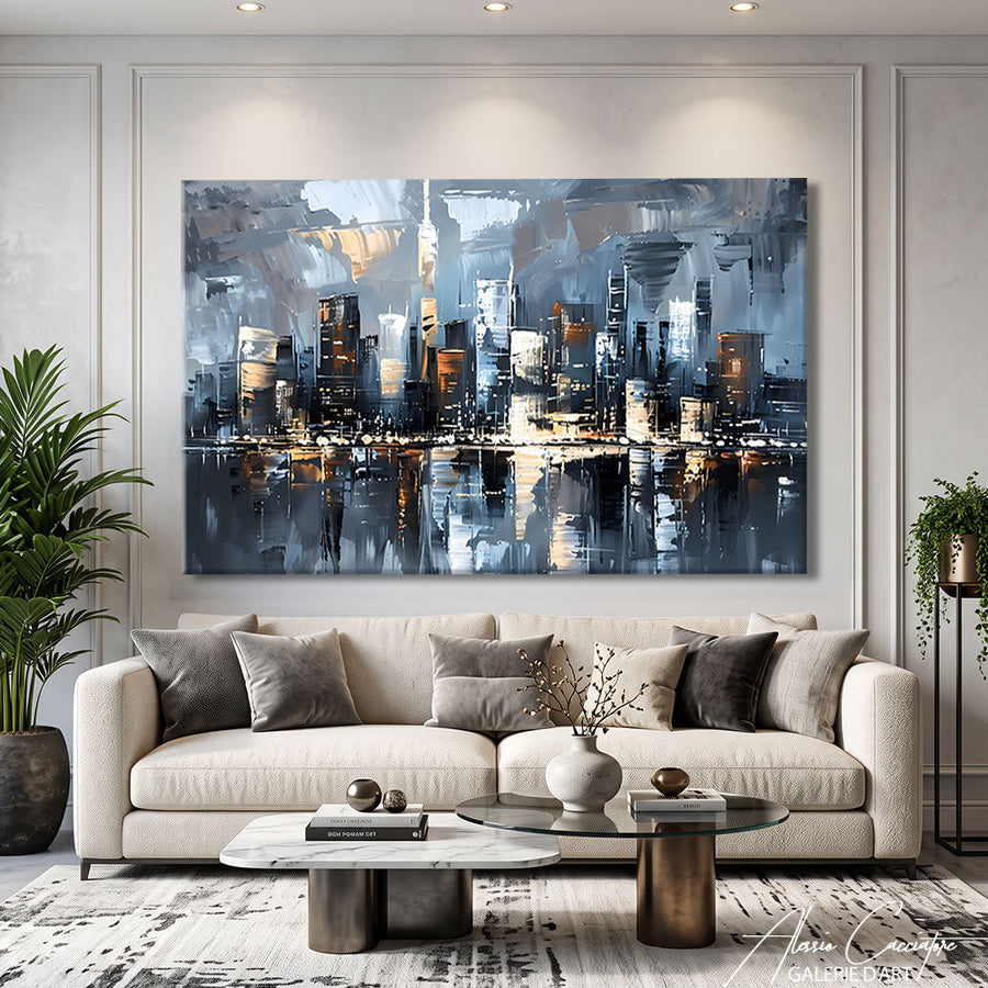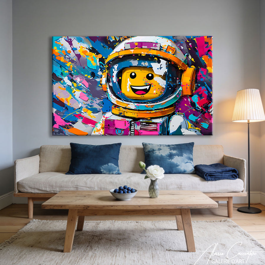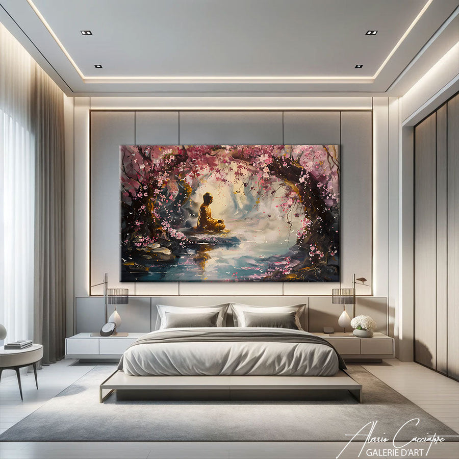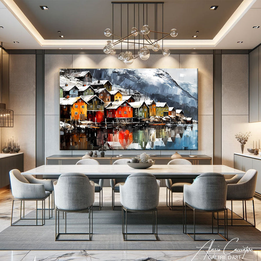

Two years ago, a couple came to the studio with a photo of their living room. Grey sofa, Ikea bookcase, green plants. They wanted “something that changes everything.” I showed them an urban triptych, 2.40m wide. They hesitated (“isn’t it a bit big?”), then hung it up. Three weeks later, an email: “We don’t recognize the room anymore.” That is exactly what good wall decor does for a living room: it transforms the space without touching the furniture. But between size, style, hanging height, and placement, there are rules to follow—otherwise, you risk putting a magnificent piece in the wrong spot and ruining the effect. In this article, I share my 10 concrete ideas for dressing up your living room walls with character, without falling into classic traps.
Why living room wall decor makes all the difference
The living room is the showcase of your home. It’s where you host guests, spend time, and watch Netflix slumped on the sofa. A bare wall really looks empty—even with high-end furniture.
A well-chosen living room painting immediately creates a focal point. It draws the eye as soon as you walk through the door. It adds dimension, depth, and ambiance. It also says something about you: your taste, your sensibilities, what speaks to you.
But be careful: a poorly sized or placed piece can produce the opposite effect. If it’s too small, it disappears. If it’s too cluttered, it suffocates the space. If it’s too high, it floats by the ceiling like a billboard.
That’s why it’s not enough just to buy a beautiful painting—you have to choose it for your living room, not for the gallery where you saw it under museum lighting.
Rule #1: Painting size (and the famous 60% rule)

The first mistake I see regularly: a small 40×60 cm piece lost above a 2.20m sofa. Visually, it just doesn’t hold up.
The 60% rule is simple: your painting (or wall composition) should cover about 60 to 75% of the width of the piece of furniture below it—sofa, console, sideboard. Not 100% (too cluttered), not 30% (too sparse). Somewhere in between.
A concrete example: a 2m sofa → a 120 to 150 cm wide piece of art. It could be a single large-format piece, or a composition of several paintings (diptych, triptych, gallery wall).
XXL painting or multiple smaller pieces?
Both work, but not in the same contexts. An XXL painting has more visual impact and presence. It structures the space and makes a stylistic statement. Ideal for contemporary or minimalist living rooms, or rooms with high ceilings.
Multiple smaller formats allow you to tell a story, vary styles, and create rhythm. But be careful: you need real coherence (color palette, theme, matching frames). Otherwise, it turns into a mess.
In my studio, I often recommend one large central piece + 1-2 satellite pieces. It balances impact and flexibility.
Idea #2: Hanging height (the magic 145 cm)
Another classic: hanging them too high. I’ve lost count of how many times I’ve seen art 1.80m off the floor, as if you’d have to stand on a chair to look at it.
The universal rule in galleries and museums: center the piece 145-150 cm from the floor. That is the average height of the human eye. It works in 90% of cases.
However.
In a living room, you must also consider the furniture. If you hang above a sofa, leave 15 to 25 cm between the backrest and the bottom of the painting. Too close: it suffocates. Too far: it floats.
If your ceiling is very high (>3m), you can go a little higher (160 cm to the center), but don’t overdo it. The piece should remain within sight when seated.
Personal tip: before drilling, tape the art to the wall with masking tape. Sit on your sofa. Live with it for 24 hours. You’ll see right away if it’s too high, too low, or just right.
Modern paintings for the living room: what style for which interior?

Choosing the style is where it becomes personal. But there are still some consistencies to respect—or intentionally break.
Minimalist contemporary living room
White walls, clean lines, Scandinavian or designer furniture. Here, a modern abstract painting works wonders: geometric, monochrome, or with a reduced palette (black/white/gold, blue/grey, earth tones). The art becomes the only point of color or texture.
Avoid formats that are too small or too busy: it breaks the sobriety.
Classic or Haussmann-style living room
Moldings, parquet floors, fireplace. A figurative or semi-abstract painting in a frame works well. Be careful not to fall into kitsch, however: a gilded framed reproduction of "Impression, Sunrise" really looks like a provincial museum.
A contemporary work with a classic subject (portrait, cityscape, revisited still life) creates an interesting contrast. That is what I often do: recognizable subject, modern treatment.
Industrial living room or loft
Bricks, metal, concrete. Here, anything goes: pop art, street art, urban photography, raw abstract. Large formats stand out naturally. Don’t be afraid of bright colors or bold compositions—the architecture can handle it.
Eclectic / Bohemian living room
A mix of styles, vintage finds, textiles, plants. You can afford a gallery wall with several works of varying sizes and styles. But keep a common thread: a shared color palette or a theme (travel, nature, portraits).
Idea #3: Playing with colors (or using none at all)
Color is the key to wall decor. It either unifies the space, energizes it, or destroys it.
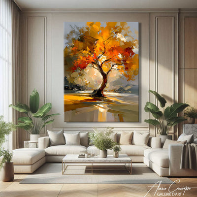
Option 1: Echo existing colors. Do you have teal cushions and an ochre rug? A painting with those tones will create immediate harmony. It’s the safe solution. It always works.
Option 2: Introduce ONE accent color. Is your living room grey/white/wood? A painting with red, mustard yellow, or emerald green will “wake up” the space. But be careful: only one strong color. Not three.
Option 3: Black and white. Timeless, elegant, structuring. A black and white painting adapts to almost any interior. It brings contrast without adding chromatic complexity. Ideal if you often change your textile decor: the art remains coherent.
In my work, I often use a limited palette (3 colors max) with plenty of off-white or grey. It lets the painting breathe and allows the client to integrate it easily without redoing all the decor.
Trendy living room wall decor: what’s working in 2024

Trends evolve, but some are here to stay. Here is what I see booming among my clients this year.
The return of contemporary figurative art
After years of abstract dominance, people once again want recognizable subjects: stylized portraits, majestic animals (lion, tiger, elephant), urban landscapes (New York, Paris, Tokyo). But treated in a modern way: solid color fields, graphic outlines, digital collage.
Textured materials
Flat paint is out. We want dimension, texture: palette knife painting, mixed media, inclusion of sand or paper. The work must have a physical presence, not just visual.
Panoramic formats
100×50 cm or 150×50 cm are exploding in popularity. They fit perfectly above a sofa, a console, or in an entryway. They visually lengthen the space. And they are often more affordable than a square of the same surface area.
The asymmetrical gallery wall
The perfectly aligned gallery wall, very Pinterest 2018, is giving way to freer compositions: frames of various sizes, without a strict grid, with empty space between works. It breathes better.
What no longer works: motivational quotes in brush script fonts, sunset-on-the-beach triptychs, poster-printed reproductions of famous works.
Idea #4: Strategic placement (not just above the sofa)
Everyone thinks “painting = above the sofa.” It’s true that it’s the natural spot. But there are plenty of other locations that work.
The wall facing the entrance
This is the first wall your guests see when entering. A striking living room decor painting here sets the tone immediately. Opt for a vertical or square format, well-centered.
Between two windows
If you have two windows side-by-side with a section of wall between them (60-100 cm), it’s perfect for a vertical format. It structures the space and balances the natural light.
Above a console or sideboard
The same logic as the sofa: 60-75% of the furniture's width, 15-20 cm above. You can add a small decorative object in front (vase, book, candle) to create a scene.
The wall adjacent to the sofa
If your sofa is against a wall, the perpendicular wall (facing you when seated) is an excellent spot. You get to enjoy the artwork while you’re settled in.
What never works: a painting behind a door, or in a dark corner without lighting. The art must be seen, otherwise, you might as well leave it in its box.
Idea #5: Lighting and highlighting
A work without lighting is like a movie without sound. You lose 50% of the impact.
Natural light is nice, but not enough. At night, your painting risks disappearing into the gloom. And if your living room faces south, be careful of UV rays that can fade certain works (especially paper prints).
Lighting solutions
Adjustable ceiling spotlights. Ideal if you have tracks or recessed spotlights. Aim one at the painting, at an angle of about 30°. Warm white light (2700-3000K), no overly cool LEDs.
Wall lamp above the painting. Very gallery-like, very elegant. There are discreet designer models available. Mind the distance: 20-30 cm above the frame to avoid casting shadows.
Indirect lighting. LED strip behind the frame, projecting a halo onto the wall. This creates a very contemporary atmosphere, especially in the evening. But it doesn't replace proper frontal lighting.
Golden rule: no direct light on a piece of art in full sun. No overly powerful halogen spotlight (it gets hot). No colored light (it distorts the hues).
Idea #6: dare to choose the artwork that not everyone likes
This advice might surprise you, but it's the one I give most often: stop looking for the artwork that everyone will like. It doesn't exist. And if it does, it's probably bland.
I sold a piece six months ago: a very graphic, almost brutal female portrait with bright red and black. The client loved it. Her husband found it "aggressive." She bought it anyway. Two months later, an email from the husband: "I end up only seeing that when I walk in. I think I love it."
A strong piece of art is polarizing. That's normal. It's actually a good sign.
If your painting triggers an "oh, that's pretty" from everyone, it's probably too consensual. If it triggers an "oh!" (surprise, questioning, debate), you've got something.
Your living room is YOUR space. Not your mother-in-law's, nor your guests'. The artwork should speak to you, move you, annoy you, question you. Not just decorate by default.
Living room painting decoration: how to harmonize with the rest of the decor
Once you have chosen your artwork, you need to integrate it harmoniously. A few concrete tips.
Repeat a color from the artwork elsewhere in the room
Does your painting have a touch of mustard yellow? Add a cushion, a throw, or a vase in that shade. It creates an immediate visual thread.
Play with textures
If your artwork is highly textured (palette knife painting, mixed media), balance it with soft materials elsewhere: linen, velvet, wool. If it is smooth and graphic, you can afford raw wood, metal, concrete.
Mind the frame
A contemporary painting often doesn't need a frame — or just a very thin black or white one. A baroque gold frame on a minimalist piece clashes (unless it's intentional and ironic).
If you are composing a gallery wall, unify the frames: all black, all white, or all light wood. It structures the whole.
Don't clutter
If you have a large living room painting, let it breathe. No need to add three shelves, five photos, and a clock. The artwork needs space to exist.
Bonus idea: smart buying (gallery, artist, print?)
Last question everyone asks: where to buy, and how much to spend?
The original artwork
This is the option I advocate (naturally). A unique, signed piece with a certificate. It has emotional value and sometimes investment value. Budget: from €300 for a young artist to several thousands for an established piece.
You buy directly from the artist (as on my site), or in a gallery. Advantage: you can talk to the artist, understand the process, sometimes ask for a custom piece.
Limited edition
A signed and numbered digital reproduction (e.g., 30 copies). Cheaper than a unique piece (€100-500), but with a certain scarcity. Ideal for intermediate budgets.
Decorative print
Sites like Desenio, Juniqe, or even Etsy offer prints from €20-80. No collection value, but visually it can be very successful. Opt for quality paper (300g minimum) and a real frame.
My personal advice: put your budget into ONE beautiful original piece rather than five cheap prints. In the long run, that's what makes the difference.
Frequently asked questions
What size painting for a 2-meter sofa?
For a 2m sofa, aim for a painting (or a composition) 120 to 150 cm wide, i.e., 60 to 75% of the sofa's width. It can be a large single format, a diptych, or a triptych. Below 100 cm, the visual effect will be too weak.
At what height to hang a painting in a living room?
The center of the painting should be about 145-150 cm from the floor, unless you hang it above furniture. In that case, leave 15 to 25 cm between the top of the furniture and the bottom of the painting. The goal: that the artwork is at eye level when you are seated.
What painting color to choose for a gray and white living room?
A gray and white living room is a neutral base that accepts almost all colors. You can either stay sober with a graphic black and white painting, or energize the space with an accent color: mustard yellow, teal, terracotta, or emerald green. Just avoid multiplying bright colors — choose one and stick to it.
Is it better to have one large painting or several small ones?
It depends on your style and space. A large painting has more impact, structures the room better, and suits contemporary or minimalist interiors. Several small formats allow you to tell a story and vary styles, but require real coherence (palette, frames, theme). If in doubt, a large format is often safer.
Can we mix different styles of paintings in a living room?
Yes, but methodically. Keep a common thread: a shared color palette, a theme (urban, nature, portraits), or an identical type of frame. An eclectic living room can handle mixing, a minimalist one much less so. If you are a beginner, stick to a dominant style and add a maximum of 1-2 different pieces.
How to light a painting in a living room?
Three options: adjustable ceiling spotlights (30° angle, warm light 2700-3000K), wall lamp above the painting (20-30 cm distance), or LED strip behind the frame for an indirect halo. Avoid direct sunlight (risk of fading) and overly powerful halogens (overheating).
All artworks mentioned in this article are available on the gallery. Free worldwide shipping, 30-day money-back guarantee.