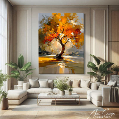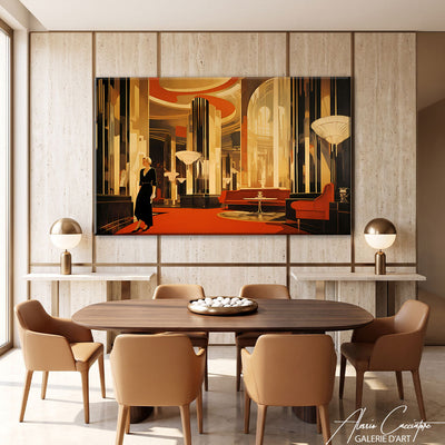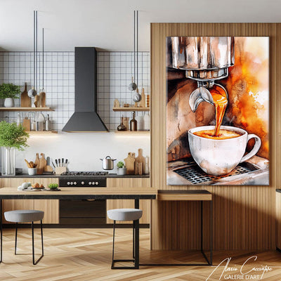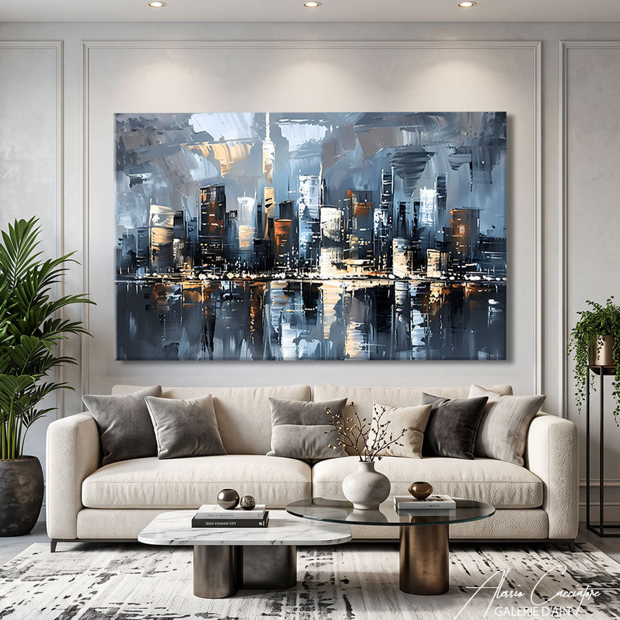

To decorate with yellow without overdoing it, reserve about 10% of the room for it and pair it with neutral or natural tones that let it breathe. A yellow painting is often the easiest way to introduce it, as it concentrates the color on a single point on the wall.
In this guide, we explain what yellow brings to an interior and how to choose the right shade. You will also find the colors to pair with it, the rooms to use it in, then our guidelines for choosing and hanging a yellow painting.
Why decorate with yellow?
Yellow is the brightest color on the color wheel: it warms up a room and brings a sense of energy and good humor. It acts like an indoor ray of sunshine, particularly useful in north-facing or poorly lit rooms.
Its strength is also its limit: used on large surfaces, bright yellow quickly tires the eye. This is why it is dosed in touches, on an armchair, a cushion, a light fixture or a painting, rather than on four walls. The 60-30-10 rule helps find the balance: 60% dominant color, 30% secondary color and 10% accent.
Which shade of yellow to choose?
The right shade of yellow depends on the desired atmosphere and the light in the room. Each shade has its character, from the softest to the most assertive, and does not pair with the same materials or furniture styles.
- Butter yellow and pale yellow: soft and bright, perfect for a bedroom or kitchen.
- Mustard yellow: warm and retro, it pairs with wood, leather and earthy tones.
- Ochre yellow: deep and natural, ideal in a bohemian or ethnic decor.
- Lemon yellow: bright and pop, to be reserved for small touches and passageways.
- Golden yellow: chic and warm, it dialogues with brass, velvet and black.
A yellow painting is a work whose dominant color or main accent is yellow: sunflowers, golden tree, sunny landscape or abstract composition. It is the most flexible way to adopt this color, because it colors the wall without repainting it and can change rooms as your desires change.
What colors to pair yellow with?
Yellow pairs most easily with neutrals that channel it, then with a few bold colors that create contrast. The comparison table below summarizes the safest combinations, the effect each produces and the rooms where they work best.
| Combination | Effect obtained | Recommended rooms |
|---|---|---|
| Yellow + white and beige | Bright and soft | Bedroom, kitchen |
| Yellow + anthracite gray | Graphic and modern | Living room, office |
| Yellow + navy blue | Contrasted and elegant | Living room, entryway |
| Yellow + sage green | Natural and fresh | Dining room, veranda |
| Yellow + black | Chic and assertive | Living room, dining room |
The yellow and blue duo is one of the most successful, because one is warm and the other cold: they balance each other naturally. To extend this idea, read our article on decorating with blue, as well as our guide for choosing the color of a painting according to your interior.
In which room to decorate with yellow?
Yellow finds its place in almost every room, provided you adapt the shade and the dose to the use of each. Living spaces support brighter tones, resting spaces softer and warmer tones.
The living room
In a living room, yellow works as a focal point: a painting above the sofa, echoed by a cushion or a throw. The yellow tree of life painting, with its golden tree on an amber background, warms up a light gray living room without saturating it, and its symbolism of growth accords well with a living space.
The dining room
The dining room supports a brighter yellow, because you share convivial moments there rather than rest. The abstract sunflower painting, with its yellow and pink flowers with colored drips, brings a joyful energy above a light wood table.

Abstract sunflower painting, available on canvas or plexiglass, from 60 x 40 cm to 120 x 80 cm.
The bedroom
In a bedroom, prefer warm and golden yellows, associated with beige, linen and wood. The sunflower woman painting, a portrait surrounded by yellow and orange flowers, hangs above a light headboard for a bright atmosphere without aggression.

Sunflower woman painting, on canvas stretched on a wooden frame or on plexiglass.
The kitchen, entryway and office
Pale yellow visually enlarges a small kitchen, while mustard yellow gives character to a dark entryway. In an office, a touch of yellow brings dynamism without distracting, provided you stick to a single object or a single canvas.
How to choose a yellow painting?
A yellow painting is chosen according to three criteria: the dominant shade, the subject and the format. The shade must recall an element already present in the room, like a cushion, a light wood or a brass light fixture, so that the canvas seems to be part of the decor.
As for the subject, sunflowers remain the yellow motif par excellence, cheerful and easy to live with: our collection of sunflower paintings offers many interpretations, from realistic to abstract. Golden trees, sunny landscapes and abstract compositions offer more sober alternatives.
Which format to choose?
The format is deduced from the piece of furniture placed underneath: the work must occupy about two-thirds of its width. Count a 60 x 40 cm above a console of about 90 cm, an 80 x 60 cm above a sideboard of about 120 cm and a 120 x 80 cm above a sofa of about 180 cm.
Canvas or plexiglass?
The paintings presented exist on canvas stretched on a wooden frame, for a warm result, or on plexiglass with hanging rail included, for a sharper and more contemporary effect. Prices start at €89, delivery is free and you have 30 days to change your mind.
At what height to hang a yellow painting?
A yellow painting is hung with its center between 145 and 160 cm from the floor, at eye level. Above a sofa or a headboard, leave 20 to 25 cm between the piece of furniture and the bottom of the frame so that the whole remains visually linked.
If you opt for several yellow canvases in a diptych or triptych, space them by 5 to 8 cm and align them on the same line. Keep a common shade from one canvas to another: it is what gives coherence to the composition and avoids the patchwork effect.
FAQ: decorating with yellow
What color goes best with yellow?
The colors that go best with yellow are white, beige and gray, which channel it without competing with it. For a more marked effect, navy blue and black create an elegant contrast, while sage green brings a natural and fresh note.
Does yellow enlarge a room?
Yes, a pale or butter yellow can give an impression of space, because it reflects light and warms the walls. The more intense yellows, like mustard or ochre, have the opposite effect when they cover large surfaces: reserve them rather for accessories and paintings.
What quantity of yellow to use in a room?
For a balanced decor, reserve about 10% of the room for yellow, that is a few well-placed touches. A painting, two cushions and a light fixture are often enough. The rest is shared between a dominant neutral color and a softer secondary color, like beige or gray.
Which yellow painting to choose for a living room?
For a living room, choose a yellow painting whose shade recalls an element already present, like a cushion or a light wood. Sunflowers bring cheerfulness, a golden tree more serenity. Its format must cover about two-thirds of the width of the sofa.
Is yellow suitable for a bedroom?
Yes, yellow is suitable for a bedroom if it remains soft and warm: butter yellow, light ochre or golden. Associated with beige, linen and wood, it creates a bright and peaceful atmosphere. Avoid lemon yellow on large surfaces, too tonic for a resting room.
In summary
- Yellow is dosed in touches, around 10% of the room.
- Neutrals channel it, navy blue and black highlight it.
- A yellow painting is the easiest way to adopt it and make it evolve.
- The center of the work is placed between 145 and 160 cm from the floor, 20 to 25 cm above the sofa.
To find your touch of sunshine, browse our collection of yellow paintings, on canvas or plexiglass from €89.