
A question comes up at the gallery almost every week: "Isn't a modern floral painting a bit old-fashioned?" Honest answer: it can be. A meticulously realistic bouquet in a gold frame does indeed feel like a dining room from 1985. But contemporary floral art has little in common with the still lifes of the past: tight cropping, thick texture, bold colors, sometimes bordering on abstraction. Well-chosen, it is one of the few subjects capable of warming up a room without weighing it down. The trick is knowing which flower, which palette, and above all, which wall. That is precisely what we are going to unravel here, room by room.
What makes a modern floral painting… modern?
It is not the subject that dates a work, but its treatment. I have seen peonies painted in 2023 that felt like they came out of an attic, and poppies that gave a Parisian living room incredible energy. The difference lies in three or four very concrete choices.
- The framing. The flower is cut off by the edge of the canvas; we don't see the entire vase, sometimes no vase at all. This "off-frame" perspective is what distinguishes the modern from the decorative.
- The texture. Visible impasto, deliberate drips, palette knife strokes: the painter's gesture remains legible. A flower that is too smooth quickly falls into the realm of illustration.
- The palette. Either very tight (two or three shades maximum) or boldly saturated. Soft pastel camaïeu is what ages the worst.
- The background. Neutral flat tints, raw textures, or deep black backgrounds—rather than window scenery or embroidered tablecloths.
If you are unsure about interpreting a work in general, our article modern floral paintings: how to choose them well details the criteria for print and frame quality, which I will not repeat here.
Which flower for which atmosphere?
Every bloom carries a different emotional charge. This is what should guide your choice, well before the color of the sofa.
Peonies and roses: softness, without mawkishness
These are the flowers of generosity. Round volume, cascading petals—they instantly soften a room that is too geometric. My advice: opt for a very close-up, almost macro version, where the flower becomes a landscape. Conversely, avoid the complete bouquet placed right in the center—that is where the subject slides into cliché.
Poppies and red blooms: the accent that awakens
Red is a pigment of tension. A single poppy on a dark background is enough to provide rhythm to an entire wall. I recommend it for very neutral interiors—beige, linen, pearl gray—where it plays exactly the role of a red cushion, but much more elegantly.
White flowers: understated luxury
Magnolias, orchids, white peonies on a light background: this is the choice for high-end interiors that do not want to shout. The effect depends entirely on the texture—without relief or subtle contrast, white on white becomes flat. Always check that there is gray, beige, or green in the shadows.
Abstract blooms: when the flower becomes a pretext
My favorite category, by far. Here, one guesses a corolla without ever identifying it. These works behave like abstract paintings while retaining the warmth of the botanical—an excellent compromise for those who are intimidated by pure abstraction.
In which room should you hang a modern floral painting?
The living room: large format, above the sofa
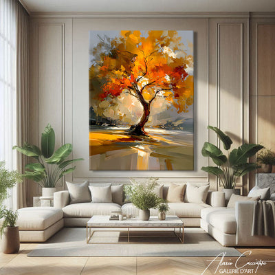
This is the most obvious location, and the one most often botched. The rule I consistently apply: the piece should occupy about two-thirds of the sofa's width, no more, no less. A painting that is too small above a three-meter-long seat looks like a postage stamp. For the living room, a colorful palette works very well: it is the room where you entertain, and it can handle the energy.

The bedroom: calmed palette, vertical or square format
In the bedroom, we turn down the volume. Powder pinks, off-whites, muted greens. Avoid bright red facing the bed: it’s pretty for five minutes, but exhausting over time. Instead, hang it above the headboard or on the side wall that you see when waking up—a detail that is always forgotten and changes everything.

The office and the dining room: the subject that keeps the conversation going
We rarely think of this, which is a mistake. In an office, an abstract bloom softens a space that is often too functional without distracting—unlike a landscape, which makes you want to go elsewhere. In a dining room, flowers have an unbeatable advantage: they fuel conversation without imposing an opinion, which no portrait really does.

The entryway and the hallway: the vertical format wins
A hallway is viewed from an angle and up close. A large format is unreadable there. Prefer a narrow vertical one, or two canvases aligned at regular intervals. It is also the ideal place to dare a color you wouldn't commit to in the living room: you pass through it, you don't stay there.
The two most common color errors
The first: wanting to match the flower in the painting to an object in the room. A red poppy facing red curtains, and the two cancel each other out. The painting should respond to the room, not repeat it. Instead, look for a subtle echo—a tone present at 10%, not 50%.
The second: neglecting the wall itself. A light canvas on a white wall needs contrast, otherwise it disappears. On a dark wall, however, a light bloom takes on spectacular depth. If you are painting, do it after choosing the artwork, never the other way around—it is infinitely simpler.
As for height, there is only one landmark: the center of the work should be about 1.50m from the floor, except above a piece of furniture, where you leave 20 to 30 cm above the tabletop. All our canvases are stretched on wooden frames and can be hung directly, without additional framing.
Frequently asked questions
Is a modern floral painting suitable for a masculine or minimalist interior?
Absolutely, provided you choose a tight palette and a graphic treatment. A black-and-white bloom, or a single flower on a deep background, is neither feminine nor romantic: it is a composition, period.
Can you hang several in the same room?
Yes, but follow a simple rule: either the same palette with different framing, or the same framing with different palettes. Never vary both at the same time, or the wall becomes "chatty."
Should I choose the plexiglass option?
It adds extra shine and depth, which is particularly flattering on very colorful blooms. On a light and matte work, the canvas alone remains more balanced. It is a matter of rendering, not protection.
Where to start
Always start with the wall, never with a sudden crush. Measure, note the light in the morning and evening, look at what is around it—only then, let emotion speak. Our selection of floral paintings covers all the styles mentioned here, from bold poppies to nearly abstract blooms, in horizontal, vertical, and square formats. And if you are tempted by the freest side of the subject, our article on the abstract floral painting extends this reflection exactly. Take your time: a well-chosen canvas will stay on the wall for twenty years.