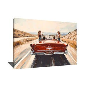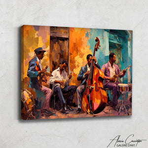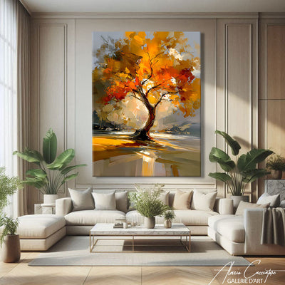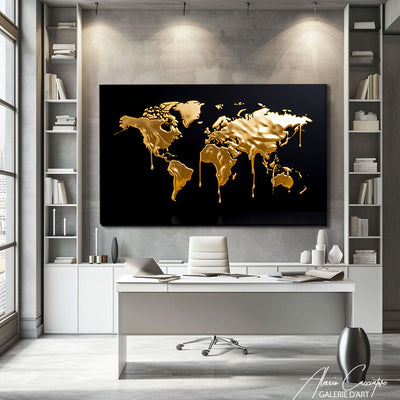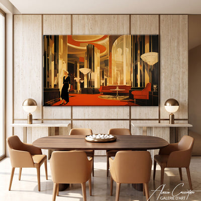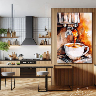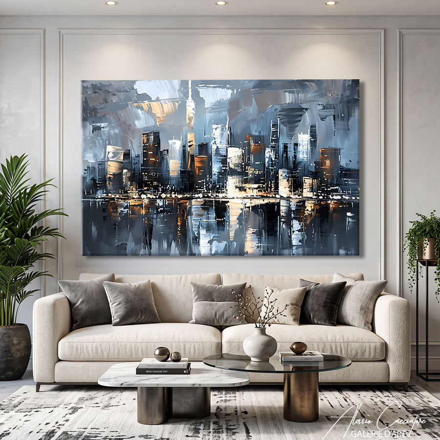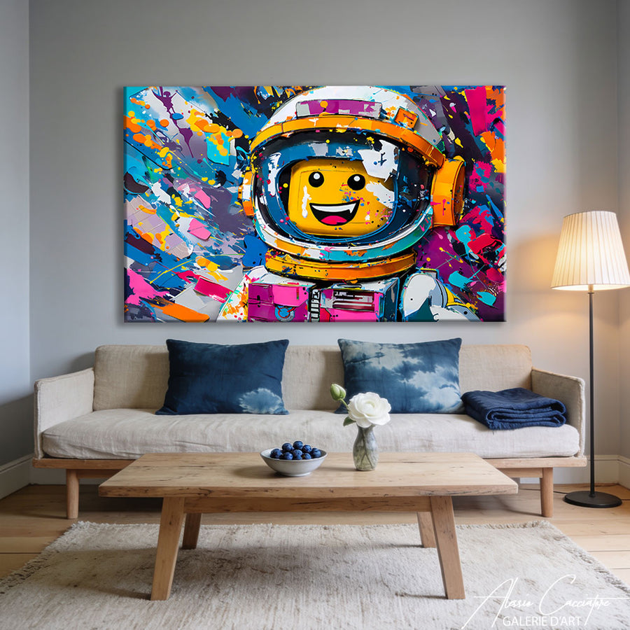

I sold my first kitchen artwork to a client who was looking for "something to hide a grease stain on the wall." Not the most glamorous start, but it opened my eyes: the kitchen is THE room we systematically neglect when it comes to decor. Yet we spend 2-3 hours a day there, drinking coffee, chatting, and living. And frankly, between the firefighter calendar and the fridge magnet, there's plenty of room for improvement.
Why the kitchen remains the poor relation of wall decor
In 80% of the homes I visit, the kitchen is bare. Or worse: decorated with purely functional objects masquerading as decor.
The living room? Impeccable. The bedroom? Carefully arranged. The kitchen? An IKEA painting bought in 2012 and never changed.
The false good reasons we give ourselves:
- "It's a technical room, not an exhibition space"
- "With the humidity, it will get damaged"
- "The walls are already taken up by furniture"
- "Anyway, nobody looks"
Except that.
The kitchen has become the central room of our lives. Open kitchens, islands, lingering breakfasts, aperitifs. We no longer just cook pasta there: we live there.
And visually, a bare wall in a kitchen screams "temporary furnished" or "moving in progress." Even if everything else is impeccable.
The real constraints of kitchen artwork (and how to manage them)

Let's be honest: hanging a piece of art in a kitchen is not like in a living room. There are real constraints.
Humidity and steam
The great panic. "My painting will warp with the steam from the pots!"
True... if you hang it 30 cm from your ceramic hob. False everywhere else.
In my studio, I test my canvases in ambient humidity conditions close to 70-75% for weeks. A normal kitchen, even with daily cooking, stays between 50 and 60%.
What really works:
- Canvas stretched on a frame (the fabric breathes)
- Satin or glossy varnish (protects the surface)
- Acrylic glass rather than classic glass (not afraid of thermal shocks)
- Printing on aluminum (zero humidity concerns)
What works less well:
- Unframed paper
- Watercolor without protective glass
- Untreated raw wood
Splashes and stains
Here, it's mainly a matter of placement. Nobody puts a painting directly behind the cooking area. That's common sense.
But above a coffee corner, an island, a serving cart, a wall facing the table? Zero risk.
I have a client who installed one of my pop art paintings right above her coffee machine. Three years later, it's perfect. Because she doesn't make her coffee explode like a grenade.
Direct light
If your kitchen has a large window that gets direct sunlight 6 hours a day, avoid classic photo prints or watercolors.
Opt for canvas artworks with resistant pigments, or aluminum prints (unchangeable).
Personally, I use pigment inks guaranteed for 100 years. Not because I'm paranoid, but because it annoys me to see a work fade in 18 months.
What size artwork for what kitchen
Size is 70% of the success of a kitchen artwork. Too small, it looks like a trinket. Too big, it overwhelms.
Closed kitchen (< 10 m²)
Ideal format: 40×60 cm or 50×70 cm.
No room for an XXL, and that's okay. A well-placed compact format does the job perfectly. Above a narrow countertop, a small table, or on the only available wall space.
Prioritize vertical compositions: they add height, especially if your ceilings are low.
Open kitchen connected to living room (15-25 m²)
Ideal format: 60×80 cm, 70×100 cm, or even 80×120 cm if the wall allows it.
Here, you have space. And most importantly, the kitchen is visible from the living room: it's part of the overall decor. A too timid painting will get lost.
If you have a central island, a large format above it (or on the wall facing the island) creates a real focal point.
Personal tip: In an open kitchen, consider a diptych or triptych. Three small aligned formats (e.g., 3×40×40 cm) give a much more contemporary effect than a single large format.
Subjects that work (and those to avoid)

Now, we're entering tricky territory. Because yes, there are subjects that loop endlessly in kitchens. And some give me hives.
"Culinary" themes (with moderation, please)
Cupcakes, coffee cups, wine quotes, stylized flat-design vegetables…
I understand the logic: "it's a kitchen, so I put a kitchen painting."
But frankly, it's like putting a bed painting in a bedroom. Too literal. It lacks breathing room.
What can pass:
- A contemporary still life (not a fruit basket in the Flemish style)
- Modern typography with a sober quote
- A black and white macro close-up of citrus fruits
What no longer passes:
- "Coffee is always a good idea" in cursive letters
- Pastel cupcakes
- The vintage "Kitchen" enamel sign
Abstract subjects (safe bet)
Abstract art is the kitchen's joker. It works everywhere, never gets old, and adapts to decor changes.
An abstract painting with warm tones (ochres, reds, oranges) warms up a white kitchen. A black and white painting structures a colorful kitchen.
In my catalog, geometric abstracts and gestural compositions are the bestsellers for kitchens. Because they bring movement without telling a story.
Urban landscapes and art photography
New York in the rain, Tokyo at night, an Italian alley… This works incredibly well in a modern kitchen.
The advantage: it opens up the space. A small closed kitchen with a large format of a night city gives the impression of a window to the world.
My client with the painting above her coffee machine? It's a black and white Brooklyn Bridge. She tells me she "goes to New York" every morning.
It's silly, but that's exactly what a painting should do.
Where to actually place a painting in your kitchen
Because "on the wall" is a bit vague.
Above the table or dining area
The prime location. You sit there morning, noon, and often evening. Might as well have something pleasant to look at.
Ideal height: the center of the painting 1.50-1.60 m from the floor (eye level when seated).
Avoid centering the painting directly above the table: shift it slightly, it adds dynamism.
On the wall facing the entrance
If your kitchen is open, this is often the first wall you see when entering the living area. Might as well make a real statement there.
Generous format recommended (minimum 70×100 cm), bold colors.
Above a countertop or serving cart
Provided there's no cooking directly below. A coffee corner, a serving cart, a bar cabinet: perfect.
Prefer a horizontal format (60×40 cm or 80×60 cm) that matches the width of the furniture.
Where you should ABSOLUTELY NOT put a painting:
- Behind the cooktop (obviously)
- In a dark corner with no light
- Too high (above 2 m), you never see it
- 15 cm from the ceiling "to fill the space": it looks bad
Coordinating the artwork with the kitchen style

An artwork isn't just "pretty" in an absolute sense. It has to speak the same language as your kitchen.
Minimalist white kitchen
Here, you have carte blanche. Anything goes.
But be careful not to fall into the "all white" trap: a black and white painting in an all-white kitchen can end up looking like a hospital.
My advice: dare to add a strong splash of color. A pop art painting, a red and black abstract expressionist piece, an urban landscape at sunset.
White is a perfect backdrop. Take advantage of it.
Wood kitchen and natural tones
Light wood, stone countertop, Scandinavian ambiance…
Prioritize earthy tones: ochre, rust, olive green, deep beige. Or a highly contrasted black and white to add structure.
Avoid fluorescent or overly saturated colors: they clash with the softness of wood.
Black or anthracite grey kitchen
Chic, dramatic, but it absorbs light.
Solution: an artwork with white, gold, or bright colors. You need contrast.
A large off-white / gold / black abstract piece works wonders. Or a very colorful pop art portrait to break the seriousness.
Colorful kitchen (blue, green, terracotta…)
If your furniture is already colorful, go for an artwork in neutral tones: black and white, grey, beige, off-white.
Or, if you're adventurous, go for tone-on-tone: a duck-egg blue kitchen with a navy blue and gold abstract painting. But you have to own that choice.
Realistic budget for a kitchen artwork (without getting ripped off)
I'll be direct: art prices can be outrageous. But for a kitchen artwork, there's no need to sell a kidney.
Framed art print (50×70 cm): 80-150 €
This is the clean entry-level. A real museum-quality print, a decent frame, acrylic glass.
Below 80 €, you're looking at an Aliexpress poster printed on fax paper. It'll last 6 months.
Canvas print stretched on a frame (60×80 cm): 120-250 €
Good value for money. No frame to buy, ready to hang, professional finish.
Pay attention to the canvas weight: below 320 g/m², it looks cheap.
Original small format artwork (40×60 cm): 250-600 €
Here, you're getting an original. Unique piece, signed, certificate of authenticity.
In my own gallery, an original 40×60 cm starts at 280 €. Because I spent 8 hours on it, with my hands, my brain, and sometimes my frustration.
Large format original (80×120 cm): 800-2000 €
For spacious open kitchens. It's an investment, but an original work of this size structures the entire room.
And frankly, between 1200 € for a unique painting that accompanies you for 20 years and 1200 € for a new IKEA sofa that sags in 3 years… The math is simple.
My personal recommendations (as an artist who lives in his kitchen)
Because yes, I have a painting in my kitchen. And no, it's not one of mine (that would be a bit narcissistic).
It's a serigraph by a Berlin artist that I bought in a gallery in Kreuzberg. 60×80 cm format, red and black geometric composition, hung above my table.
I look at it every morning and have for 4 years. I still like it just as much.
What I really recommend:
1. Choose a piece that doesn't "look like decor"
If you think "oh, that will go well with my tea towels," you've missed the point. An artwork must exist for itself, not to match the backsplash.
2. Prioritize a compact but impactful format
Better a bold 50×70 cm than a bland 100×150 cm.
3. Avoid series (unless it's truly intended)
One strong piece > three small anonymous formats bought as a set on a decor site.
4. Always hang at eye level
Not 2 meters up "to fill space." If you have to crane your neck to see it, it's too high.
5. Change it if you get tired of it
An artwork that you get tired of after 6 months is normal. You don't have to live with it until you die. Resell it, give it away, change it.
Art is not furniture. It's alive.
Frequently asked questions
What type of artwork is resistant to kitchen humidity?
A canvas stretched on a frame with protective varnish, an acrylic glass print, or an aluminum print are the most resistant formats. Avoid unframed paper and unprotected watercolors. In a normal kitchen (without direct steam), a classic canvas will last for years without issue.
What size artwork for a small kitchen?
For a kitchen under 10 m², opt for a 40×60 cm or 50×70 cm format. A vertical format adds height and doesn't clutter the space. A too-large painting in a small kitchen visually overwhelms the room.
Can you hang a painting above the cooktop?
No, this is the only area to truly avoid. Steam, grease splashes, and direct heat will damage any artwork. However, above a dining area, a non-cooking countertop, or facing the island, there's no problem.
Should you choose an artwork with culinary themes for a kitchen?
Absolutely not. Overly literal paintings (coffee, cupcakes, food quotes) quickly become dated and boring. Opt for an abstract piece, an urban landscape, or a modern composition that breathes. Art should open up the space, not reduce it to its function.
What's a reasonable budget for quality kitchen artwork?
Expect to pay 80-150 € for a quality framed print (50×70 cm), 120-250 € for a canvas print stretched on a frame (60×80 cm), and starting from 250 € for a small-format original artwork. Below 80 €, you're looking at low-end posters that will yellow quickly.
How to hang a painting in an open kitchen?
In an open kitchen, the painting is part of the overall decor visible from the living room. Choose a generous format (minimum 70×100 cm) on the main wall, at eye level (center of the painting 1.50-1.60 m from the floor). You can also opt for a triptych above the island for a contemporary effect.
All works mentioned in this article are available on the gallery. Free worldwide shipping, 30-day money-back guarantee.