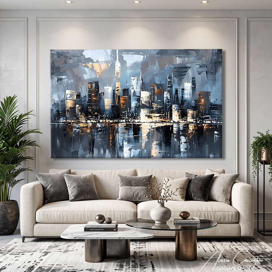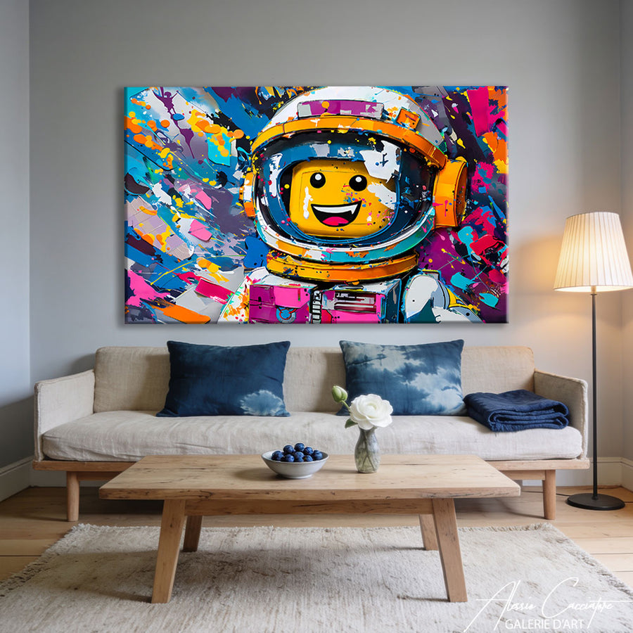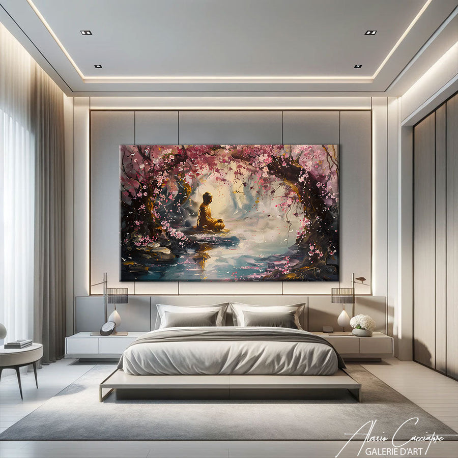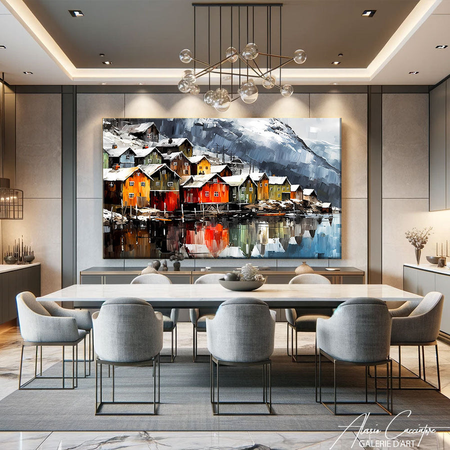

The first time a client asked me to divide one of my canvases into three distinct panels, I initially thought he was crazy. Then I understood: he was looking to create rhythm. A triptych isn't just a work cut into pieces. It's a visual narrative, a breath, a way to transform a mundane wall into a staged scene. In my Parisian studio, I regularly compose these three-act pieces – and frankly, it's become one of my favorite formats.
Why a triptych works where a single canvas fails
Some walls literally swallow up a single artwork. Too big, too empty, too cold.
The triptych wall art solves this problem through intelligent fragmentation. Instead of a compact visual mass, you create three anchor points that guide the eye. It's like a sentence with three well-placed commas: it breathes.
In large spaces – lofts, open-plan living rooms, modern offices – the triptych interacts better with the architecture. It creates movement without oversaturating. Each panel works alone, but together they tell a larger story.
The narrative sequence effect
When I compose a triptych, I think cinema. Panel 1: the exposition. Panel 2: the climax. Panel 3: the resolution. This can be abstract – evolving color gradients – or figurative – a character going through three states.
What annoys me about some commercial triptychs is that they foolishly cut up a panoramic photo. No intention. A true triptych composes each act.
The three main composition families for a decorative wall triptych

Not all triptychs are created equal. After dozens of them, I've identified three main compositional logics.
The panoramic triptych
The image unfolds horizontally across three panels. Cityscape, marine horizon, street scene. It's the best-selling format, but also the most delicate: if the spacing between panels is miscalculated, the work fragments instead of unifying.
The rhythmic vertical triptych
Three identical portrait-format panels, often three variations of the same motif. For example: three portraits of lions under different lights, or three material studies. I like this format for narrow, tall walls – stairwells, hallways, office walls.
The asymmetrical triptych
My favorite. A large central panel + two smaller side panels. This creates a natural visual hierarchy; the eye knows where to look first. Perfect for centered compositions – portraits, mandalas, frontal architecture.
Choosing the right dimensions: what no one tells you
Salespeople throw standard figures at you: 3x40x80cm, 3x50x70cm. But what size is your wall?
Here's my empirical rule, tested on at least fifty installations: the triptych should occupy 60 to 75% of the wall's width. Less, it floats. More, it smothers.
For a 2m sofa, I generally recommend three 50x70cm panels with 10cm spacing – a total of 170cm. This leaves visual margin on each side.
Spacing between panels: the underestimated variable
In my studio, I've noticed that 8 to 15cm between each panel is the optimal interval. Below 8cm, the panels visually merge. Above 20cm, they separate.
On very wide walls (4m+), I sometimes dare to go up to 25cm – but only if the artwork has a strong panoramic composition that supports this breathing space.
Triptych wall art: how to install without wrecking your wall

Installing a triptych is 30% technical, 70% visual flair.
Before even grabbing the spirit level, tape three A4 sheets to the wall at the approximate size of your panels. Step back 3 meters. Adjust. Live with it for 24 hours if you can. It sounds ridiculous, but it avoids €200 mistakes.
The paper template method
Cut three rectangles to the exact dimensions of your panels from kraft paper. Position them on the wall with painter's tape. Mark the fixation points with a pencil through the paper. Remove the paper, drill, fix.
I've seen too many people measure to the millimeter with a tape measure and get it wrong. The human eye doesn't perceive perfect level – it perceives visual balance. Trust your feelings.
The case of fragile plaster walls
If your wall cannot support traditional wall plugs, two options: Command adhesive hooks (up to 2kg per hook) or picture rails with invisible cables. I use the second solution for my own triptychs – it allows for readjustment without re-drilling.
The mistakes I see all the time (and how to avoid them)
After dozens of botched installations that clients showed me in photos, here are the top 3 recurring mistakes.
Mistake 1: Triptych too high
The museum rule says: center of the artwork 1m60 from the floor (average eye level). But in a living room with a sofa, lower it to 1m40-1m50. The artwork should interact with you seated, not standing.
Mistake 2: Poor color scale
A very colorful triptych on an already cluttered wall (shelves, plants, frames) creates chaos. If your decor is dense, opt for a black and white or monochrome triptych. Let the artwork breathe.
Mistake 3: Ignoring natural light
A triptych with a lot of glare under glass placed opposite a window is a guarantee that you'll never truly see it. Prefer canvas prints or matte aluminum for walls exposed to direct light.
My favorite triptychs: three concrete examples from my catalog

I won't give you an academic list. Here are three pieces I've created that illustrate three radically different approaches to the triptych.
1. Urban series New York in black and white
Three 60x80cm panels. Manhattan under three lights: dawn, midday, dusk. Vertical format, repetitive rhythm, chromatic unity. This triptych works because each panel tells the story of time passing – it's literally a film in three still images.
2. Asymmetrical golden abstraction
A large central panel 80x120cm + two side panels 40x120cm. Mixed media: acrylic, gold leaf, thick texture. The asymmetry creates visual tension that keeps the eye engaged. Installed in a lawyer's office in Berlin, it creates a presence without being aggressive.
3. Wildlife triptych: lion, elephant, cheetah
Three identical 50x70cm panels, three frontal animals on a neutral background. Classic, almost heraldic composition. What works here is the symmetry of the gaze – each animal stares at you. In a contemporary living room with minimalist furniture, it anchors the space.
DIY triptych or artist's work: the true cost of quality
I'm often asked: "Can't I just print three photos at a printer?"
Yes. You can.
But here's what you won't see on a low-cost print: the depth of the blacks, the subtlety of the transitions, the texture of the medium. An artist's triptych often uses premium materials – stretched canvas on a wooden frame, Dibond, Plexiglas – with giclée prints or mixed media techniques.
I did the test in my studio: same image, three different supports. The framed poster version at €60 vs. the premium canvas version at €280. The difference is stark in real life – even if they look similar in an Instagram photo.
The killer argument for artist's work
A signed triptych is also a unique or limited edition piece. You won't find the same one in 50,000 IKEA living rooms. To my mind, that's what justifies the price difference: you're not just buying a decoration, you're investing in visual singularity.
How a triptych wall painting transforms a professional space
Offices, lobbies, coworking spaces: the triptych has found an ideal playground there.
Why? Because in a professional context, you're looking for both visual impact (making an impression) and sobriety (remaining professional). The triptych does both: it structures the space without being illustrative.
I installed an abstract blue and silver triptych in the lobby of a Parisian consulting firm. Three 70x100cm panels, panoramic composition. The director's feedback: "It finally gives an identity to this space that was dead."
In individual offices, I recommend the vertical format. A 40x60cm portrait triptych above a low piece of furniture dresses the space without overwhelming it. And frankly, it's classier than a motivational quote poster bought on Etsy.
Frequently asked questions
What height should a triptych painting be hung above a sofa?
The bottom of the triptych should be between 15 and 25cm above the sofa backrest. Too high, it loses visual connection with the furniture. Too low, it gives the impression of floating. For a standard 90cm high sofa, this places the center of the artwork around 1m40-1m50 from the floor – perfect for comfortable seated viewing.
Can different formats be mixed in a triptych?
Absolutely, that's even what creates the most interesting compositions. The asymmetrical format – a large central panel flanked by two smaller ones – creates a natural visual hierarchy. The eye immediately knows where to look first. However, maintain coherence in proportions: if the central panel is 80x100cm, the side panels can be 40x100cm, but avoid 40x60cm which would break the vertical balance.
What is the ideal spacing between the three panels of a triptych?
Between 8 and 15cm is the interval that works best in 90% of cases. Below 8cm, the panels visually merge and lose their individuality. Above 20cm, they separate and no longer form a coherent unit. On a very large wall (4m+), you can go up to 20-25cm, but only with a strong panoramic composition.
Horizontal or vertical triptych: which to choose?
It depends on your wall. Horizontal format (three landscape panels side-by-side): ideal above a sofa, a bed, a long piece of furniture. Vertical format (three portrait panels): perfect for narrow, tall walls, stairwells, hallways, office walls. Measure your wall, apply the 60-75% coverage rule, and the format will become obvious.
Does a triptych work in a small room?
Yes, provided the dimensions are adapted. In a 12m² bedroom, opt for three 30x40cm or 40x50cm panels max. The triptych creates rhythm even on a small surface – that's precisely its strength compared to a single canvas which can seem too massive. Prioritize soft or monochrome shades to avoid visually saturating the space.
How to clean a triptych painting without damaging it?
It depends on the medium. Canvas: gentle dusting with a feather duster or dry microfiber cloth, never liquid products. Dibond or Plexiglas: slightly damp microfiber cloth, in gentle circular motions. Glass under frame: classic glass cleaner, but protect the frame edges. If your triptych has raised texture (thick paint, gold leaf), avoid rubbing – simple dusting is sufficient.
All works mentioned in this article are available in the gallery. Free worldwide shipping, 30-day money-back guarantee.