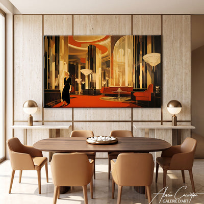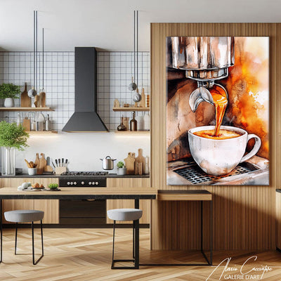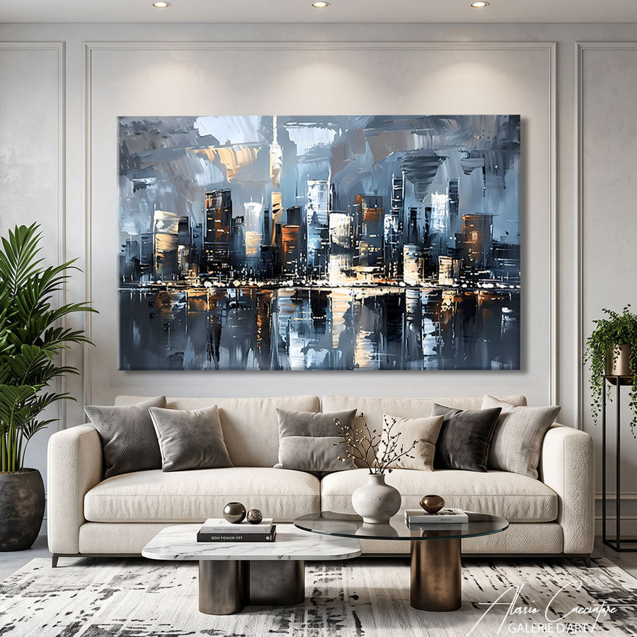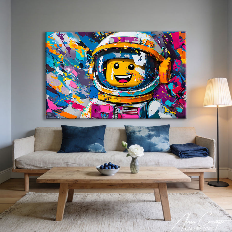

To decorate with red without overwhelming the room, use it as an accent color on about 10% of the space, and let neutral tones do the rest. A red painting is the simplest way to achieve this: it concentrates the color on a single point on the wall. In this guide, we explain what red brings to an interior, which colors to pair with it, in which rooms to use it, and how to choose and hang a red painting. You will also find a chart of the safest color combinations and our size and height guidelines.
What does red represent in decoration?
Red is the color of energy, warmth, and conviviality. In a room, it immediately catches the eye and gives an impression of life, even in a very understated decor. This is why it should be used precisely rather than spread out.
A red painting is a wall artwork in which red is the dominant shade or the color that structures the composition. It can be flowers, an animal, an urban scene, or an abstract composition. Unlike an entirely red wall, it is easy to move and requires no construction work.
Not all shades tell the same story. Bright red and vermilion are lively and cheerful, burgundy and blood red are more subdued and elegant, while brick red leans towards the warmth of earth tones. Choose the shade according to the mood you want to create in the room.
How much red should you use in a room?
The simplest rule is the 60-30-10 rule: 60% dominant color, 30% secondary color, and 10% accent color. Red naturally finds its place in these 10%. A painting, two cushions, and one object are more than enough to make the color stand out.
- 60%: walls, floor, and large furniture in a neutral tone (white, beige, gray).
- 30%: sofa, curtains, or rug in a soft secondary shade.
- 10%: the red painting and a few textile or decorative accents.
Beyond this proportion, red can quickly tire the eye, especially in a small room. If you like intense atmospheres, increase the dose in small touches and take the time to live with it before adding a new red element.
Which colors to pair with red?
Neutral colors are red's safest allies, as they let it breathe. White makes it fresh and graphic, gray makes it chic and contemporary, and black makes it dramatic. Bolder combinations, with gold or navy blue, require a little more restraint.
| Combination | Effect achieved | Recommended room |
|---|---|---|
| Red and white | Fresh, bright, graphic | Living room, kitchen |
| Red and gray | Chic, soothing, contemporary | Living room, bedroom |
| Red and black | Intense, theatrical | Office, dining room |
| Red and gold | Warm, refined | Living room, entryway |
| Red and navy blue | Structured, elegant | Office, living room |
Red and gray, the easiest match
Gray calms red and gives it a contemporary look. On an anthracite gray wall, a painting with red flowers becomes the focal point of the room without appearing aggressive. Add a gray sofa and a few green plants to balance the overall look.

Red peony painting on canvas, available on canvas or plexiglass, from 60x40 to 120x80 cm.
To extend this combination, our modern gray paintings allow you to create a wall where red remains the only accent color. This restraint is the key to a colorful interior that remains relaxing on a daily basis, even in a room where you spend a lot of time.
Red, black, and gold for an intense atmosphere
The red, black, and gold trio creates a warm and sophisticated atmosphere, ideal for an evening living room or an office. Dark walls make the red stand out, while gold adds light. Our article on decorating with gold details how to balance this metallic touch.

Abstract design painting, available on canvas or plexiglass, from 60x40 to 120x80 cm.
Navy blue offers another option: it structures red and gives it a more classic, almost nautical look. Our guide to decorating with blue helps you choose the right shade to accompany a red accent.
In which room to dare red?
The living room and dining room are the most natural rooms for red, because it is a color that invites conviviality. A large red painting above the sofa or sideboard is enough to warm up a room with white walls. In the entryway, a medium format sets the tone upon arrival.
In the bedroom, red is used more cautiously, because it stimulates more than it soothes. Concentrate it on a single painting above the headboard, surrounded by light bedding and white walls. A strong subject like a red lion gains impact there thanks to the sobriety of the decor.

Red lion painting, available on canvas or plexiglass, from 60x40 to 120x80 cm.
The office welcomes red well when paired with black or navy blue, which gives energy without distraction. In a small room like the toilet, a red painting in a 60x40 cm format creates a successful surprise effect, provided you keep the surrounding walls light.
How to choose a red painting?
First choose the subject according to the desired atmosphere, then the shade of red, then the format. Red flowers bring softness and femininity, animals like the lion bring strength, abstract leaves more freedom to play with the rest of the decor.
- Subject: flowers for softness, animal for character, abstract for freedom.
- Shade: bright red to energize, burgundy for a subdued look.
- Format: about two-thirds the width of the piece of furniture placed underneath.
- Support: canvas stretched on a wooden frame or plexiglass with hanging rail included.
Regarding the support, the canvas stretched on a wooden frame offers a matte finish that softens intense reds. Plexiglass, on the contrary, enhances the depth and brilliance of the color. Our artworks start at €89, shipping is free, and you have 30 days to change your mind.
How to hang a red painting without overwhelming the room?
A well-hung red painting has its center between 145 and 160 cm from the floor, at eye level. Too high, it seems to float and draws the eye toward the ceiling. Above a sofa or headboard, leave 20 to 25 cm between the piece of furniture and the bottom of the frame.
For the width, aim for about two-thirds of the piece of furniture: a 60x40 cm for a console of about 90 cm, an 80x60 cm for a sideboard of about 120 cm, a 120x80 cm for a sofa of about 180 cm. If you combine several red canvases, space them 5 to 8 cm apart to form a cohesive ensemble.
Finally, leave some breathing room around the artwork. Avoid hanging other colorful paintings on the same wall and prefer neutral frames or sober objects nearby. A red accent works all the better when it is the only one carrying the color.
FAQ: decorating with red
What color to pair with red in a living room?
Gray and white are the safest combinations for a living room, because they let red breathe. Gray gives a chic and contemporary look, white gives a fresh and bright look. For a warmer atmosphere, add a touch of gold or natural wood.
Is red suitable for a bedroom?
Yes, if you limit it to a single focal point, such as a painting above the headboard. Red stimulates, so it should be surrounded by light walls and neutral bedding. Deep shades like burgundy are more relaxing than bright red.
How much red should you use in a room?
Aim for about 10% of the visual space, according to the 60-30-10 rule. A red painting, two cushions, and a decorative object are generally enough. Beyond that, red can quickly tire the eye, especially in a small room or a poorly lit space.
What subject to choose for a red painting?
Choose the subject according to the desired atmosphere. Red flowers, such as peonies, bring softness and elegance. An animal, such as a lion, brings strength and character. An abstract composition leaves more freedom to pair the painting with various colors in the room.
Canvas or plexiglass for a red painting?
The canvas stretched on a wooden frame gives a matte finish that softens intense reds, ideal for a living room or bedroom. Plexiglass enhances the depth and brilliance of the color, perfect for a dark wall. It is delivered with its hanging rail.
In summary
- Use red as an accent color, on about 10% of the room.
- Pair it with gray or white for a safe look, with black and gold for an intense atmosphere.
- Concentrate the color on a red painting rather than several scattered objects.
- Choose a format close to two-thirds the width of the piece of furniture: 60x40, 80x60, or 120x80 cm.
- Center the artwork between 145 and 160 cm from the floor, or 20 to 25 cm above the sofa or bed.
Want a touch of red on your walls? Discover our collection of red paintings: free shipping and 30 days to change your mind.