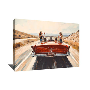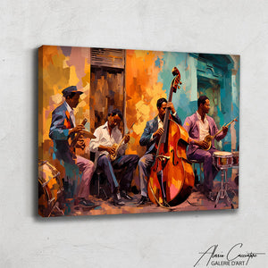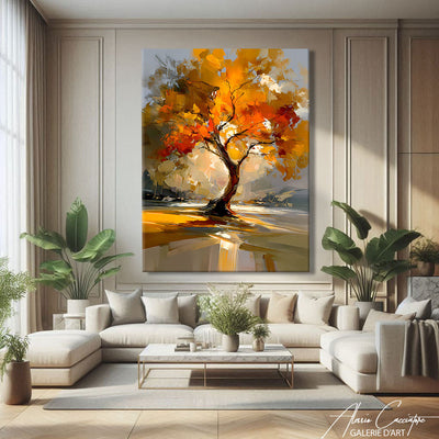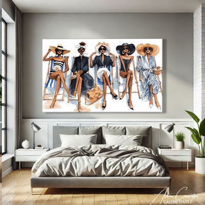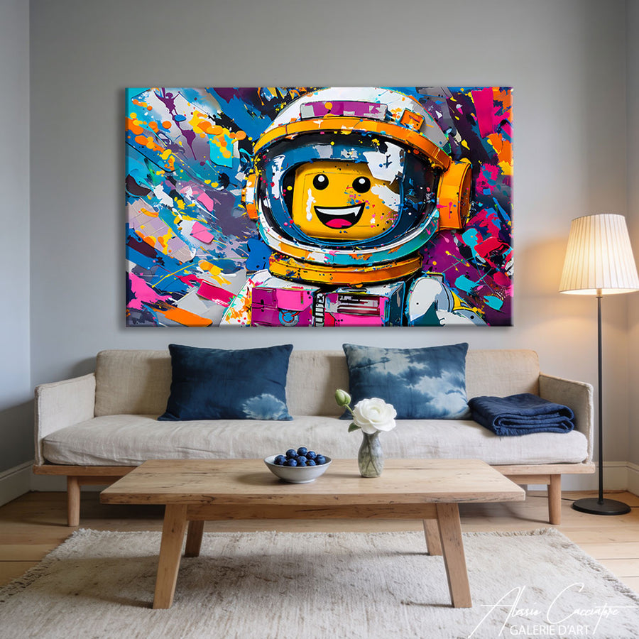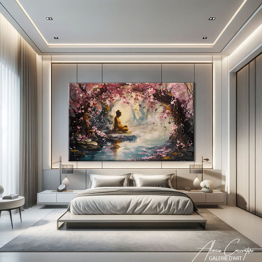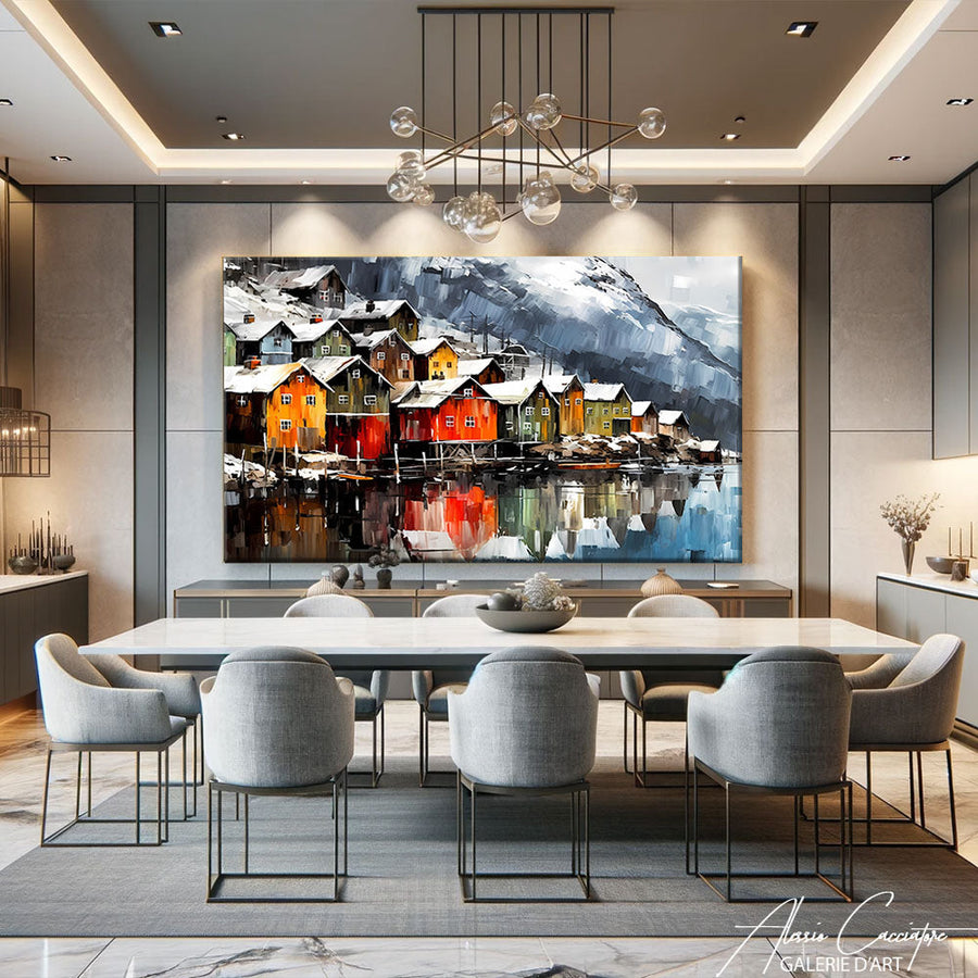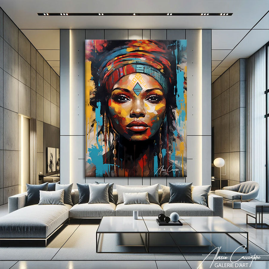

Natural materials, terracotta colors, travel memories, and that little air of freedom that makes a house feel alive: bohemian chic decor is a dream. But the line between an inspiring interior and a joyful mess is thin. So, how can you create bohemian chic decor that exudes escapism without ever looking cluttered? In the gallery, we always tell you the same thing: it all starts with the wall. A well-chosen bohemian painting sets the palette, the mood, and the level of elegance in the room. Here is our step-by-step method, with the right sizes, the right heights, and the mistakes to avoid.
Bohemian or bohemian chic: what's the difference?
Pure bohemian comes from the hippie spirit of the 70s: you layer, you accumulate, you mix everything. Bohemian chic keeps the same vocabulary (natural fibers, warm tones, nomadic patterns, plants) but it edits. Fewer objects, a controlled palette, and above all, one statement piece per wall rather than a mosaic of accessories.
Our basic rule: a maximum of three natural materials per room (for example, linen, rattan, and wool) and one masterpiece that sets the tone. It is this artwork that transforms a collection of pretty objects into a real decor. To find yours, browse our selection of bohemian paintings: flowery patios, female portraits in warm colors, sunny alleys, all designed for this style.
What color palette for bohemian chic decor?
Bohemian chic is based on a warm and soft palette. Apply the 60/30/10 rule:
- 60% neutral base: off-white, linen, sand, warm beige. These are your walls, your sofa, your large textiles.
- 30% secondary color: terracotta, ochre, rust, dusty pink. Cushions, rugs, throws... and the painting.
- 10% accent: olive green, teal, or saffron yellow, in small touches.
The painting plays a key role: it must incorporate at least two colors already present in the room (the terracotta of a cushion, the green of a plant) to connect all the elements together. Terracotta shades are the safest: our collection of terracotta paintings is ideal for setting the mood. If you are unsure about combinations, our guide for choosing the color of a painting according to your decor details the method.
Which bohemian painting to choose? The subjects that work
Not all subjects lend themselves to bohemian chic. Those that work best tell of elsewhere, of light, of a sweetness of life:
- Mediterranean patios and alleys: colorful doors, bougainvilleas, cement tiles. They immediately bring the warmth of the South.
- Female portraits in warm tones: they humanize the room and embody the free spirit of the style.
- Textile and craft scenes: rugs, hanging fabrics, pottery. They echo your own materials.
- Abstracts in earth tones: perfect for a more refined, almost minimalist version.
To avoid: very graphic visuals in pure black and white or neon colors, which break the softness of the whole.

As for the finish, stretched canvas on a wooden frame is our #1 recommendation: its matte finish and light texture naturally match linen, rattan, and wool. Plexiglass offers deeper colors and a more "gallery" effect: reserve it for a more chic bohemian version, in an entryway or dining room, avoiding walls facing a large window to limit reflections.
Sizes and heights: the rules for a bohemian chic wall
Bohemian chic needs air. A wall saturated with small frames quickly looks like a junk shop; a large, well-proportioned canvas looks like a gallery. Our guidelines:
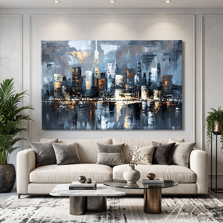
- Above the sofa: aim for 2/3 of the sofa's width. For a 220 cm sofa, a painting 140 to 150 cm wide. Leave 20 to 25 cm between the backrest and the bottom of the canvas.
- Above the bed: about 2/3 of the headboard's width, i.e., 100 to 110 cm for a 160 cm bed, hung 15 to 25 cm above the headboard.
- Free wall: the center of the painting at 145-155 cm from the floor, eye level.
- Vertical format (type 80 x 120 cm): ideal for a reading nook, next to a large plant, or above a console table.
And keep at least 20 to 30 cm of bare wall on each side of the artwork: it is this breathing room that makes the difference between bohemian and bohemian chic.

Room by room: how to adapt the style?
The living room
This is the room where you can dare the largest format. A horizontal painting in warm colors above the sofa, a Berber or Kilim rug on the floor, linen cushions in two tones of the canvas, a large potted plant: the decor is set. Add warm lighting (2700 K bulbs) so that the ochres and terracottas take on all their depth in the evening.
The bedroom
We lower the volume: softer tones (powder pink, sand, sage green), a soothing subject like a female portrait or a seaside scene, washed linen bedding. A single artwork above the bed is enough.

The entryway and dining room
In the entryway, a vertical format above a raw wood console table welcomes your guests with warmth. In the dining room, a large horizontal format centered on the table (and not on the wall) creates a real focal point. Bohemian chic also loves travel references: our guide for creating travel decor at home will give you other ideas to tell your escapades.
The mistakes that turn bohemian chic into a mess
- Multiplying small formats scattered on all walls: the eye no longer knows where to rest. Prefer a large canvas or a well-aligned duo.
- A palette without a common thread: if every object has its own color, the whole looks cluttered. Three dominant shades, no more.
- A painting that is too small: a 40 x 50 cm canvas above a 2 m sofa disappears. Better to think big.
- Neglecting the lighting: cold lighting kills earth tones. Aim for warm white and an accent lamp near the artwork.
- Buying everything at once: bohemian chic is built over time. Start with the artwork, then add textiles and plants around it.
FAQ: your questions about bohemian chic decor
What wall color for bohemian chic decor?
Off-white, warm beige, or a lime-effect plaster are the best choices: they highlight the earth tones of the painting and textiles. For more character, a light terracotta or soft ochre wall works very well, provided you choose an artwork in lighter tones to maintain the contrast.
Can you mix bohemian chic and Scandinavian style?
Yes, it is even one of the most successful combinations. Keep the Scandinavian base (white walls, light wood, simple lines) and bring bohemian warmth with a large painting in warm tones, a woven rug, and a few textured cushions.
Which bohemian painting for a small living room?
Paradoxically, a generous format: a single 80 x 120 cm or 100 x 70 cm canvas visually enlarges the space better than several small frames. Choose bright colors (sand, pink, light ochre) and a perspective, like a patio or an alley, that opens up the wall.
In summary
- Bohemian chic = natural materials + controlled palette + one statement piece per wall.
- 60/30/10 rule: warm neutrals, terracotta and ochres, a touch of green or blue.
- The painting incorporates at least two colors from the room.
- Width: 2/3 of the piece of furniture above which it is hung; center at 145-155 cm from the floor.
- Keep 20 to 30 cm of bare wall around the artwork.
- Stretched canvas on a frame for a matte and natural finish, plexiglass for a more gallery version.