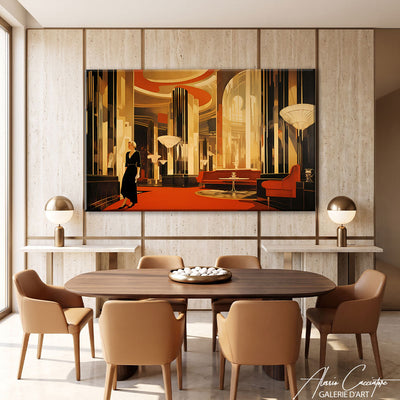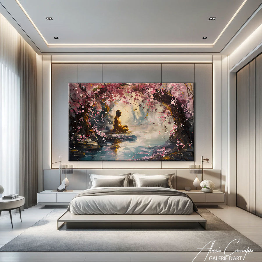

An Art Deco painting is not simply “a piece of art with gold and some lines.” It is a very precise visual vocabulary, born in 1920s Paris, that adheres to almost mathematical rules of composition. And that is precisely what makes choosing one tricky: two canvases may look similar in a thumbnail image and produce radically different effects once hung. After about fifteen years spent hanging artwork for clients, I have seen the same mistakes repeated—a format that is too timid, a palette that clashes with the parquet floor, a pattern so busy it overwhelms the room. This article provides concrete answers to the questions I am asked most often: how to recognize this style, which colors to favor, which room to install it in, and at what height.
What exactly is an Art Deco painting?
Art Deco was officially born with the International Exhibition of Modern Decorative and Industrial Arts in 1925, in Paris. The movement reacted against the organic flourishes of Art Nouveau: where its predecessor embraced the botanical curve, Art Deco straightens, disciplines, and geometrizes. The war was over, industry was triumphing, and ocean liners and skyscrapers dictated the aesthetic. The result: a style that is simultaneously sumptuous and rigorous—a rare thing.
The five tell-tale signs
- Asserted geometry: fans, chevrons, zigzags, concentric circles, stylized rising suns.
- Symmetry: the composition is almost always organized around a central axis.
- Gold and brass: used as accents, never as a total block of color.
- The tapered silhouette: slender women, stretched animals, stepped buildings—everything tends toward the vertical.
- Bold contrast: deep black, cream white, and a saturated color that stands out.
If a work checks three of these five boxes, you are definitely in the Art Deco register. Anything less, and it is more of a decorative style "inspired by the Roaring Twenties," which is not a flaw, but does not produce the same effect of coherence in a room.

What colors should you choose for an Art Deco painting?
This is where 80% of the success lies. Art Deco works on a deep dark or neutral base—black, anthracite, midnight blue, bottle green, burnt terracotta—enhanced with gold, copper, or champagne. The classic trap is to pile up metals: if your room already contains brass light fixtures, a gold coffee table, and copper frames, choose a canvas where gold remains a minority, in thin lines rather than solid areas.
Two simple benchmarks I use systematically. First, the third metal rule: beyond three different metallic finishes in the same room, the eye loses focus and the ensemble becomes gaudy. Next, the single echo rule: the saturated color of the canvas (emerald, burgundy, peacock blue) must exist elsewhere in the room—a cushion, a book binding, a vase—but only once. Two echoes is already coordinated decoration; one is intention.
If you are hesitant about committing to a strong color, the monochrome path remains foolproof: black and white brings Art Deco geometry into the spotlight without ever looking dated. Our black and white painting collection shares many codes with Art Deco, and we detail this approach in our guide on the abstract black and white painting.
In which room should you hang an Art Deco painting?
Contrary to popular belief, this style is not confined to the living room. It excels everywhere there is a bit of stage-setting to be done.
The living room, for the centerpiece
Above a sofa or a fireplace, a large Art Deco format creates an immediate focal point. Count on a canvas width equal to two-thirds of the furniture below it: on a 220 cm sofa, aim for 140 to 160 cm wide. Any smaller, and the canvas floats, giving the impression of an accident.
The bedroom, for hushed elegance
This is my favorite use, and the most under-exploited. An Art Deco female portrait above the headboard, in a champagne and black palette, transforms a mundane bedroom into a hotel suite. Favor a pattern with breathing room—plenty of background, few details—so as not to saturate a room where you are looking for calm.

The entryway and office, for verticality
Hallways and entryways call for vertical formats: Art Deco, with its stepped skyscrapers and stretched silhouettes, is right at home here. In an office, a stylized skyline works remarkably well on video calls—it's prosaic, but it has become a real choice criterion for my clients since 2020.

What format and at what height should you hang it?
The hanging height is non-negotiable: the center of the canvas should be 145–150 cm from the floor, the average eye level. Above a piece of furniture, you go lower, leaving 20 to 30 cm between the top of the furniture and the bottom of the frame—beyond that, the visual link is broken.
As for dimensions, Art Deco does not tolerate miniatures well. Its geometric patterns need room to breathe: below 60 x 90 cm, chevrons and fans become illegible from a distance. If your wall is narrow, prefer a generous vertical format over a small horizontal one. And if you have a large open space, an Art Deco triptych produces a spectacular frieze effect, very faithful to the spirit of the ocean liners of the era.
A word on materials, since the question always comes up: all our works are printed on canvas stretched over wooden frames, with a plexiglass option for a deeper and slightly glossy finish. Plexiglass accentuates blacks and makes golds vibrate—it's the choice I recommend for Art Deco if your room does not have direct backlighting.
How to associate it without falling into pastiche?
The risk with such an identifiable style is historical reenactment. Three safeguards. One: do not accumulate markers. An Art Deco painting in a room that is entirely Art Deco cancels itself out; the same painting in a clean, contemporary interior becomes an event. Two: keep empty space around the canvas, at least 40 cm of bare wall on each side. Three: mix eras. An Art Deco canvas above a Scandinavian sofa, or facing a 70s armchair, creates exactly the tension that prevents the whole thing from sounding like a “movie set.” Our wall decoration ideas for the living room detail other combinations of this type.
Frequently asked questions
Art Deco and Art Nouveau, what is the difference?
Art Nouveau (1890-1910) is organic, botanical, asymmetrical, and all curves. Art Deco (1920-1939) is geometric, symmetrical, and industrial. Remember the formula: Art Nouveau grows, Art Deco is built.
Is an Art Deco painting suitable for a small apartment?
Yes, provided you hang only one and give it an entire wall. In small volumes, the mistake is to multiply small pieces: a single generous canvas visually enlarges the room; five small formats shrink it.
Is gold still relevant?
The massive, shiny gold of 2015 has passed, but matte brass and champagne have settled durably into high-end decor. Look for canvases where gold appears in thin lines rather than solid areas: it is this treatment that transcends trends.
In summary
A successful Art Deco painting is three things: readable geometry, a palette held to two colors plus one metal, and a format generous enough for the pattern to breathe. The rest—the room, the height, the associations—follows from these fundamentals. Take the time to measure your wall before ordering; it's the only advice that no one follows and everyone regrets.
To compose your selection, browse our Art Deco painting collection: female portraits, stylized skylines, geometric compositions, and golden abstractions, all printed on canvas stretched over wooden frames, with a plexiglass option. And if you are still hesitant about the style, our Art Deco painting page offers formats from 60 x 90 to XXL to dress up any wall.