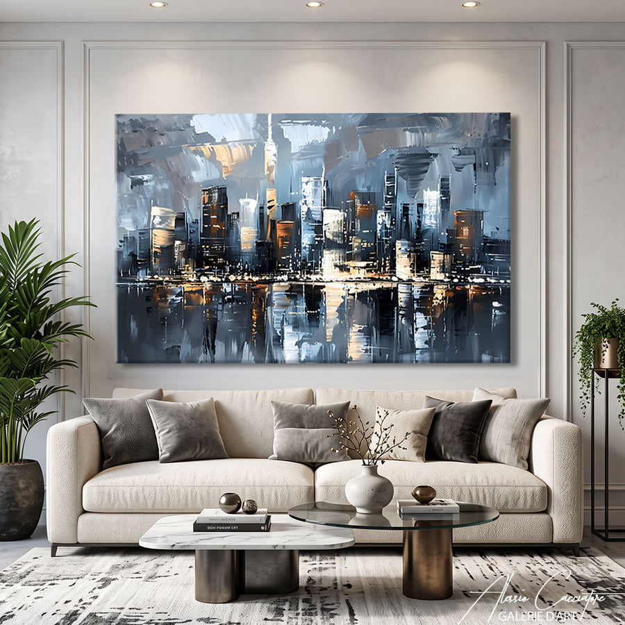

Last week, a couple contacted me after three months of fruitless searching. Their living room? Impeccable. Charcoal gray sofa, light oak parquet, perfect lighting. But the walls remained desperately empty. They wanted a modern painting for the living room but didn't know where to start. What was holding them back? The fear of making a mistake. The fear of investing in a piece that wouldn't dialogue with the space. However, choosing a painting for your living room is less complicated than you might think.
Why "modern" doesn't mean much (and how to navigate it)
Honestly, when someone says to me, "I'm looking for a modern painting for my living room," I always ask: modern like Mondrian in 1920, or modern like an abstract from 2024?
The term "modern" in art normally refers to a historical period (roughly 1870–1950). But in everyday language, it means more "contemporary," "sleek," or "not classical," which covers a massive spectrum.
What people really mean by "modern"
In my experience, when someone is looking for a modern living room painting, they generally want:
- Clean lines, no baroque flourishes
- Colors that integrate into a current interior
- An artwork that doesn't look like what we found at our grandparents' place
- Something between geometric abstract and stylized figurative
But there's no denying it: some "modern" interiors welcome figurative portraits very well. Others prefer radical abstract compositions. The style of the work should primarily respond to the atmosphere you want to create, not to an academic definition.
The rule of proportions (the one no one follows)

The number one problem I see with my clients? Paintings that are too small.
You have a 2.2m sofa and you put a 60x40cm canvas above it. The result: it looks like a postage stamp on a factory wall. The work gets lost, and the living room loses its impact.
The rule of thumb: your painting should cover between 50% and 75% of the width of the main piece of furniture (sofa, console, sideboard). For a standard 2m sofa, aim for at least 100-120cm wide for the canvas.
Now, this rule isn't divine law. In my studio, I have a client who put a very small format (40x40cm) on a 4m wide wall. But she placed it asymmetrically, accompanied by two wall sculptures. It works because it's thought of as a global composition.
Height: how far from the floor?
The center of the artwork should be between 1.45m and 1.60m from the floor—roughly at the eye level of a standing person.
If you are hanging it above a sofa, leave 15-25cm between the top of the backrest and the bottom of the frame. No more, otherwise the work seems to float without any connection to the furniture.
Colors: matching or contrasting (both work)
There are two schools of thought.
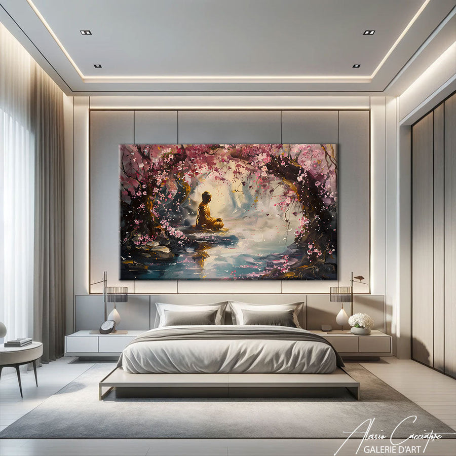
The harmonic approach: you choose a living room decor painting whose tones pick up those already present in the room. Midnight blue sofa? Opt for a work with touches of blue. It's coherent, restful, and safe.
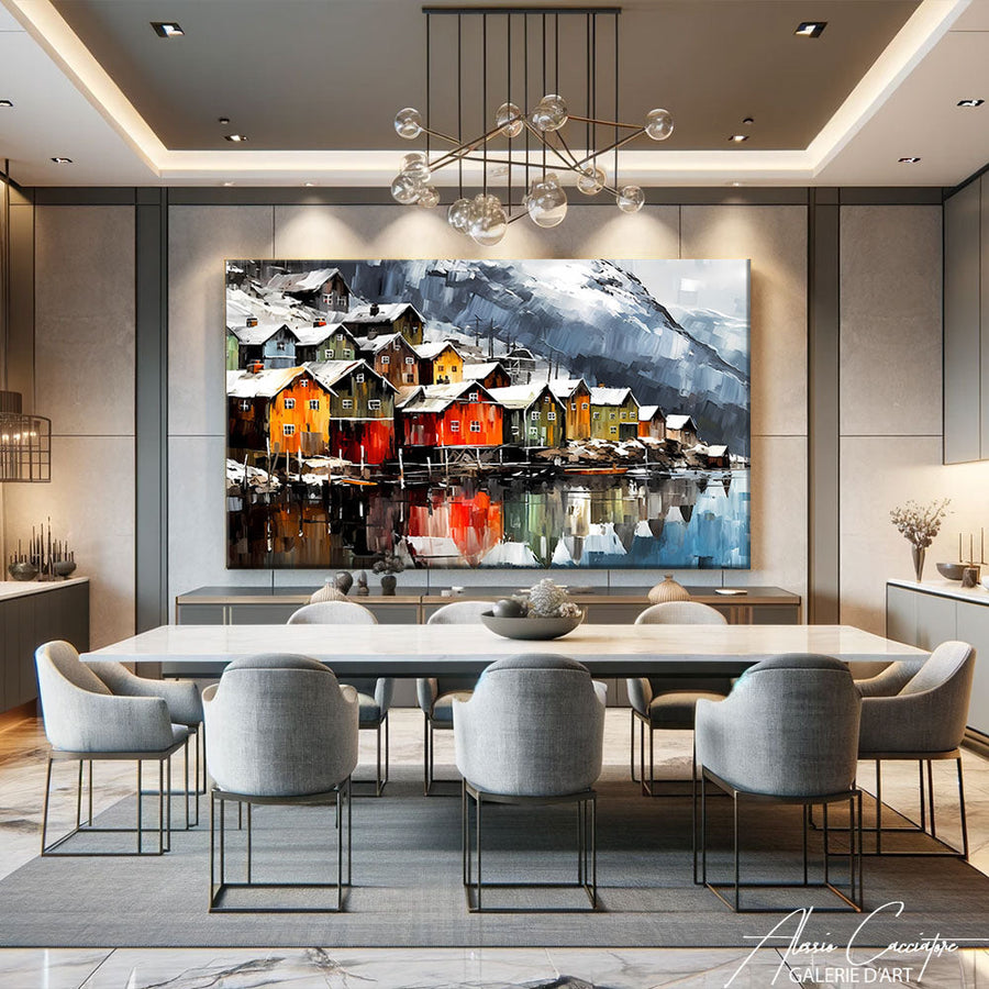
The contrasting approach: you use the painting as a point of rupture. A very neutral interior (white, gray, beige) can welcome an explosion of red, orange, or yellow. The artwork becomes the visual hero of the room.
In my opinion, the contrasting approach works better in minimalist interiors. If you already have a lot of patterns, textures, or colors, it's better to have a more understated painting that allows the space to breathe.
The total monochromatic trap
What annoys me: all-gray interiors with an... all-gray painting. Yes, it's coherent. But it's also flat. Even in a neutral palette, introduce some vibration—a slightly warm off-white, a deep black, a hint of ochre.
Abstract vs. figurative: what it really changes

I often hear: "Abstract is more modern." Wrong. Or at least, it's reductive.
A hyperrealistic portrait can be ultra-contemporary in its treatment. Conversely, some geometric abstractions definitely reek of the 70s.
Abstract has one advantage: it is narratively neutral. It tells no story and depicts nothing specific. That makes it compatible with many environments, which is what fans of abstract paintings are often looking for. Perfect for a living room that also serves as a dining room or workspace.
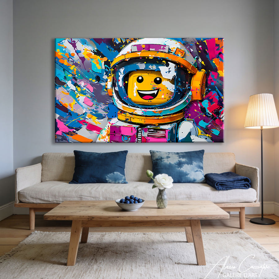
Modern figurative (stylized portraits, graphic urban scenes, animals in flat color) brings a presence and a more marked identity. Stylized modern portraits are more engaging, but they also require more coherence with the rest of the room.
In my experience, clients who love to entertain prefer figurative—it generates conversation. Those looking for a soothing cocoon tend toward soft abstract, with organic shapes.
And pop art?
Pop art works very well in contemporary living rooms, especially lofts or urban interiors. But watch out for kitsch: a silkscreened Marilyn from an online catalog quickly becomes impersonal. If you like the pop spirit, look for original works with a real graphic stance.
Where to place your painting (and common mistakes)
The classic reflex: above the sofa. Logical, it's the main wall. But it's not the only option.
Above a console or sideboard: ideal if your sofa is placed in the center of the room, with its back to the window. The living room wall decoration is then focused on the opposite wall.
On the perpendicular wall: create a visual vanishing point. When you enter the living room, your gaze is drawn to the artwork, even if it isn't facing the entrance.
As a wall composition: several small formats grouped together. But be careful, this requires real layout planning. A piece of advice: cut out paper templates, stick them to the wall with masking tape, and live with them for a few days before drilling.
The mistake I see all the time
Hanging it too high. Seriously, 80% of the paintings in the living rooms I visit are 20cm above the optimal level. The result: you have to look up to appreciate them, when you should be seeing them naturally, whether sitting or standing.
Natural vs. artificial light: it changes everything

A work you like in a gallery might disappoint you at home. Why? The light.
Modern living room paintings with shiny surfaces or glazes reflect light. In a very bright living room (floor-to-ceiling windows, southern exposure), this can create annoying reflections. Conversely, in a dark room, these same reflections add depth.
Matte works with highly opaque pigments handle light variations better, but they can seem dull in a poorly lit room.
My practical advice
If possible, ask for a photo of the artwork in different lighting conditions. Or better: if you are buying online and the seller offers returns, test it at home for a few days. Hang it up, live with it, observe it in the morning, in the late afternoon, and in the evening under a lamp.
I sold a piece to a couple who initially hated it on the first day (light too harsh), then adored it the next evening (ambient light, indirect spotlights). The work hadn't changed—their perception had.
Budget: how much to invest in a work for your living room?
Trick question. It depends on so many factors.
A mass-produced living room decor painting costs between €50 and €300. An original work by an emerging artist? Between €400 and €2000. An established artist? That can go up to €5000 and well beyond.
The real question: what value do you place on having something unique in your home?
In my studio, I see clients willing to put €800 into a painting but who bought their sofa for €400. Others do the opposite. Neither approach is better—it's a question of priorities.
The investment argument
Unlike a poster, an original work can increase in value. Not always, and not systematically. But if the artist gains notoriety, your initial purchase can become a real asset. And even without that, you have something that no one else has.
What seems like a bad idea to me: buying art solely as an investment. Buy because it touches you. If it gains value, great. If not, you still have something that you enjoy every day.
Current trends: what works (and what's outdated)
In trendy living room wall decoration for 2024, I see three main directions:
1. Organic abstract — soft shapes, earthy colors (terracotta, ochre, sage green). Very compatible with the natural/wabi-sabi style that currently dominates interiors.
2. Stylized figurative — geometric portraits, flat silhouettes, graphic animals. A return to storytelling, but treated in a contemporary way.
3. Radical black and white — charcoal drawings, inks, strong contrasts. Works in industrial or minimalist interiors.
What's starting to feel dated? "Keep Calm" prints, motivational quotes in giant fonts, vintage world maps. We've had them for ten years; that's enough.
The trap of trends
Following trends is fine for a cushion. For a piece of art that will stay on your wall for ten years, it is better to choose something that moves you personally, even if it is not "the latest thing."
How to know if a piece of art "works" in your home
There is a simple test. Hang the artwork temporarily (or a full-size paper print of it, if you haven't bought it yet). Live with it for 3-4 days.
If after that period:
- You still look at it with pleasure → that's a good sign
- You no longer notice it → it lacks presence
- It annoys you → move on to something else
The goal is not for the piece to scream. It can be discreet. But it must remain alive, continuing to exist in your field of vision even after several weeks.
I have had a piece in my own living room for three years. Some mornings, I look at it and see details I had never noticed before. That is what a successful piece is: it continues to unfold over time; it doesn't exhaust itself in a week.
Frequently Asked Questions
What size painting for a 20m² living room?
For a 20m² living room, aim for a size between 100x100cm and 120x80cm minimum. If your sofa is 2m wide, the painting should cover at least 100-150cm to have a real presence. You can also opt for a triptych, which occupies more visual space.
Should the painting match the colors of the sofa?
Not necessarily. Two approaches work: harmony (picking up existing tones) or contrast (using the painting as a focal point with different colors). In a very neutral interior, a colorful painting creates dynamism. In a space that is already busy, it is better to remain understated.
Where to hang a painting in a living room without a sofa?
Above a console table, on the wall facing the entrance, or on a perpendicular wall to create a visual vanishing point. The important thing is that the work is visible from the main passage and rest areas (armchairs, dining table if it is in the same space).
Is an abstract painting easier to integrate than a figurative one?
Yes and no. Abstract art is narratively neutral, making it compatible with more environments. However, a modern figurative piece (stylized portrait, graphic urban scene) can bring real personality to a space. It all depends on the desired effect: soothing and discreet, or bold and conversational.
How to avoid reflections on a painting in a very bright living room?
Choose a matte piece rather than one with a glossy varnish. Also, avoid hanging it across from a window or under a spotlight directed straight at it. If you already have the work, adjust the hanging angle (slightly tilted forward) or use indirect grazing lighting rather than front lighting.
All the works mentioned in this article are available in the gallery. Free worldwide shipping, 30-day money-back guarantee.