
To decorate with brown without darkening the room, pair it with light shades and natural materials, then reserve it for a large surface and a few accessories. Used in moderation, brown warms up an interior and gives it a depth that grey or white alone cannot provide.
In this guide, we will help you choose the right shade for each room, create color combinations that work, and avoid a "cave" effect. You will also find our guidelines for choosing a brown painting, its size, and hanging height.
Why decorate with brown?
Brown is a reassuring color that evokes wood, earth, leather, and coffee. It immediately creates an impression of warmth and stability, whereas cool tones can appear distant. This is why it is a staple in interiors that prioritize comfort over effect.
A brown painting is a piece whose palette is dominated by shades of brown, from chocolate to caramel, often enhanced with copper, ochre, or cream. On a wall, it serves as an anchor point: it connects the parquet, wooden furniture, and textiles around a single family of tones.
Brown also has a practical advantage: it is very forgiving. It pairs well with most styles, from Scandinavian to bohemian, including Art Deco, and ages well in a decor that evolves with small touches.
Which shade of brown to choose for each room?
The shade of brown is chosen first based on the light and the size of the room. The smaller or darker the room, the better it is to stick to light and warm browns; deep browns require space and light so as not to overwhelm the atmosphere.
Chocolate brown for depth
Chocolate and espresso bring an enveloping character, ideal in a bedroom or office. Use them on a small surface: an accent wall, a velvet armchair, or a piece with a dark background is enough to add depth without weighing down the room.
Caramel and cognac for warmth
Caramel, cognac, and camel are the easiest shades to live with. They pair well with light wood, linen, and off-white, and work just as well in a bright living room as in an entryway. A leather pouf or a throw is often enough to set the mood.
Hazelnut and taupe for softness
Hazelnut and taupe are softened browns, close to neutrals. They are suitable for small rooms and minimalist interiors, as they warm up the atmosphere without drawing all the attention. They also serve as a transition between a white wall and darker furniture.
| Shade of brown | Desired effect | Recommended rooms |
|---|---|---|
| Chocolate, espresso | Depth, intimacy | Bedroom, office, reading nook |
| Caramel, cognac, camel | Warmth, conviviality | Living room, entryway, dining room |
| Hazelnut, taupe | Softness, calm | Small rooms, bedroom, bathroom |
What colors to pair with brown?
Brown pairs first with light colors that give it breathing room, then with a few brighter shades that bring it to life. The idea is to maintain a bright base and use brown as an anchor color on a few carefully chosen elements.
- Brown and beige: the softest combination, ideal for a cozy atmosphere.
- Brown and off-white: a clean contrast that keeps the room bright, perfect for a living room.
- Brown and olive green: a nature-inspired duo that soothes a bedroom or office.
- Brown and teal: an elegant warm and cool contrast, for well-lit rooms.
- Brown and gold: a chic touch, used sparingly on a frame, a light fixture, or a piece of art.
- Brown and terracotta: a warm monochrome palette, very successful in bohemian decor.
If you like soft atmospheres, our collection of beige paintings pairs naturally with dark wood furniture. For a more elegant touch, golden reflections make brown shine without making it harsh; we detail these combinations in our article decorating with gold.
How to prevent a brown room from looking dark?
A brown room looks dark when the color covers all the large surfaces at once: walls, floor, sofa, and curtains. The simplest rule is to choose a single large brown surface and keep the others light.
Lighting does the rest. Multiply warm light sources at eye level, and place the darkest elements facing the windows rather than against them. Materials that reflect light, such as glass, brass, or plexiglass, also lighten the overall look.
A piece with metallic reflections plays the same role on a wall. Our selection of gold paintings brings this light into a brown living room or a bedroom with chocolate tones. Finally, vary the textures, from velvet to raw wood, including linen, to avoid a monolithic effect.
Which brown painting to choose for each room?
A brown painting is chosen based on the atmosphere of the room: graphic for an office, soothing for a bedroom, warm for a living room. The subject matters as much as the color, because it is what sets the tone of the decor.
In an office: a graphic pattern
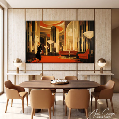
In an office, a structured pattern adds character without being distracting. Our contemporary Art Deco painting combines deep browns with copper and gold geometric lines. It pairs perfectly with a dark wood desk and a cognac leather armchair.

contemporary Art Deco brown painting, available on canvas or plexiglass, from 60 x 40 to 120 x 80 cm.
In a bedroom: a nature subject
In a bedroom, a subject from nature brings serenity. The design deer painting combines an orange-brown coat with a dark background. Placed above a light headboard, it creates a warm focal point that invites rest without overwhelming the room.

brown design deer painting, on canvas or plexiglass, from €89.
In a living room: a soothing composition
In a living room, a landscape-oriented piece pairs with the length of the sofa. The Zen pebbles painting layers stones with copper and grey reflections, which connect a grey sofa and a cognac leather pouf. For more ideas, read our guide cozy living room painting.

Zen pebbles painting, available on canvas or plexiglass, in 60 x 40, 80 x 60, and 120 x 80 cm.
How to hang a brown painting?
A brown painting is hung using the same guidelines as any artwork: its center should be between 145 and 160 cm from the floor, at eye level. Above a sofa or headboard, leave 20 to 25 cm between the furniture and the bottom of the frame.
Width matters as much as height. The artwork, or the set of canvases, should occupy about two-thirds of the width of the furniture. If you combine several canvases in a diptych or triptych, leave 5 to 8 cm between each panel so that the whole reads as a single composition.
| Furniture width | Target artwork width | Recommended size |
|---|---|---|
| 90 cm | About 60 cm | 60 x 40 cm |
| 120 cm | About 80 cm | 80 x 60 cm |
| 180 cm | About 120 cm | 120 x 80 cm |
These three sizes are offered for the paintings presented in this article, on canvas stretched over a wooden frame or on plexiglass with a hanging rail included. Our artworks start at €89, shipping is free, and you have 30 days to change your mind.
FAQ: decorating with brown
What color to pair with brown in a living room?
Beige, off-white, and cream are the safest combinations for a brown living room. They keep the room bright and highlight the wood and leather. For more character, add a touch of olive green, teal, or gold on the cushions or a painting.
Is brown an outdated color in decor?
No, brown is not outdated: on the contrary, it is returning to interiors that prioritize warmth and natural materials. What dates a room is rather a uniform brown placed everywhere. Paired with linen, light wood, and soft shades, it looks current and welcoming.
How to warm up a room with brown without darkening it?
To warm up a room without darkening it, limit brown to a large surface and a few accessories. Keep light walls, multiply warm lighting, and choose caramel or hazelnut shades in small rooms. A painting with brown tones is often enough to set the mood.
Which painting to choose for a brown wall?
On a brown wall, choose a painting that is lighter or brighter than the wall, with touches of cream, copper, or gold. The contrast makes the artwork stand out from the surface. Graphic subjects and landscapes with warm tones work particularly well on a chocolate or taupe background.
At what height to hang a brown painting?
Hang a brown painting so that its center is between 145 and 160 cm from the floor. Above a sofa or bed, leave 20 to 25 cm between the furniture and the bottom of the frame. The artwork should cover about two-thirds of the width of the furniture.
In summary
- Brown warms up an interior provided it is used on a large surface and a few accessories.
- Choose the shade according to the light: chocolate for large rooms, caramel or hazelnut for small ones.
- Pair it with beige, off-white, olive green, or gold to keep the light.
- Hang your brown painting with its center between 145 and 160 cm from the floor, covering two-thirds of the width of the furniture.
To find the shade that suits you, browse our collection of brown paintings.