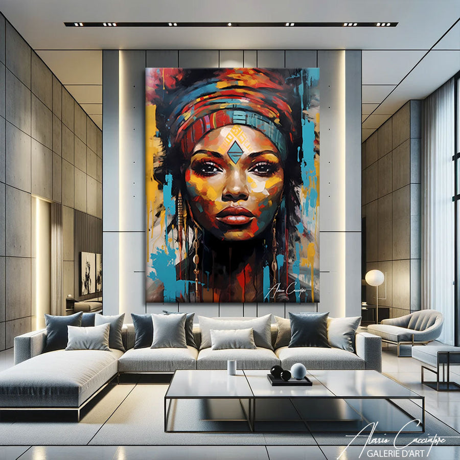

To pull off vintage decor, pair a few retro pieces with a simple, contemporary base rather than dating everything to the same era. A warm palette, one or two pieces of furniture with old-fashioned lines, and a carefully chosen vintage picture are all you need to create the right atmosphere.
In this guide, we explain what vintage style really is, which colors to choose, and how to mix old and new without creating an outdated look. You will also find ideas for pictures in each room, a size guide, and our tips for hanging them at the right height.
What is vintage decor?
Vintage decor is an interior that draws its colors, shapes, and patterns from past decades, from the 1920s to the 1980s, while remaining comfortable and contemporary. It does not aim to recreate an era exactly as it was. It selects a few distinctive elements and lets them interact with contemporary pieces.
Vintage, retro, or antique: what’s the difference?
The word vintage primarily refers to a style inspired by a specific era, often the middle of the last century. Retro takes these elements more freely and graphically, with bold colors and stylized posters. Antique refers more to the classics of painting and scenes from days gone by, with a more weathered feel.
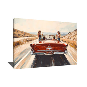
In decor, these three styles go very well together. A retro graphic poster can sit alongside an antique-looking landscape, as long as the palette remains cohesive. Our collection of retro pictures brings together subjects with bold colors that fit this style.
Which colors to choose for vintage decor?
The colors of vintage decor are warm, slightly faded, and never too bright. They evoke interiors from days gone by while remaining easy to live with. Here are the colors that work best, used in small doses on a light base:
- Mustard yellow, for a cushion, armchair, or picture detail.
- Rust and terracotta, which warm up a wall or rug.
- Olive or sage green, soothing and easy to pair with wood.
- Teal, elegant on velvet or as a picture background.
- Cream and brown, for the neutral base that ties everything together.
A picture in sepia tones plays this connecting role perfectly. The vintage world map picture depicts the continents in deep brown on an ochre background that evokes old parchment. Above a gray sofa, it interacts with mustard, rust, and red cushions for a warm atmosphere.

Vintage world map picture, available on canvas or plexiglass, from €89.
How to mix old and new without creating an outdated look?
The secret to successful vintage decor lies in balance: a modern base and a few statement pieces. Keep the walls light, the sofa simple in shape, and the lighting contemporary. Then add an inherited or retro-style piece of furniture, a brass light fixture, and a vintage picture that sets the tone for the room.
Avoid cluttering a single room with objects from the same era, as the space can quickly start to look like a frozen set. It is better to have one statement piece per area, surrounded by understated materials such as light wood, linen, or black metal. The contrast between old and new is what makes the style so elegant.
Vintage also pairs very well with other styles. If you like natural materials and patterns, our guide to creating bohemian chic decor will give you complementary ideas. For a more rugged look, industrial wall decor shares the vintage love of metal and graphic posters.
Which vintage picture to choose for each room?
The right vintage picture depends on the atmosphere you want to create in each room. A nostalgic, warm subject is ideal for the living room, a soft landscape for the bedroom, and a more graphic poster for the office. The picture below summarizes our suggestions along with the sizes offered on the product pages mentioned in this article.
| Room | Recommended vintage subject | Recommended size |
|---|---|---|
| Living room | World map, travel scene | 120x80 cm above a sofa |
| Bedroom | Mountain landscape, soft nature | 80x60 cm or 120x80 cm above the bed |
| Office | Retro poster, airplane, vintage vehicle | 60x40 cm or 80x60 cm above the desk |
In the bedroom: a landscape in soft tones
In a bedroom, choose a calm subject that invites relaxation. The vintage mountain picture shows snow-capped peaks under a pink and peach sky, bordered by dark fir trees. Hung above a wooden headboard, it adds a nostalgic, warm touch without ever overwhelming the room.

Vintage mountain picture on canvas, available on canvas or plexiglass, from 60x40 cm to 120x80 cm.
In the office: a graphic retro poster
In an office, a retro graphic poster stimulates without distracting. The vintage airplane picture depicts a red and orange propeller plane flying through cream clouds against a deep blue background. Its bold outlines and old-fashioned poster texture add energy to a white office or reading nook.

Vintage airplane picture on canvas, available on canvas or plexiglass, from €89.
How to hang a vintage picture?
A vintage picture is hung like any other artwork: the center of the piece should be between 145 and 160 cm from the floor. This height corresponds to the eye level of a standing person and highlights the subject. Above a sofa or headboard, leave 20 to 25 cm between the furniture and the bottom of the frame.
For the width, follow our two-thirds rule: the artwork or composition should occupy about two-thirds of the width of the furniture. Above a 180 cm sofa, a 120x80 cm picture naturally finds its place. If you are arranging a diptych or triptych, leave 5 to 8 cm between each panel for a smooth flow.
As for the material, canvas stretched over a wooden frame offers a matte finish that is particularly suited to the vintage spirit. Plexiglass, delivered with its hanging rail, adds a shinier touch that creates a nice contrast with a retro subject. On the product pages mentioned here, canvas starts at €89 and plexiglass at €99, with free shipping.
FAQ: vintage decor
How to make vintage decor look modern?
Keep a modern base and add only a few statement pieces. Light walls, a simply shaped sofa, and contemporary lighting balance out a retro piece of furniture or a vintage picture. The contrast between the two eras avoids an outdated look and creates a warm yet contemporary atmosphere.
Which colors to pair in vintage decor?
Opt for warm, slightly faded shades: mustard yellow, rust, terracotta, olive green, teal, and brown. Use them in small doses on a cream or off-white base. A picture in sepia or ochre tones links these colors and unifies the room.
Which picture to choose for vintage decor?
Choose a nostalgic subject with soft colors or retro graphics. Sepia world maps, mountain landscapes, and vintage airplane or vehicle posters work very well. Adapt the subject to the room: travel in the living room, nature in the bedroom, graphics in the office.
What is the difference between vintage and retro?
Vintage draws faithfully from a past era, often the middle of the last century. Retro takes these elements more freely, in a graphic and colorful style. In decor, the two are easily combined as long as the palette remains cohesive from one room to the next.
At what height should a vintage picture be hung?
Place the center of the artwork between 145 and 160 cm from the floor, as with any picture. Above a sofa or headboard, leave 20 to 25 cm between the furniture and the bottom of the frame. The artwork should cover about two-thirds of the width of the furniture.
In summary
- Vintage decor mixes a few retro pieces with a modern, understated base.
- The key colors are warm: mustard, rust, olive, teal, and brown.
- One statement piece per area is enough to avoid an outdated look.
- Choose the picture according to the room: travel, nature, or graphic poster.
- Hang the center of the artwork between 145 and 160 cm from the floor.
To find the piece that will set the tone for your interior, discover our collection of vintage pictures.