
A Japanese wall art piece is not just a blue wave or a cherry blossom branch placed on a wall. It is a way of conceptualizing space: plenty of negative space, a precise gesture, a striking color in just the right spot. If you are wondering which motif to choose, what size to pick, and which room to hang it in, this article answers point by point. No jargon, just the concrete benchmarks I use when a client calls me saying, "I really like it, but I don't know if it will go in my home."
What truly makes a Japanese wall art piece?
Three aesthetic principles run through the entire visual history of Japan, and they explain why a Japanese work of art "rests" the eye, while a very cluttered painting fatigues it.
- Ma, negative space. Emptiness is not a lack; it is a full-fledged compositional element. A sky left bare, a mist swallowing half the canvas: it is this visual silence that gives the motif its strength.
- Asymmetry. The subject is rarely centered. It is offset, cropped by the edge, placed in a third of the image. It is unsettling on paper, magnificent on a wall.
- Wabi-sabi. The appreciation of the imperfect, the weathered, and the ephemeral. A flower that has begun to wilt is more moving than a perfect one.
Concretely, this results in works with a limited palette—two or three dominant colors, often an accent of gold, red, or indigo—and very legible lines. This is exactly why a Japanese art piece fits so well into a contemporarily furnished interior: it adds a sense of breathing room instead of adding noise.
The most common motifs, and what they say
- The wave — energy, the force of nature, directly inspired by Hokusai's prints.
- The crane — longevity and fidelity. It is one of the most positive symbols in the archipelago, very present in Japandi compositions.
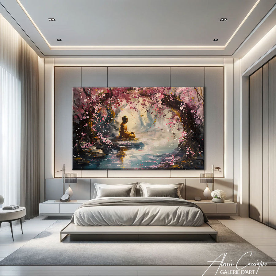
- The cherry blossom (sakura) — fleeting beauty, renewal. Ideal if you are looking for softness.
- The kimono and the geisha — codified elegance, textile detail. A very graphic motif that can hold a wall on its own.
- Urban Japan — rainy alleys, neon signs, ramen bowls. A pop and contemporary vibe, miles away from traditional imagery.
Which motif to choose according to the desired mood?
The question to ask yourself is not "which one is the most beautiful?" but "what emotion do I want in this room?". Here is how I decide.
You are looking for calm. Go for botanical motifs and birds: tree, branch, crane, mountain mist. Palettes of beige, sand, water green, and subtle gold. This is the Japandi register—the encounter between Scandinavian minimalism and Japanese sobriety—and it is arguably the easiest to live with on a daily basis.
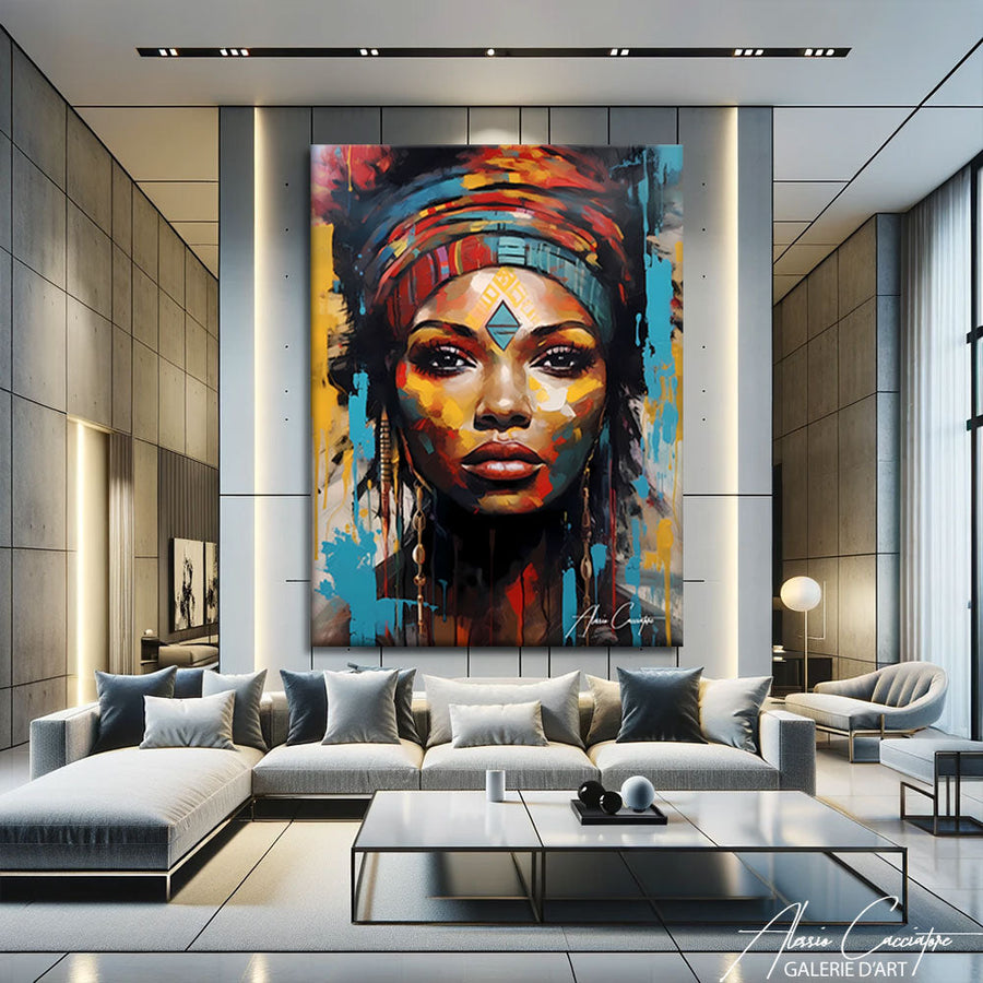
You are looking for character. The kimono, geisha, tiger, or peacock bring a strong presence. These works can handle (and demand) a bare wall around them. Do not surround them with a gallery of family photos, or you will ruin them.
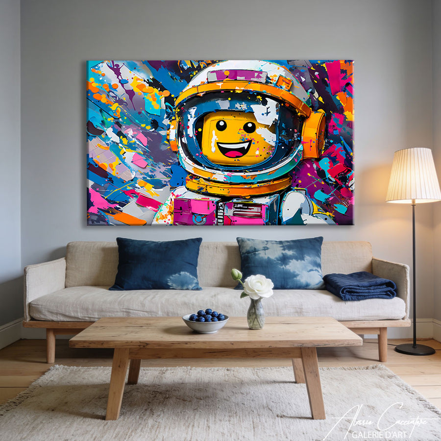
You are looking for life and humor. Contemporary Japan—neons, ramen, mischievous cats—works remarkably well in a kitchen, a hallway, or a teenager's room. It is the only Japanese category where I recommend being bold with saturated colors.

What size and format for a Japanese wall art piece?
This is the number one mistake, by far: buying too small. An undersized painting floats in the middle of the wall and looks like a postage stamp. Three simple benchmarks:
- Above a piece of furniture (sofa, sideboard, headboard), aim for 60 to 75% of the furniture's width. For a 220 cm sofa, that means a canvas 140 to 165 cm wide. Yes, it's big. That is precisely what is needed.
- Hanging height: center the artwork at approximately 150 cm from the floor—at eye level. Above a sofa, leave 20 to 30 cm between the backrest and the bottom of the canvas.
- Vertical format for narrow wall sections, entryways, and stairwells: it visually stretches the ceiling height. Horizontal or panoramic format for large living room walls and dining rooms.
The vertical format is actually very consistent with the Japanese tradition of the kakemono, the hanging scroll placed in the tokonoma alcove, which was changed according to the seasons. If you are interested in the subject of large formats, our guide to decorating a zen living room details how to coordinate artwork with furniture.

In which room should you hang a Japanese art piece?
Honest answer: almost any room, provided you adapt the motif and scale.
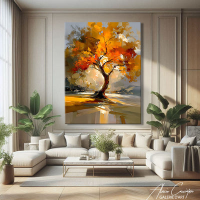
The living room. This is the natural place for a large piece. A tree or mountain motif above the sofa structures the entire room and provides a focal point for the eye. Avoid surrounding it with other works: a Japanese art piece needs air.
The bedroom. Opt for muted tones and contemplative subjects. This is the room where ma truly comes into play: a very pared-down composition above the headboard genuinely helps soothe the transition into sleep.
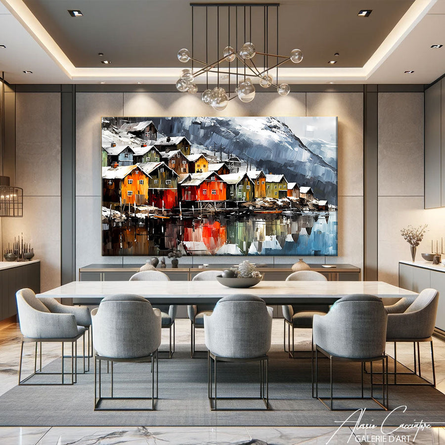
The dining room. Scenes of dining, kimonos, or Japanese restaurants create immediate conviviality there. Hang it on the wall visible when you are seated, not behind your guests' backs.
The office. Graphic compositions with a cool palette (indigo, gray, white) support concentration better than highly colorful artwork within the field of vision.
The entryway and hallway. Vertical format, strong motif: this is your opening statement, make it sharp.

Canvas or plexiglass: what to choose?
We offer every piece in two finishes, and the choice is significant.
The canvas stretched over a spruce wood frame has a light grain that absorbs light. It is the choice for traditional motifs: inks, washes, paper, washi paper textures. The result is matte, warm, and almost painterly. This is what I recommend in nine out of ten cases for a bedroom or living room.
Plexiglass, on the other hand, reflects light and saturates colors. For an urban motif, a neon sign, vermilion red, or gold, the effect is spectacular. However, it does catch reflections: avoid it if it is facing a large bay window directly.
Frequently Asked Questions
Does a Japanese wall art piece go with a modern interior?
Yes, and it is actually one of its best environments. Its limited palette and airy composition dialogue naturally with contemporary furniture, light wood, and polished concrete. The risk is never the mismatch: it is the clutter around it.
How do I avoid the "sushi restaurant decor" look?
By choosing one single strong work rather than an accumulation of thematic objects. A Japanese piece, yes. A Japanese piece + fans + lanterns + plastic bonsai, no. Sobriety is precisely the subject of this art.
What color wall should be behind a Japanese art piece?
Off-white, linen, greige, and warm grays are unbeatable. Deep greens and midnight blues also work very well with compositions featuring golden accents. Avoid patterned walls: the two would neutralize each other.
Where to begin?
Measure your wall, decide on the desired emotion, then choose the motif—in that order. You will save a great deal of time. Our collection of Japanese art brings together the two families mentioned here, from the calmest Japandi to the most vibrant urban scenes, in both vertical and panoramic formats.
If you are mainly drawn to serenity, continue your search in our Buddha wall art collection, which is very similar in spirit. And for bedrooms, our article on how to decorate a zen bedroom is a useful complement to this guide. Finally, if you are still hesitating between several pieces, simply browse all our Japanese canvases: in my experience, the one that catches your eye after three seconds is almost always the right one.