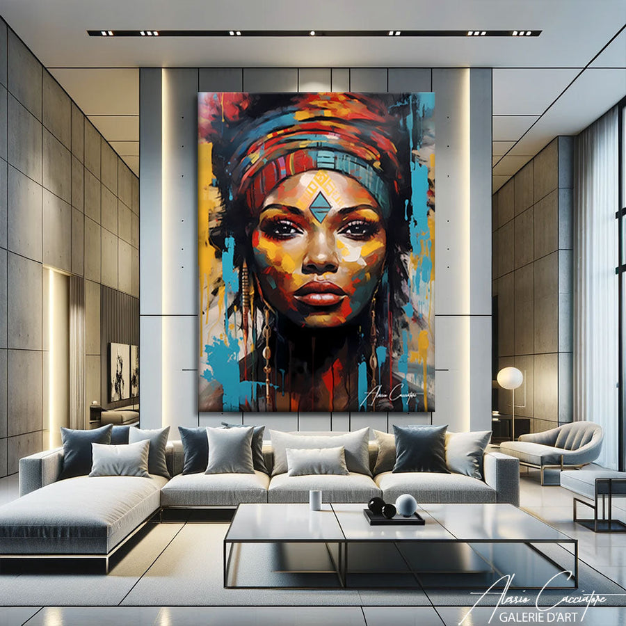

Last week, a customer said to me: "I'm looking for a painting with a colorful woman's face, but not too girly, you know?" I know exactly what you mean. In the fifteen years I've been painting portraits, I've received that request at least three times a month. Because a colorful female face on a wall is never just decorative — it's political, intimate, and says a lot about who you are. So, before you buy, there are some things you need to know.
Why the female face obsesses contemporary art so much
Frankly, if you hang out at an art fair or scroll through Instagram, you're going to come across dozens of portraits of women. Colorful, deconstructed, pixelated, fragmented.
It's not a coincidence.
The female face remains the territory where the artist best expresses the tension between imposed beauty and claimed identity. From Warhol's pop art icons to street artists like Shepard Fairey or C215, the woman's face has become a manifesto. It says: "Look at me, but on my terms."
In my studio, when I paint a female portrait, I never seek perfect beauty. What interests me is the gaze. A gaze that follows you, judges you, defies you. The vibrant colors — fuchsia, electric turquoise, lemon yellow — are not there to look pretty. They serve to take the face out of its decorative function to make it a subject, not an object.
"A well-executed colorful portrait is one that makes you feel uncomfortable for two seconds before fascinating you."
And that is exactly what my clients are looking for: a work that doesn't blend into the decor, but imposes itself.
Colorful woman's face painting vs. black and white: two opposing languages

Many hesitate between a colorful woman's face painting and a black and white woman's face painting. I understand. Both have their strengths.
Black and white: radical timelessness
A black and white woman's painting is raw elegance. It works everywhere, ages well, and never goes out of style. It's the safe choice, the one that says "I have taste, but I don't take risks."
I have nothing against it, mind you. Some of my black and white portraits are hits with lawyers, architects, and people who work in minimalist interiors. The black and white woman's painting fits effortlessly into a graphic, streamlined, masculine world.
But.
Color: the political statement
When you opt for a colorful woman's face painting, you are embracing something more frontal. Color is not neutral. It takes a stand. It says: "I refuse to be discreet."
In my colorful series, I often use saturated hues that shouldn't go together — bright orange + candy pink + Klein blue. On paper, it's ugly. On canvas, it pops. Because color creates a visual shock that forces attention.
And that is the difference between a painting you look at once and a painting you look at a hundred times.
The 4 mistakes to avoid when buying a colorful female portrait
Mistake #1: choosing a portrait "that goes with the cushions"
I've seen it a thousand times. A client finds a portrait in pink and yellow tones because it matches her sofa. Three months later, she redecorates, and the painting no longer speaks to her.
A portrait is not an accessory. It needs to speak to you independently of everything else. If you only like it because it goes well with your current interior, move on.
Mistake #2: ignoring the gaze
The subject's gaze is 80% of the strength of a portrait. A face looking away, eyes lowered, or avoiding eye contact — it can be beautiful, but it doesn't have the same presence as a frontal, direct, almost aggressive gaze.
In my work, I always favor the camera gaze. Because that is what transforms a pretty painting into a work that keeps you company.
Mistake #3: underestimating the size
A 40x60 cm portrait is cute. But it lacks impact. For a colorful female face to have punch, it needs to be large. At least 80x120 cm if you have the space. A portrait must impose itself.
Mistake #4: buying a reproduction without knowing it
On marketplaces like Etsy, many "paintings" are actually digital prints sold as original works. You pay €300, and you receive a poster under plexiglass.
Always check: original work, limited edition, or reproduction? It is written somewhere. If it's vague, run away.
How to integrate a colorful woman's face painting into a contemporary interior
 A colorful female portrait is a game-changer in a room. But you still need to know how to integrate it.
Rule #1: one single feature wall
If you have a powerful woman's face painting in color, it becomes the focal point of the room. Everything else should fade back a little. Avoid drowning it in a wall of frames or sticking it next to another strong work. It needs air around it.
In my Parisian apartment, I have a female portrait above the sofa — nothing else on that wall. She decides the atmosphere, not me.
Rule #2: play with contrasts
A hyper-colorful painting paradoxically works very well in a neutral interior. White walls, gray sofa, light parquet — and bam, a vibrant face in turquoise and magenta.
Conversely, in an interior already loaded with color, a black and white woman's painting can create a sense of breathing room.
Rule #3: lighting is 50% of the result
A poorly lit portrait loses all its strength. Ideally, install an adjustable spotlight or a wall-mounted reading light that projects light onto the canvas.
I have a client who bought one of my works and hung it in his hallway with no light. He told me: "I'm disappointed, you can't see anything." I added a spotlight. He called back: "Damn, that's not the same painting."
My 3 series of colorful female portraits (and why they work)
I'm going to tell you about three series I've developed over the last few years. Because they illustrate the different ways of approaching the female face in color well.
"Neon Gaze" Series: the gaze as a weapon
These are frontal, hyper-contrasted portraits with saturated monochromatic backgrounds. The subject is always looking at the camera. The colors are aggressive: neon green, electric pink, burnt orange.
I started this series after a breakup. I needed to paint strong women who don't look down. Result: these are my best-selling works. Because they command a presence, almost a threat.
"Fragmented" Series: the shattered face
Here, I deconstruct the portrait. One turquoise eye, the other yellow. One half of the face in a flat red, the other in a purple gradient. Asserted Cubist influence, but with a pop palette.
These paintings attract a younger, more urban audience. They work particularly well in lofts, coworking spaces, and industrial interiors.
"Pastel Rage" Series: subversive softness
Here, I play with the cliché. Pastel colors — powder pink, sky blue, peach — but subjects with a hard gaze, sometimes scars, tattoos, asymmetrical features.
It's my way of saying: femininity is not mandatory softness. You can be pink and violent, pastel and fierce.
Where to buy a real colorful woman's face painting (not decorative trash)

The market is saturated with crap.
Posters printed in China, sold for €400 with a gold frame. Aliexpress reproductions resold on Instagram by fake "art curator" accounts. Canvases painted on an assembly line in Vietnamese factories, signed by no one.
How to recognize a real work?
- The artist has a name, a website, an active Instagram. You can see their studio, their process, their failures.
- The price reflects the work. Below €300 for an original 80x100 cm canvas, it's suspicious. That doesn't mean you have to pay €5000, but there is a floor.
- There is a certificate of authenticity. Even if it's a young, unknown artist, they must sign and number their works.
- You can ask the artist questions directly. If it's just a generic shop with a contact form, be wary.
On my site, each work is accompanied by a text that I write myself. I tell the story of why I painted it, what held me up, what made me happy. Because a painting is not a product, it's a conversation.
And if the artist is incapable of talking to you about their work, it means they didn't make it.
The colorful female portrait in offices: yes, but not just any way
More and more companies are integrating contemporary works into their spaces. And the colorful woman's face painting often comes up.
But be careful.
In an office, a female portrait must avoid two traps:
Trap #1: the male gaze disguised as art
A hyper-sexualized portrait of a woman, even a colorful one, even an "artistic" one, doesn't go over well in an open space. It sends a message. And not the right one.
When a company commissions a work from me, I always suggest portraits where the subject has power, not availability. Strong gaze, frontal posture, no ambiguity.
Trap #2: the "too much" factor
In a workspace, a portrait that is visually too aggressive can be tiring. I have a client who bought one of my "Neon Gaze" portraits for his meeting room. After three months, he told me: "Alessio, it's magnificent, but on conference calls, I stare at the painting instead of listening."
We moved it to the lobby.
The right compromise? A colorful portrait, but with a balanced composition, saturated colors but not neon, a present but not inquisitive gaze. It exists, I promise.
Why I stopped painting "pretty" faces
Five years ago, I painted classic female portraits. Beautiful. Harmonious. They sold well.
And then one day, a Berlin gallery owner said to me: "Alessio, you paint well, but you say nothing."
That stung.
But she was right.
I started painting asymmetrical, disturbing, borderline ugly faces. Noses too big, eyes offset, twisted mouths. But with incredible colors, wild textures, a brutal energy.
Result: my sales dropped for six months.
Then they exploded.
Because the people who buy contemporary art don't want pretty. They want real. They want a work that takes a stand, that embraces a radical aesthetic choice.
Today, when I paint a colorful female face, I never seek to please. I seek to provoke a reaction. If you remain indifferent, I've missed my mark.
But if you love or hate it violently, then we're good.
Frequently Asked Questions
What size should I choose for a colorful woman's face painting in a living room?
For a standard living room (20-30 m²), aim for at least 80x100 cm. A smaller portrait will lack impact. If you have a large wall (above a sofa, for example), don't hesitate to go up to 120x150 cm. A face must command attention, not be forgotten. Measure your wall, leave 15-20 cm of margin on each side, and choose the largest size possible.
Can a colorful woman's face painting fit into a classic interior?
Yes, and that's actually often where it works best. A colorful contemporary portrait in a Haussmann-style or classic interior creates a controlled visual shock. The trick: choose a work with a structured composition (not too chaotic) and hang it in a sober frame—black or antique gold. The contrast between the old and the contemporary gives depth to both.
Colorful or black and white woman's face painting: which holds more value?
Honestly, it depends on the artist, not the palette. A good black and white painting by a listed artist will increase in value. A bad colorful painting by an unknown artist will lose its value. What matters: the signature, the quality of execution, and whether the work is part of a coherent series. Color is a matter of taste, not investment.
How do I know if a woman's face painting is a real original work?
Three clues: 1) The work is signed on the back or side (not just a stamp). 2) There is visible texture (relief of the paint, brushstrokes). 3) The artist provides a certificate of authenticity with their name, the date, the dimensions, and their signature. If you have any doubts, ask for a close-up photo of the surface. A digital print is perfectly smooth.
Where should I hang a colorful female portrait in a bedroom?
Avoid above the bed (a direct gaze can be disturbing when you are sleeping). Opt for the wall facing the bed, or a side wall near the window. If the bedroom is small, opt for a work with less saturated colors (pastels, muted tones) so as not to visually overload the space. A black and white female portrait also works very well in a bedroom.
All the works mentioned in this article are available in the gallery. Worldwide shipping offered, money-back guarantee within 30 days.